Category Archives: Uncategorized

Tester Memorial Symposium

I am still working out what to use this blog for.  In the most important sense I want to provide a way for the general public to see some of what goes on in the daily work of scientists and university professors.  Also, as a way for people to see a little of what I am up to.  This may also function as a log of activities; however, I do not intend for it to be a full and complete record in any way.  Rather this is an informal and possibly eclectic compilation of topics.

This week our department is having the 38th Annual Albert L. Tester Memorial Symposium in the Keoni Auditorium of the East-West Center, and I volunteered to chair the first session yesterday morning.  The symposium is a series of presentations of student research from any department.

First however, Dr. Tim Tricas gave a short introduction of who Albert L. Tester was, what topics he worked on (Fisheries Biologist) and some memories people shared with him of people who knew Dr. Tester.

Then Jaclyn Mueller from Oceanography gave a talk about "Efficient extraction of nucleic acids from microbial plankton (viruses, bacteria, and protists) collected on aluminum oxide filters."  I talked with her briefly before the session and she is working on marine RNA viruses.  The concentration of viruses in ocean water is amazing.

This was followed by Carolyn Parcheta from Geology and Geophysics on "Volcanic fissure conduits: the first quantification of shallow subsurface geometry."  She made maps on the centimeter scale of fissures to better understand outgassing dynamics.  One detail from this talk was the use of lydar to 3D map deep into volcanic vents beyond what is visible on the surface.  I wonder if rovers could be used to crawl deeper into the fissures to map them some more?

Then Tyler Hee Wai from Mechanical Engineering talked on "Investigating Dusk and Dawn Shifts in Snapping Shrimp Sounds."  There is an applied angle to this work.  The baseline of snapping shrimp sounds can be used to remotely detect boat motors.  It is completely passive and undetectable so activities like fishing in marine refuges could be detected.

Finally, the final talk of the first morning session was by Chelsea Marvos from Nursing on "Emotional Intelligence and Clinical Performance/ Retention of Nursing Students."  I also talked to her before the session; nursing programs have a problem with retention and she is investigating how predictive the performance on an emotional intelligence test is for student retention rates.  Afterward there were questions from the audience about what the test is like.  She said parts of it can be strange like asking to interpret the feeling of a picture of a pile of rocks, etc.  However, during her talk she said emotional intelligence is something that can be trained and brought up the possible value of incorporating this into nursing training programs.

Eight-Species Plant DNA Alignment

I've added a few more species to our plant chloroplast rbcL DNA sequence collection.

D18

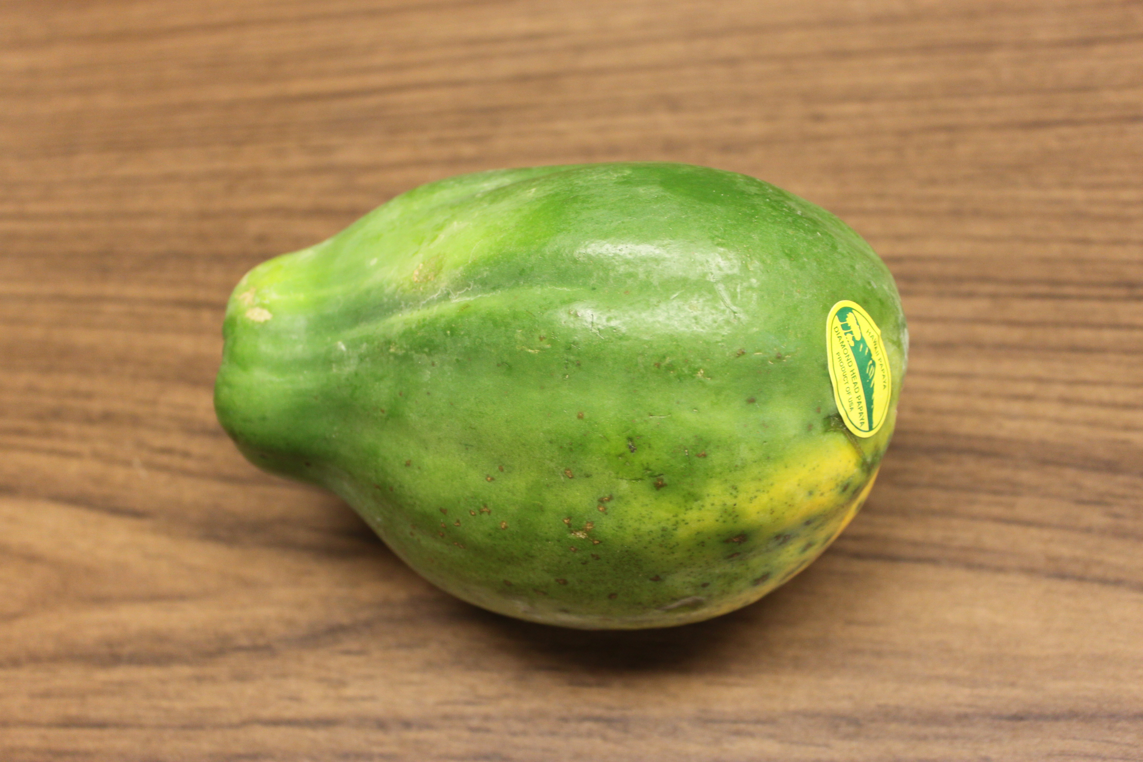
The first two new ones, above and below, I bought at the local store: sweet corn (Zea mays) and papaya (Carica papaya).

D17

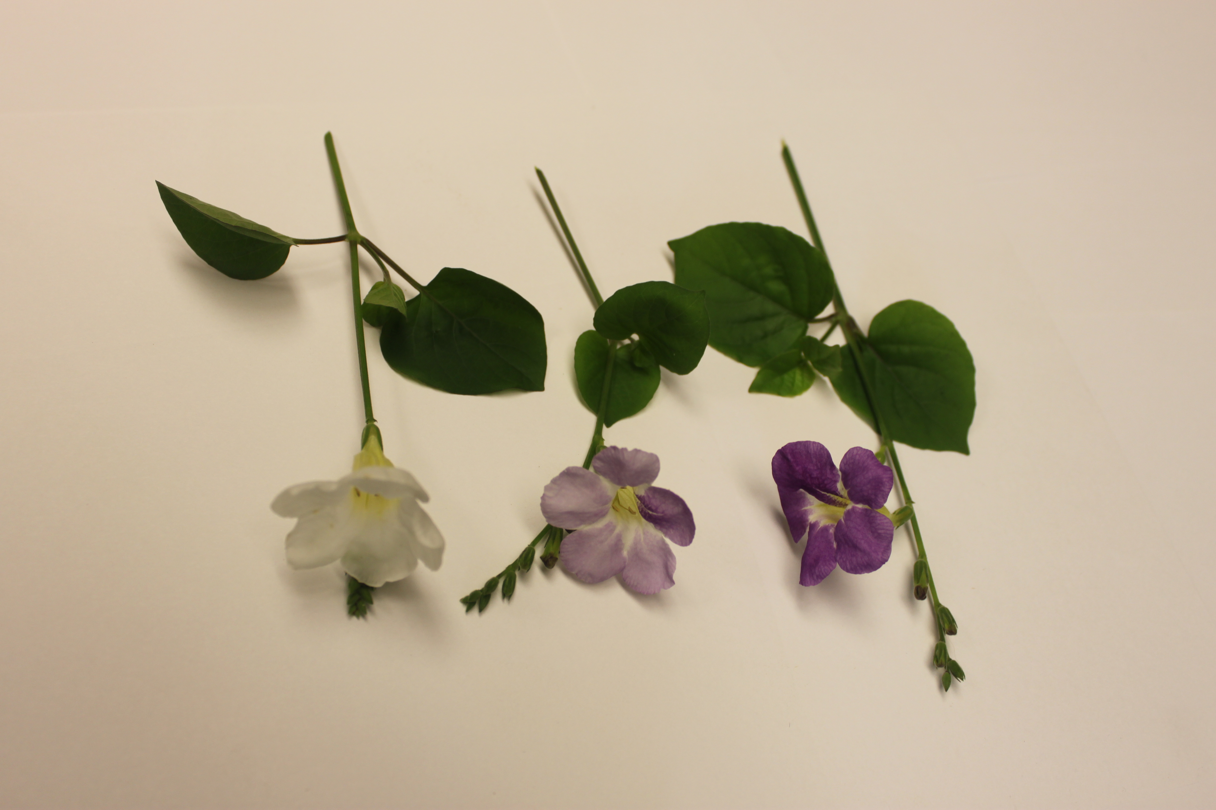
There is also a type of flower blooming all around campus this time of year (March-April).  They range from white to dark purple.  I am guessing that they might be a good example of incomplete dominance (in genetics classes we often use white/pink/red snapdragons as an example, but these may be a nice local example that students actually see outside of class).  I looked them up and they are Chinese Violets (Asystasia gangetica).

D8-D10

Above, purple on the right, to light purple in the middle, to white on the left.

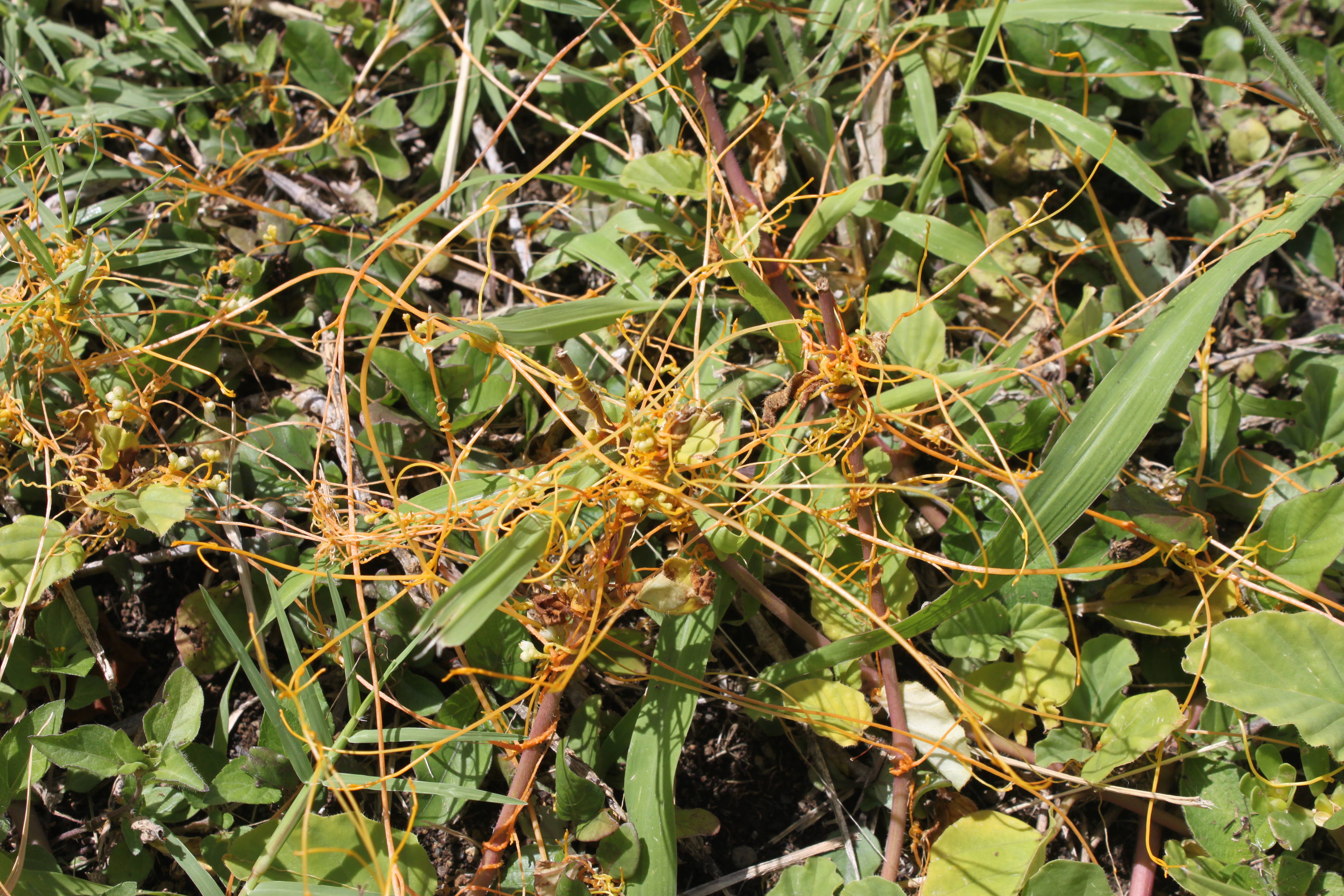
The plant below (it looks like orange threads) is very interesting.  It is called western field dodder (Cuscuta campestris) and is a parasite that attaches to and takes nutrients from other plants.  Most plants use their chloroplasts to produce energy, but the dodder has come up with an alternative strategy.  So, what does its chloroplast sequence look like?

D12

Some places online say that the dodder does not have chloroplasts or produce chlorophyll.  However, this is not true.  Funk et al. (2007) sequenced the chloroplast genome of two dodder species (C. reflexa and C. gronovii) and found that they had reduced and rearranged genomes.  McNeal et al. (2007) also found some gene loss and rearrangements, and an increase in the nucleotide substitution rate, in two other dodders (C. exaltata and C. Obtusiflora).  Furthermore, Berg et al. (2004) found that C. gronovii and C. subinclusa have lost the plastid RNA polymerase (necessary for gene expression by generating a messenger RNA, i.e. transcription) and that rbcL has had to evolve to be transcribed by RNA polymerase from the nuclear genome.

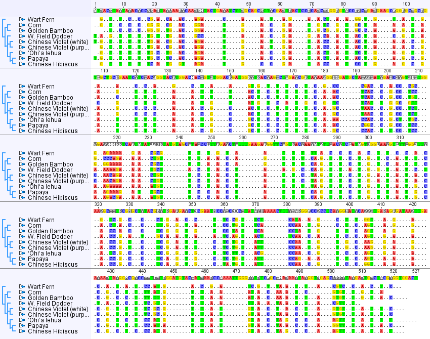
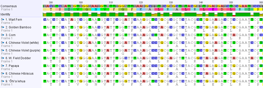
Below is the DNA sequence alignment from all eight species (including the four from the earlier post).  There are nine entries because I included two Chinese violets, a white form and a purple form, and unsurprisingly they have identical sequences.

8plant-rbcL-alignment

I changed the settings so that any DNA position that is variable is highlighted and positions that are the same in all species are represented by a ".", except in the consensus sequence given along the top.  Overall, you may notice a 2-1-2-1-2-1 pattern in the spacing of variable sites.  Below is a close up of a stretch where this is particularly strong.

8plant-rbcLalignment-conserved-aa-codon-vary

In this part of the rbcL gene every three nucleotides codes for a particular amino acid.  Below each DNA sequence I have listed the corresponding amino acid code.  Across all eight species the amino acid sequence is identical (in this region; there are some variations in some other parts of the gene) corresponding to "TSIVGNVFGFKALRALRLEDLRIP."  In other words, none of the DNA changes affect the sequence of the protein enzyme (enzymes catalyze biochemical reactions (catalyze = cause the reaction to occur)) that is produced by the gene.  The sets of three nucleotides that code for an amino acid are known as codons.  If you look at a codon table that translates between nucleotides and amino acids you can see that any change to the second position causes a change in the corresponding amino acid.  However, often changes in the third position have no effect on the amino acid (i.e. they are "silent").  For example, GCA, GCC, GCG, and GCT all code for alanine (A).  Occasionally changes to the first position do not change the amino acid; so both TTA and CTA code for leucine (L).  This explains the spacing of the DNA sequence changes between these species.  Mutations are expected to be happening across all of the sites.  However, ones that change the protein sequence may affect the function of the enzyme and are removed by selection.  So, over time, the only changes that are accumulating between species are ones that are not affected by selection (i.e. are selectively "neutral").

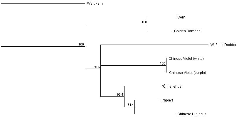
Below is a phylogenetic tree that can be obtained from these sequences to represent their inferred evolutionary history (rooted by the fern sequence as an outgroup).

8plant-rbcL-tree

Corn and bamboo are both types of grasses so it makes sense that they group together.  The dodder has a long branch, representing many DNA changes, which fits with what we expect given the extensive changes and higher rates of substitutions in the dodder chloroplast genome.  The two Chinese violets cluster together identically, which makes sense because they are the same species.  There could be a small amount of genetic variation within the species between the two samples but it is also not surprising that there is not in this particular sequence. The remaining branches are the lehua, hibiscus and papaya which are all considered Rosids within the Eudicots (true dicots) while the dodder and Chinese violet are considered Asterids within the Eudicots.

So how much confidence do we have in the branching pattern in this tree?  One way to address this is by "bootstrapping."  This is a process where a large number of fake samples are generated by randomly sampling from the original dataset (randomly picking nucleotide sites) and the percent of time a particular branch of the tree is found (contains the same set of descentants) is used as a measure of confidence in that part of the tree.  However, if many different branching orders are found, and different groups of descendants are contained within the branch, from different sets of the data then we have lower confidence in that particular feature.  (See Felsenstein (1985) and Efron et al. (1996) for more information.)  In the tree below I have applied bootstrapping and only shown the branches that are supported in a majority of the replicates.  If there is no majority (e.g. if three different branching orders are found at equal 1/3 frequency) that part of the tree is collapsed together.

8plant-rbcL-tree-consensus-bootstrap

Several parts of the tree have high support from the data and are recovered >95% of the time (in fact the grass grouping was found 100% of the time).  But the papaya hibiscus grouping had low support (64.4%) and branching order at the base of the eudicots (asterids and rosids) have little support in this dataset and so at the moment should be taken with a grain of salt (i.e. without confidence).

More Transformations, pBLU and pGreen

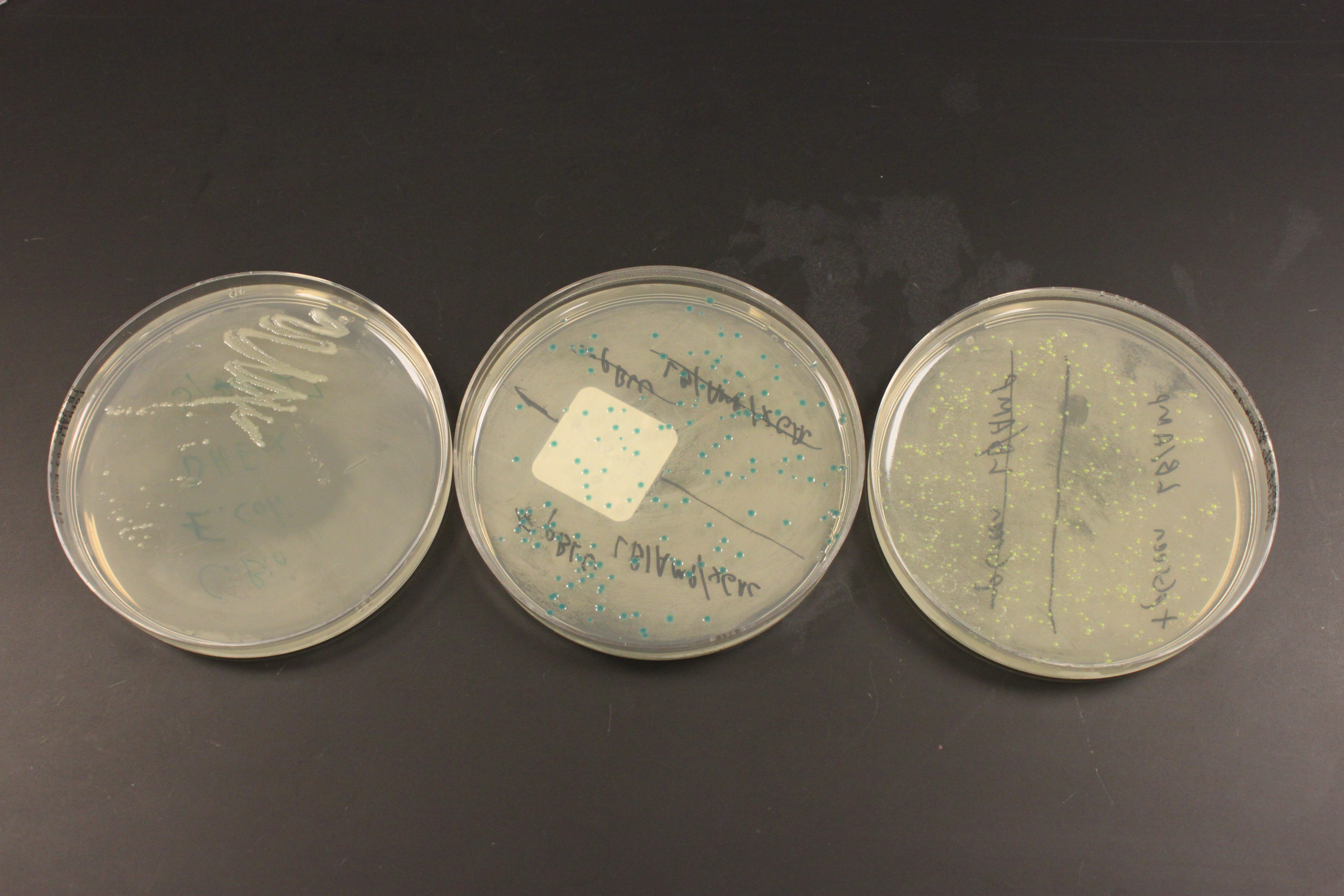
IMG_0093

Above are three plates of media with E. coli bacteria growing on them at 37 C overnight.  This is a different strain of E. coli called DH5alpha (I used MM294 earlier) but neither one has antibiotic resistance.  In the left plate, without antibiotic, I "streaked" out cells by running a sterile wire loop back and fourth through the cells repeatedly, making a dilution until I could pick a single clone colony of rapidly growing cells.  I then transformed the cells using heat shock.  The plate on the right is expressing GFP (as part of a fusion protein with lacZ) that gives them a green color that I mentioned in an earlier post.  The plate in the middle shows colonies that are dark blue, they are expressing a fully functional lacZ gene and have X-gal added to their media.  Chemically X-gal "looks" like a disaccharide (a "double" sugar molecule made of two simple sugars).  lacZ normally cuts disaccharides to make monosaccharides for the cell to use, however when X-gal is cut a molecule containing bromine is formed that spontaneously forms a new molecule with itself and gives the cells the dark blue color.

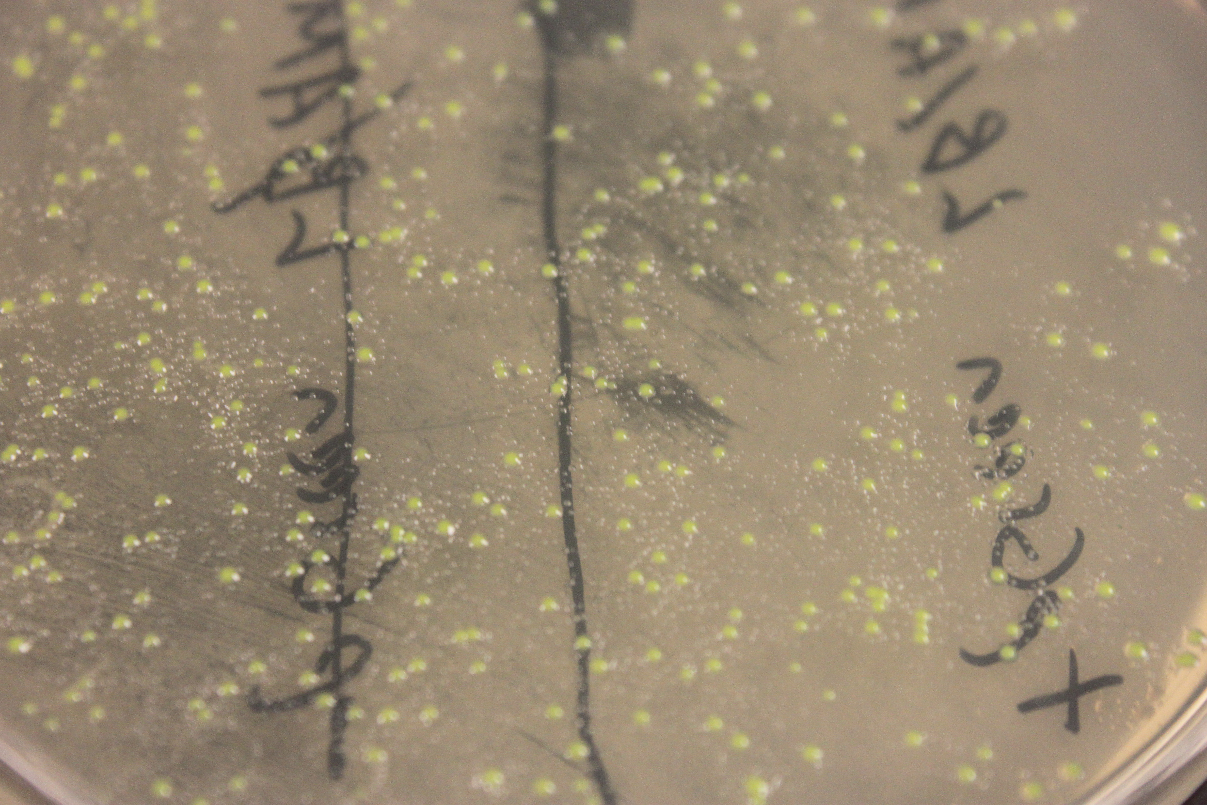
IMG_0094

In the close up image above you can see smaller "satellite" colonies around the GFP transformed cells.  In these plates ampicillin is used to select for only the cells that have taken up the plasmid, which contains an amp-resistance gene.  However, the enzyme produced destroys ampicillin in the media around the cells, which allows cells that were not transformed to start growing.  You have to be careful not to pick the nearby untransformed colonies when attempting to clone a DNA sequence in a plasmid.

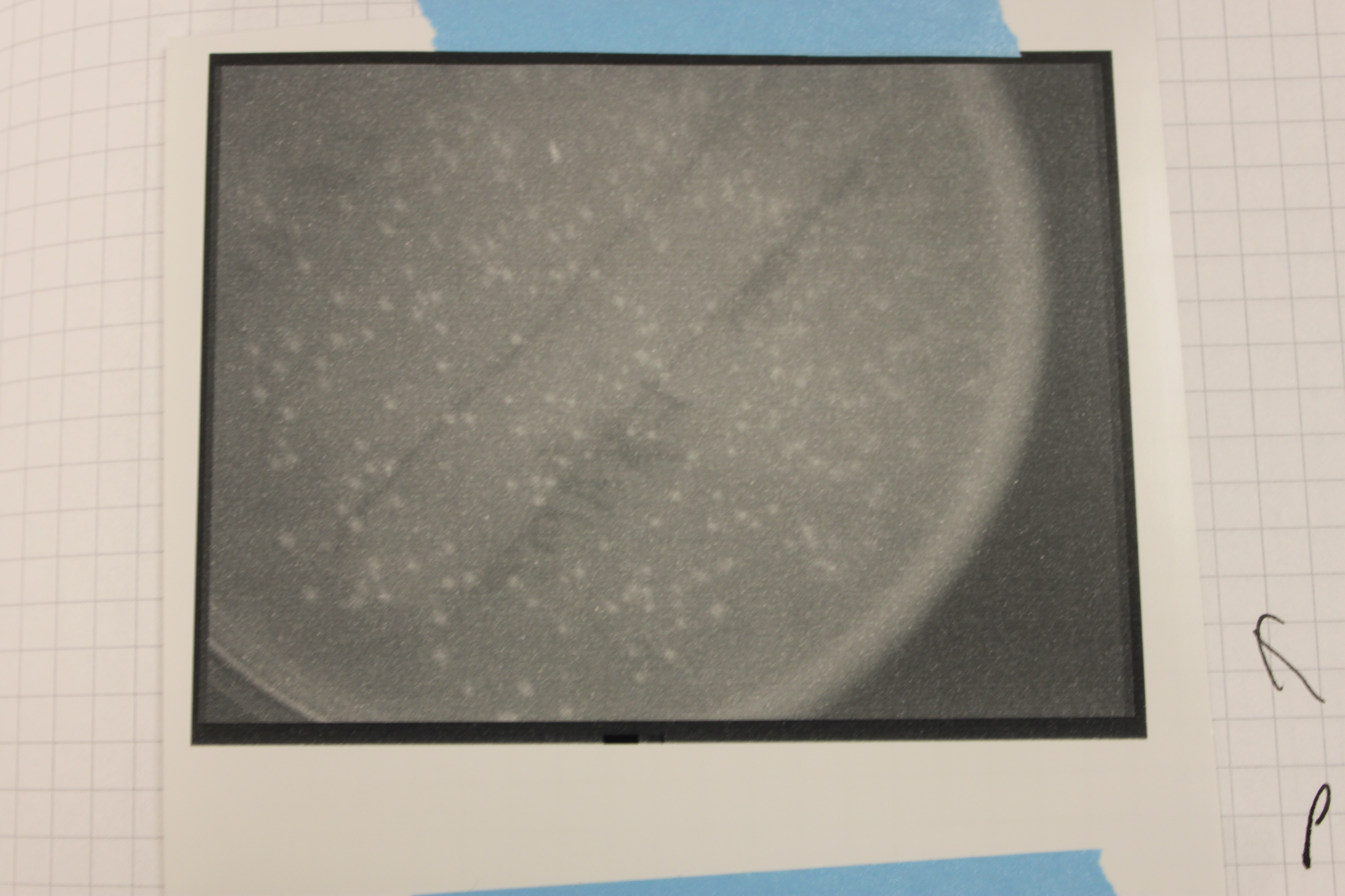
I tried looking at the GFP expressing cells under UV light in a dark room and I could not see them glowing.  So I put the plates in a transilluminator we use to take pictures of gels.  It uses UV light and the camera can be set for a long exposure.

IMG_0024 (2)

Above is the image from the UV transilluminator.  You can see bright spots where the colonies are growing, but is this GFP?

I put some other plates in for comparison.

IMG_0023 (2)

On the bottom is the GFP expressing plate, on the upper right are the lacZ colonies, and one the upper left are untransformed colonies I streaked out.  The lacZ expressing cells are darker, but this could be because of the blue dye from Xgal.  The regular cells seem bright, perhaps from auto-fluorescence, which does not make the GFP cells very convincing in terms of fluorescence.

I am going to try some more variations.  Part of the reason I am doing this is to get a bacterial transfromation/cloning system up and running in the lab, another part is to find a nice system, or set of systems, for teaching a genetics lab in the fall.

Fruit Fly Images

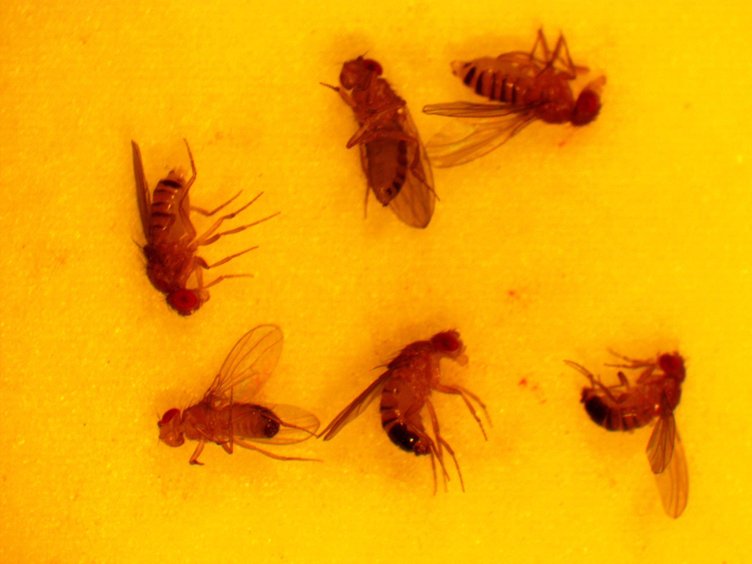
A camera that fits into the eyepiece of our microscope arrived this afternoon (MiniVID USB by LW Scientific) and I couldn't wait to try it out.  Here are the first pictures I captured with it.  These are "raw" without any balance adjustments to color, brightness, etc.

dmel-w-wt-2013-04-11-16-11-54

In the image above six fruit flies are knocked out with carbon dioxide.  We move them around with paint brushes.  I've arranged three females along the top and three males below.  The females tend to be slightly larger in body size and the males have darkly pigmented ends of their abdomens.  The relative size and pigmentation can vary between strains however so the best way to tell the difference is at the end point of the abdomen, simply put, males are rough and bumpy and females have a sharp point.

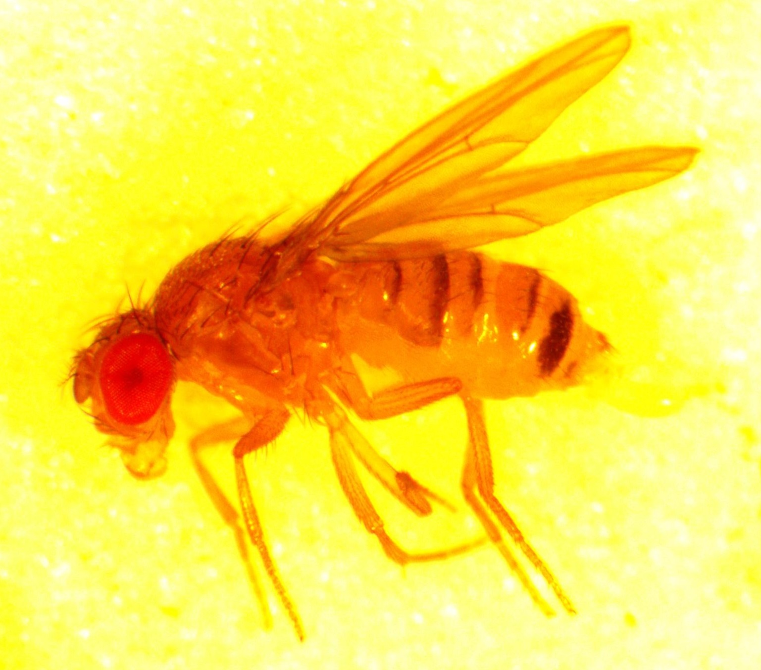
dmel-w-wt-2013-04-11-16-13-22-crop

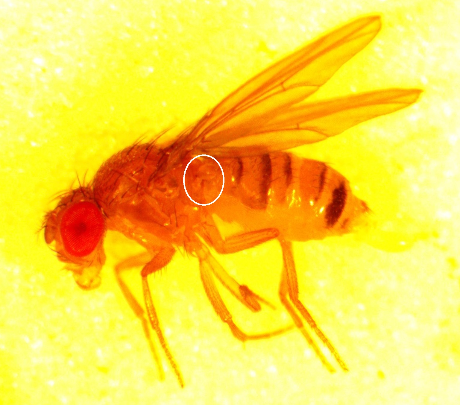
And here (above) is a close up of a female.  You can see the bristles on the body and wing veins.  Right behind the base of the wing is something like a "ball on a stick" called the haltere.  I've circled it in the copy below.

dmel-w-wt-2013-04-11-16-13-22-crop-halt-outline

The halteres vibrate in a plane when the fly is flying and act like a type of gyroscope to maintain orientation.  (Also, incidentally, this effect is not unrelated to Foucault's pendulum which remains swinging in a plane as the earth rotates beneath it.)

dmel-w-wt-2013-04-11-16-17-57-crop

Above is a female that is starting to wake up and has stood up on her legs.  The big difference about this fly from the ones above is that she is a mutant and has white eyes (they look kind of reddish/yellow in these images on some displays but in real life they are indeed white).  Below is a male, also with white eyes.

dmel-w-wt-2013-04-11-16-16-46-crop

You can also just see the "sex combs" on the front legs.  The are a dark patch on the front of the leg midway up.  Only males have these but they can be hard to see when sorting large numbers of flies.  I've outlined them in the picture below.

dmel-w-wt-2013-04-11-16-16-46-crop-sexcomb

The white eye color is due to a mutation at a gene called white (genes are named after mutant phenotypes) on the fruit fly's X-chromosome.  The symbol for white is w and this particular mutant is the first allele (mutant variation) found at white by Thomas Hunt Morgan and is written as w1.  These flies have been maintained by various labs over time and are direct descendants of the white mutants discovered by Morgan over a century ago, which he used to establish that genes were located on chromosomes by X-linked inheritance.

This also brings up another point.  The names of genes seems seem easy and obvious at first but at some point along the way you realize it is counter intuitive.  In classical genetics a gene was discovered when a mutation occurred.  More often than not mutations inactivate a genes normal function to some degree.  So genes are named for the opposite of what they normally do.  When the white gene is functioning the flies have red eyes; when it is inactivated they have white eyes.  Using the car analogy again, if we named parts of cars in the same way the brake pedal would be called something like stopless and the gas pedal would be unmoved.  So in a normally functioning car you would activate unmoved to go faster and stopless to slow down, which seems intuitively backwards based on the names.

Mutation Predictions

This semester I have been working through some basic population genetics background to prepare for a class I plan to teach next spring.  One place to start is on the predicted effects of mutations.  The simplest model to begin with is one of irreversible, one-way, mutations.  Imagine a functional gene sequence and that mutations can occur to disrupt the gene function, effectively turning it "off."  I like to mention working on cars for analogy.  If you made small random changes to car parts, the most likely outcome, if anything happens at all, is that you break the function of the part and render it useless (rather than gaining a new and different function or, even-rarer, improve its function).

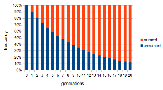
So say the mutation rate is really high, like 10% per generation, and you start off with 100% functional gene copies.  Then after one generation only 90% of the copies are functional because of the 10% that mutated (1 - 0.1 = 0.9).  In the next generation 90% of the 90%, or 81%, are still functional; in the third generation 90% of the 90% of the 90%, or , remain functional.  (There are also mutations in the already mutated alleles but these do not change the phenotype (it is still an inactive gene function) so these are ignored and lumped together; only the mutations in the remaining unmutated alleles are kept track of.)  So it is easy to see that after generations with a mutation rate of the fraction of unmutated alleles is .  Our example gives the following graph over the first 20 generations:
mutation-irreversible

This curve follows a (discrete) geometric distribution and over long periods of time can be closely approximated by a (continuous) exponential distribution.   This is an example of exponential decay like the classic curve of radioactive decay and the idea of radioisotope half-lives.

The same type of curve and equation applies even if we do not start off at a 100% frequency of one allele.  Say the functional allele is at 50% frequency, , then one generation later 10% of the 50% mutate leaving 90% of the 50% unmutated, .  Generally, if the starting frequency at time zero is then the frequency after generations, , can be calculated as .

Another way to look at this is (the frequency at time g is equal to the frequency in the generation before, g-1, multiplied by the fraction that did not mutate, . However, and , etc.  Substituting in the reverse order, and , etc.  Quickly we see that from a beginning point the equation becomes because we are multiplying g-times.


One reader did not like the previous paragraph and found it hard to understand; I'll try to present it again here in just equation form.

, if is defined as the number of generations after exists.


Actual mutation rates vary widely over several orders of magnitude but in general are much lower than the example of 10% per generation I used above.  Often, the mutation rate affecting the function of a gene is on the order of to per generation.  The mutation rate at a single nucleotide site in a DNA sequence is on the order of .  It can be tricky to measure mutation rates directly.  Often mutations are recessive or are not completely visible as a phenotype.  However, in humans there have been several studies focusing on achondroplasia (a form of dwarfism) to measure mutation rates.  The mutant allele is dominant, so a single copy results in the dwarf phenotype.  The phenotype is fully penetrant (if you have the allele you have the phenotype, in contrast many human traits are incompletely penetrant).  Finally, the phenotype is unambiguous.  These factors make measuring the rate of appearance of achondroplasic individuals from birth records ideal for directly measuring mutation rates.  Results from different studies vary but rates on the order of 1 in 25,000 or have been found.

Obviously, selection and genetic drift are important factors affecting allele frequencies in real populations.  Mutations in the FGFR3 gene that result in achondroplasia are removed from a population by selection and never attain high frequencies.  However, for the moment I am keeping things simple by only looking at the predicted effects of mutation rates.  Imagine a species that moves into a cave system and then the population is cut off from the outside world (so called troglofauna, or cave animals).  If genes are no longer needed in the cave environment, like ones involved in eye development or pigmentation patterns, how long would we expect functional alleles (different forms of a gene) to remain in the population?  In other words, mutant non-functional alleles are no longer removed by selection.

Using a little algebra

can be rearranged to

by dividing by .  Then take the of both sides

and divide again to solve for the number of generations

.

Using from above and setting (so that the frequency at time is the starting frequency at time zero, we get a half life of the functional allele of 17,328 generations.

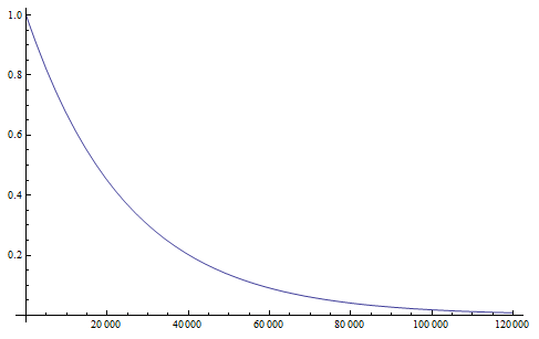
Setting we find that after 115,127 generations 99% of the population's alleles have mutated to the non-functional form.  The curve for the first 120,000 generations looks like this:
mutation-allele-decay-120k

showing the initial steep drop and then leveling off of the change in frequency due to mutations.

If we consider a generation to be about a year long for many species than after about 120,000 years (which is not really that long) any genes that do not have functions that are selected for are expected to be inactivated and functionally lost from the genome.  This can easily explain the pigment-less, eyeless cave fish found in the southeastern US.
Turning this around, if a gene is found to be functional and preserved in the genome and at a high frequency (>90%) in the population, it follows that it is being maintained by selection in the recent past.  Humans along with many other primates (and independently guinea pigs) have lost the ability to synthesize vitamin C because of mutations in the GULO gene (the remnants of which still remain on our 8th chromosome). This suggests our distant ancestor had plenty of vitamin C in their diet for thousands of generations and that mutations in GULO were not removed by selection.

This also suggests a way to measure mutation rates by changes in allele frequency in the absence of selection, if we know when the selection pressure was removed.  Imagine bacteria that carry a plasmid with resistance to two different types of antibiotics.  Initially they are kept on media containing both antibiotics, but then are transferred to a plate containing only one (to maintain the plasmid).  We know that bacteria, under optimal conditions, can divide every 20 minutes or so.  We could periodically take out a sample and assay what proportion still maintain resistance to the missing antibiotic.  The equation above can be rearranged again so that the fraction resistant, and the time on the new media, can be plugged in to estimate the mutation rate.

However, this does ignore any possible fitness cost to the bacteria to maintain antibiotic resistance, and selection could also drive the inactivating mutations to high frequency in the population (this could also be occurring in cave species; an energetic cost to producing pigments, or the presence of eyes providing a source of infections, could result in selection inactivating the genes even faster than predicted by mutation).

In fact, growing bacteria continuously in a chemostat and periodically checking for mutations in resistance to infection by bacteriophages (viruses that infect bacteria) is a classical method to assay mutation rates.  Different compounds can be added to the chemostat to test if they raise or lower mutation rates.  The assumptions used in measuring these mutations rates are essentially the same as presented here in this post, with one exception.  When the mutant frequency is very low the curve is nearly linear.  So

is almost equal to

when is near 100%.  This is because almost all of the alleles are unmutated, so essentially any potential mutations that can occur do occur on unmutated copies.  In terms of the mutant frequency , if the mutation rate is 1% and at first no mutants are present, in the first generation the mutant fraction is .  In the second generation , which is almost 0.02.  In the third generation , which is almost 0.03, etc.  The low frequency approximation can be rewritten as (the mutant fraction each time step adds the same quantity to the initial number of mutants).  This is a linear equation of the form , where b is the y-intercept and m is the slope of the line.  So in this case the slope of the increase in mutant frequency is equal to the mutation rate.  If the slope increases when chemicals are added to the broth the bacteria are growing in then they are potential mutagens.

At any rate, the phenotypes of cave species and the predicted rapid inactivation of gene function by mutation in the absence of selection maintaining the function is a nice, simple, easy to understand example of inferred evolution.  The mutations that can occur in bacteria are also a nice observable example of evolution in action.

OK, that's enough for now.  In future posts I will discuss some more complicated mutation models.
A Four-Species Plant DNA Alignment

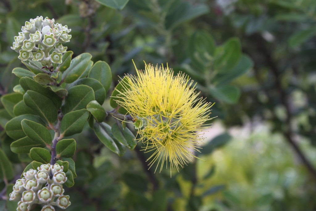
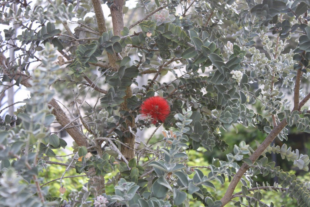
There are several interesting plants growing around the building where I work.  One of these is the native ʻŌhiʻa lehua (Metrosideros polymorpha).

D3

There are plants with red flowers (with darker leaves and stems) and ones with yellow flowers (with lighter leaves and stems).

IMG_0143

IMG_0144

One of the students here told me that her grandmother said if you pick the flowers from a lehua it will rain.

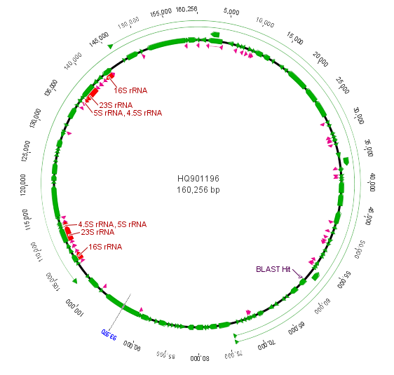
I took a small leaf sample for extracting DNA and some samples from three other plants for comparison.  I planned to amplify and sequence a small segment from the chloroplast genome.  Like the mitochondria, the chloroplast has a small genome that is a loop of DNA.  It is much larger than the mitochondria but much smaller than the nuclear genome (which contain the linear chromosomes we are used to thinking of) of plants and animals.  Of course the chloroplast is well known as the site of photosynthesis in the plant but it also carries out other functions.  Here is a representation of the chloroplast genome from the cotton plant and then zooming in on a section of the rbcL gene (in the lower right) for sequencing.

chloroplast-genome-cotton

rpcL-genome-zoom

The purple "BLAST Hit" is the section sequenced.  If you look back a few posts at the mitochondrial genome you can see that there are many more genes and the chloroplast genome is quite a bit larger.

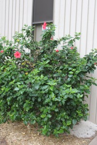
A close comparison that happened to be around was a Chinese Hibiscus (Hibiscus rosa-sinensis).

D2

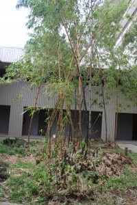
The lehua and the hibiscus are both dicot plants.  Moving further out is the golden bamboo (Bambusa vulgaris) which is a monocot but still an angiosperm (flowering plant).

D1

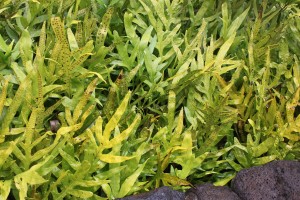
For an even more distant relative of lehua I took a sample from the wart ferns (Microsorum scolopendria) growing around their base.

D4

Like many plants M. scolopendria ferns were introduced to Hawai'i and they have now esabilshed themselves in the wild here.  They are called "wart" ferns because of the spore clusters on the leaves.

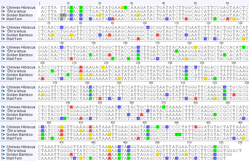
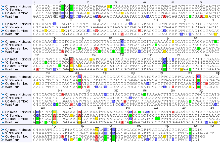
So here is what the alignment of the chloroplast DNA sequences from these four species of plants looks like.

plant_rbcL_4species

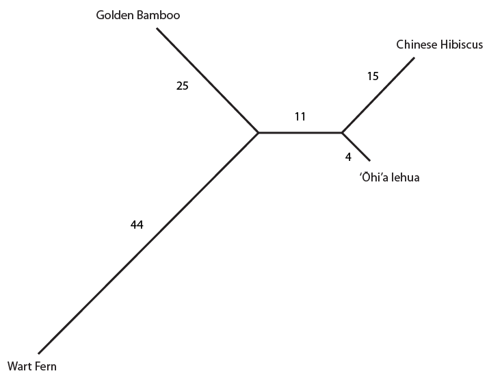
Most DNA positions that vary between the samples are highlighted (but if you look closely not all are; I used geneious software to make this plot; this might be a bug or, more likely, I have a highlighting setting wrong.).  One thing that is quickly apparent is the large number of unique nucleotides in the wart fern sequence.  This can be explained because the fern is so divergent from the other species.  You can also see that when a DNA difference is shared between only two species (like position 11 near the beginning), it tends to be shared between the lehua and hibiscus, the two most closely related species among these four.  Overall the unique sites and shared sites give this type of "tree" representation.  (Shared derived (derived means different from a common ancestor) states are useful for reconstructing ancestral relationships between divergent species and are called synapomorphies.)

4plant-rbcL-tree-numbers

The numbers along each branch indicate the unique DNA basepair differences highlighted for each species (there are actually some more upon closer inspection that were not highlighted, as I mentioned above, but I left it as it is for now).  The "11" in the segment separating the lehua and hibiscus from the other plants represent the 11 differences (synapomorphies) only shared by these two species.

However, there are some sites that do not share this pattern.  For example, site 404 places lehua with bamboo and site 281 places lehua with the fern.  Here is the alignment with the 11 shared sites mentioned above outlined in black, and the sites that are incongruent with the actual relationship of these species indicated in red or green (for the two different incongruent patterns present).

4plant-rbcL-alignment-informative

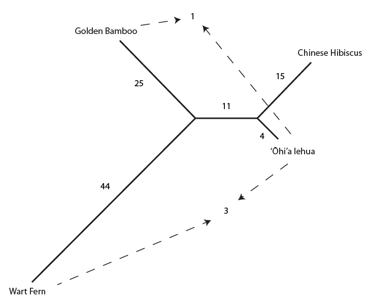
And below the incongruent sites are indicated on the tree with dashed arrows.

4plant-rbcL-tree-incongruent

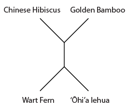
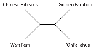
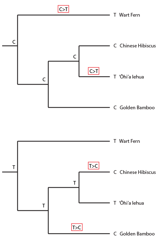
Overall the data suggests the grouping that we believed to be true a priori (based on observable physical characteristics of the plants), that the lehua and hibiscus are more closely related.  But one DNA position suggests a closer relationship between the lehua and bamboo and three positions push the lehua closer to the ferns.  This gives some level of support for the following two alternative tree topologies.

4plant-rbcL-tree-alt1

4plant-rbcL-tree-alt2

However, a far more likely explanation is that these DNA positions experienced more than one mutation event that resulted in parallel mutations to the same state in different lineages (or even  a "back" mutation to an ancestral state after a lineage seperation.)  This sharing of states from different events is termed homoplasy.  Because of the long evolutionary distances between these species it is reasonable to suspect a few sites have had multiple "hits;" also, if you look closely, a few sites like position 20 and 149 have had multiple mutation events to more than two states (but these have not been highlighted by the software I used to make the plot).

If we believe the wart fern is the most divergent, we can use this assumption to "root" the tree by using the fern as an "outgroup."  In this simple representation time moves from left to right; the older part of the tree is to the left and the younger is to the right.  (This plot is just to represent the relative order of events, the branch lengths here are not proportional to the amount of change or inferred time period.)

4plant-rbcL-root-tree

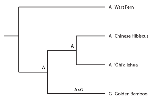
In the image below a past mutation even from an "A" to a "G" in the bamboo linage (for example position 32 in the alignment) is mapped onto the tree.  This is a single (not shared) derived state (an autapomorphy) so it is not useful for inferring ancestral relationships, but it gets the ball rolling with thinking about mapping mutations onto a tree.

4plant-autapomorphy

The state of the DNA position is given at the tips of the tree in front of each species name (resulting in a "G" in the bamboo sequence) and at two positions inside the tree where we can infer the sequence of a common ancestor.  Now for the synapomorphy pattern:

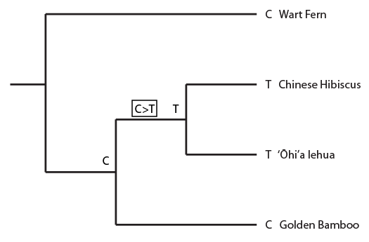
4plant-synapomorphy

Above the history of position 11 in the alignment is indicated.  A C to T mutation occurred before the common ancestor of the hibiscus and lehua but after the species split from the lineage leading to the bamboo (indicated in the black box as in the alignment).  And now I'll plot a homoplasy pattern that gives incongruent results.

4plant-homoplasy2

Here is an example from position 281 in the alignment.  The lehua and fern share one state and the hibiscus and bamboo share the other.  In this case we suppose that more than one mutation event has occurred in the history of this position, but based on only this data we cannot tell when/where it occurred, what direction it was in (a T to C or a C to T), or what the ancestral states were likely to be.

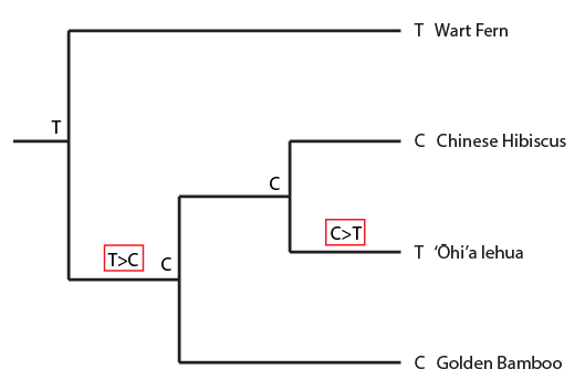
And here is yet another possibility where a back-mutation occurred along a lineage to restore an ancestral state.

4plant-backmutation

This example helps illustrate that often in biology we deal with some level of uncertainty; but this does not necessarily prevent us from being able to make inferences.  Also, assumptions are important tools to use to work through a problem, so long as we are clear about what those assumptions are.  The four species used in this example cover a long range of evolutionary time.  There is plenty of opportunity for multiple mutations to occur.  When looking at closer related species there is often far less uncertainty (of the kind discussed here, homoplasy, for this type of gene--there are other types of issues with closely related datasets).  This data also provides a "backbone" tree to place other plants onto as I collect more samples.

Bacteria Transformation, pGreen

pGreen-tx

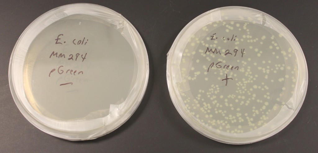
In the last few days I have been practicing transforming bacterial cells with small loops of DNA called plasmids.  The picture above shows two plates of media for growing E. coli bacteria.  (Escherichia coli bacteria are naturally found in our gut but some forms can also be responsible for food poisoning.)  These plates also contain the antibiotic ampicillin in the media.  This strain of E. coli, MM294, is not resistant to ampicillin.  I mixed the bacterial cells with a plasmid containing a gene that provides ampicillin resistance in one tube, and in a control tube I did not add any of the plasmid.  This was done in a calcium chloride solution (CaCl2) cooled on ice that helps the DNA associate closely with the cell membranes.  The vials are then "heat shocked" in 42 C water, which disrupts the cell membranes and helps the plasmid to be taken into the cell.  Then I spread the cells on the plates to grow overnight.  In the left "-" plate without the plasmid added the ampicillin killed the cells.  In the right "+" plate the "amp" resistance gene on the plasmid allowed cells to grow and divide that had taken up the plasmid.  Each spot is the descendants of a single original cell that was transformed (within a spot the cells are essentially genetically identical and are referred to as "clones").  The plasmid also contains a modified green fluorescent protein (GFP) from a bioluminescent jellyfish (Aequora victoria) that causes them to faintly glow green under UV light.  The GFP modification, a fusion of part of another gene, also gives them a light green color in regular light that you can see above.  (pGreen refers to this plasmid.)

The Mitochondrial Genome

Dmel-mtDNA-genome

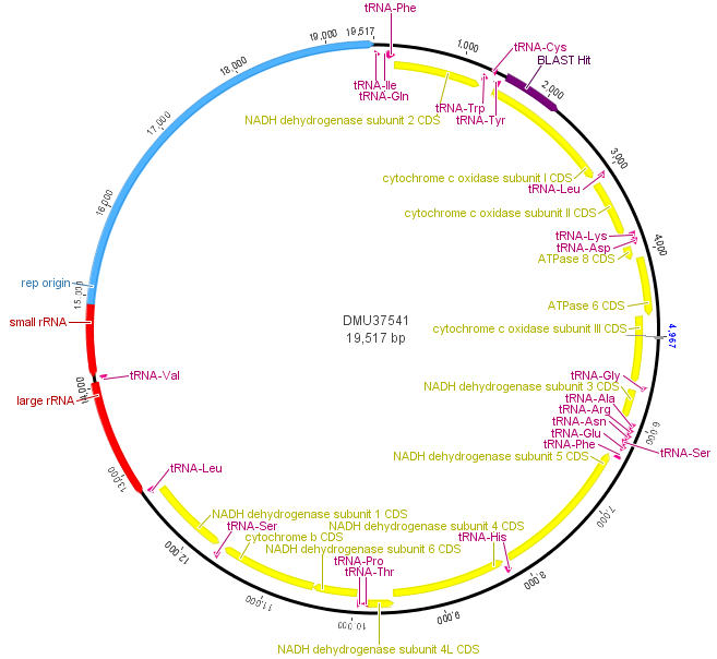
Above is a map of the mitochondrial genome of the fruitfly, Drosophila melanogaster.  One fun thing about the mtDNA genome is that it forms a loop instead of a linear sequence like the rest of our chromosomes (humans have them too).  It is very small compared to the rest of the genome; the D. melanogaster one is under 20,000 bp (basepairs).  In most, but by no means all, animals the mitochondria is inherited from the mother.  Its job in the cell is to produce chemical energy for the cell (in the form of ATP).  In blue, in the image above, there is an origin of replication used to copy and divide the genome into daughter mitochondria.  In yellow are genes that carry out various functions.  In purple and red are RNAs for producing the proteins coded for by the genes.  The section I have been sequencing from various species and talking about in the last couple posts is indicated at 1 o'clock (upper right) in dark purple by "BLAST Hit," which is in cytochrome c oxidase subunit I (COI).

Three insect species COI alignment

We also extracted DNA from some fruit-flies (Drosophila melanogaster) we had in the lab and from some mosquito larvae we found on campus in a stagnant pool.

IMG_0135

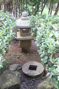
The stone "coin" had a lot of mosquito larvae in the pool of rainwater in its center.

IMG_0141

In the image above you can see larvae floating in rainwater above cigarette butts.

We sequenced COI from these as well.  Based on the sequence the mosquito larvae turned out to be Culex quinquefasciatus (the southern house mosquito which was unintentionally introduced to Hawai'i in the 1800's).

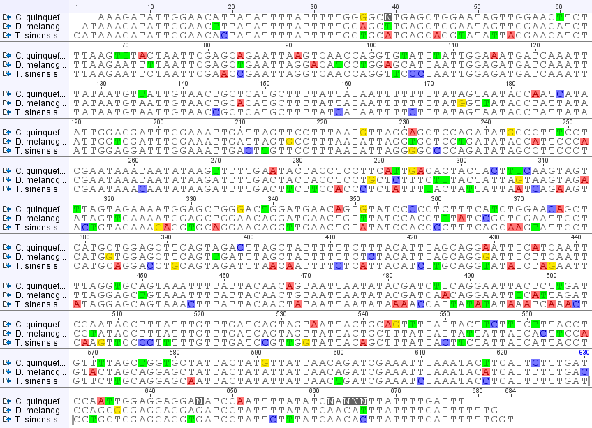
3insect-COI-alignment

In the image above I have made an alignment of the sequences from the three species (including the mantis, Tenodera sinensis, from the last post).  Base-pairs that are different from the other two are highlighted.  Toward the end of the Culex sequence are some N's.  These are just positions where the sequence was difficult to determine and has some uncertainty, not necessarily an actual difference.  In the rest of the sequence there are four patterns: positions in which Culex is different, positions in which Drosophila is different, positions in which Tenodera is different, and positions in which all three are different from each other.  I've put the counts of these together below.

Culex: 52
Drosophila: 38
Tenodera: 82
All three: 8

So, based on these DNA sequences, we can see that Culex mosquitoes and Drosophila fruitflies are more similar to each other than either is to the Tenodera mantis.  This makes sense in terms of insect classification.  Mosquitoes and fruit-flies are both in the order Diptera (flies) and both have two wings (which is what di-ptera means).  Mantises are in the order Mantodea and incidentally, like most winged insects, have four wings.

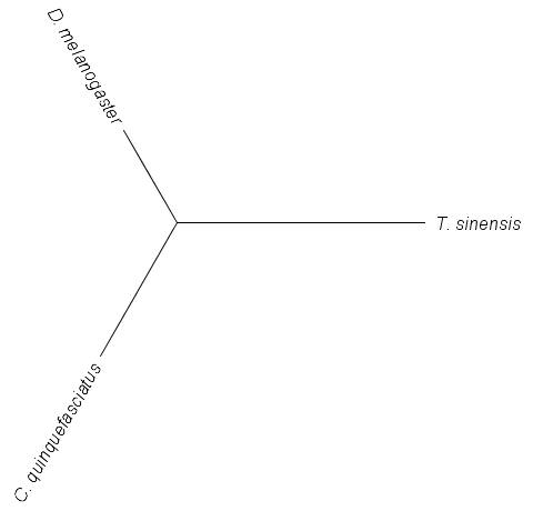
The relative distances of these DNA sequences can be illustrated by the "tree" below.

3insect-COI-tree

(These types of graphs are called trees.)  The branch from the center to the mantis (T. sinensis) is the longest because it has the most differences from the other two.  The branch to C. quinquefasciatus is a bit longer than the one to D. melanogaster because the mosquito has more DNA differences unique to it than the fruitfly.  This is a simple example of how biologists can build trees to illustrate the relationship between organisms.

Mantis DNA sequence

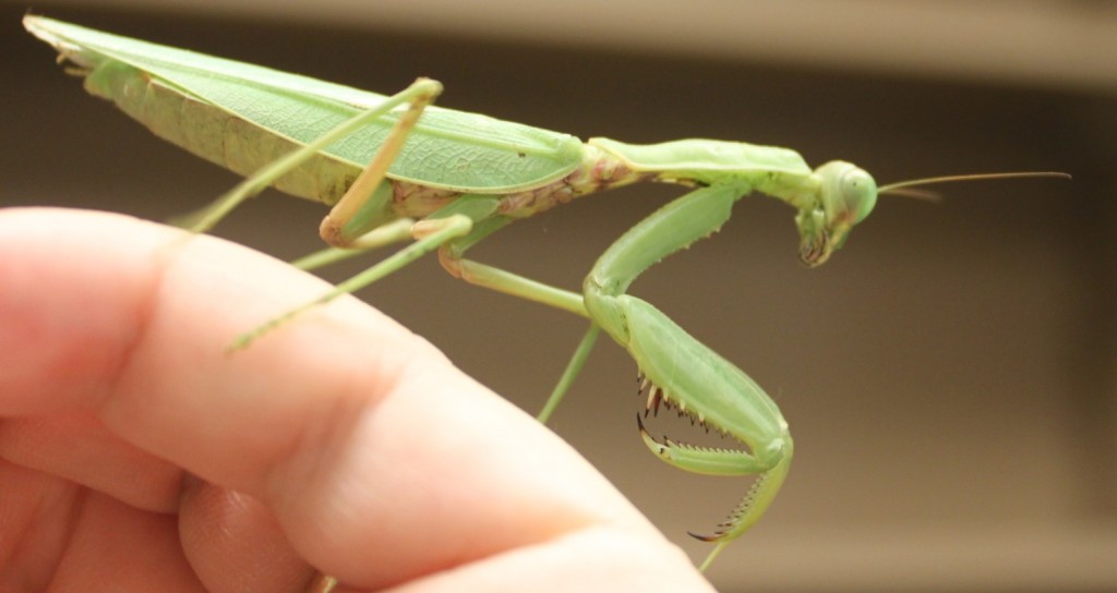
I've been brushing up on DNA extraction, PCR (DNA amplification) and prepping the product for DNA sequencing (Sanger sequencing).  The sequencing is done at a site on campus (link).  We submitted our first DNAs Friday afternoon and got the results back by email Saturday afternoon!  We tested a range of samples with a range of primers to see what worked and what didn't.  (Part of this is getting ready for a genetics class I am teaching in the fall where I want students to sequence DNA from biological samples they collect.)  My daughter found a praying mantis (Tenodera sinensis) in a parking lot so I snipped off a tiny piece of the end of one of its feet for a DNA sample.

D7-mantis-organism

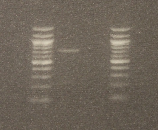
After DNA extraction I used two primers (short nucleotide sequences) to target a section of DNA, 710 base-pairs long (DNA letters), for amplification.  (The primers are "LCO1490" 5'-GGTCAACAAATCATAAAGATATTGG-3' and "HCO2198" 5'-TAAACTTCAGGGTGACCAAAAAATCA-3', Folmer et al. 1994)  The PCR worked!  There was a band on the gel the right size. Below is an image of the DNA.

D7-COI-gel-image

The gel image is read bottom up in columns.  The first and last columns on the right and left with all the bright bands are DNA "ladders."  Those are a collection of different sized DNAs to use as a reference.  The bottom of the gel is positively charged and the top negative when it is running (before taking the image).  This is done by hooking it up to 90 volts for half an hour.  DNA is negatively charged so it runs down the gel.  Smaller segments run faster than large ones so it separates a mixture by size.  The PCR from the mantis sample is in the second row and a blank sample containing no DNA is beside it in the third row (this is a negative control for possible DNA contamination).  By comparing the band from the mantis sample to the ladder we can see that a sequence between 700 to 800 base-pairs was amplified.

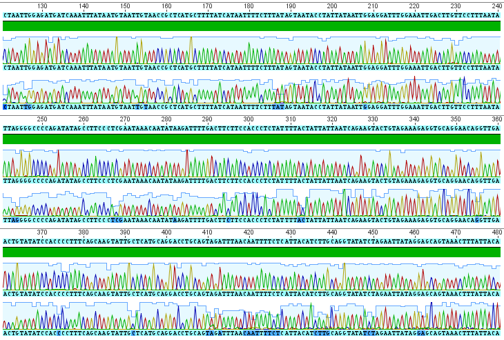
The sequences from this PCR amplification came back very nice with high quality signal.  Here is a screen capture showing part of the "trace" file.

D7-mantis-COI

Each peak corresponds to a signal from a base-pair at that site along the DNA sequence (red=A, blue=C, yellow=G, green=T).  There are two rows at each site because I sequenced both strands.  The region I amplified is a small part of the cells mitochondrial genome, in a gene called COI for short (Cytochrome c Oxidase subunit I).  From the results I get the following, cleaned up, 684 basepair DNA sequence (in fasta format).

>Mantis_COI
CATAAAGATATTGGAACACTATATTTTATTTTTGGTGCATGAGCAGGTATATTAGGAACATCTTTAAG
AATTCTAATTCGAACCGAATTAGGTCAACCAGGTTCCCTAATTGGAGATGATCAAATTTATAATGTAA
TTGTAACCGCTCATGCTTTTATCATAATTTTCTTTATAGTAATACCTATTATAATTGGAGGATTTGGAA
ATTGACTTGTTCCTTTAATATTAGGGGCCCCAGATATAGCCTTCCCTCGAATAAACAATATAAGATTT
TGACTTCTTCCACCCTCTATTTTACTATTATTAATCAGAAGTACTGTAGAAAGAGGTGCAGGAACAG
GTTGAACTGTATATCCACCCCTTTCAGCAAGTATTGCTCATGCAGGACCTGCAGTAGATTTAACAAT
TTTCTCATTACATCTTGCAGGTATATCTAGAATTATAGGAGCAGTAAACTTTATTACAACTATAATTAAT
ATAAAACCATTATATATAAATCAAACTCAAGTTCCCCTTTTTGTTTGATCCGTTGGTATTACAGCTTTA
TTACTTCTATTATCATTACCTGTTCTTGCAGGAGCAATTACTATATTATTAACTGATCGAAATCTAAATA
CCTCATTTTTTGATCCTGCTGGAGGAGGTGATCCTATTCTTTATCAACACTTATTTTGATTTTTTGGT

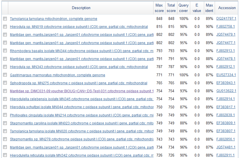
Just to check if this is the right sequence (I might have accidentally switched samples or there is always a possibility of DNA contamination) I searched for similar sequences using BLASTn on GenBank.  Here is a screen shot of the most similar sequences.

mantis-blast-result

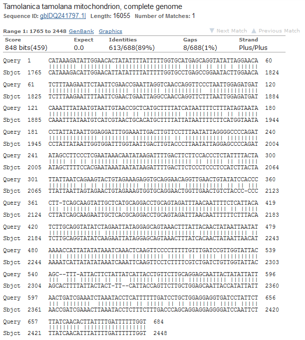
These are Mantis (Mantidae family) species that are returned so this looks correct.  The top match is compared below.

mantis-top-match

Tamolanica tamolana, the shield mantis from New Guinea, is 89% identical.