A followup from the last post. I have used Mathematica to create an animation of the effect of changing genotype fitness values. There is a lot of background information I am skipping over at the moment--I plan to put together a separate page to go through this in more detail. However, for now, In short, if you have two alleles (alleles are types of a gene) in a population, you can have homozygotes (individuals that have two copies of the same allele) or heterozygotes (individuals that have a copy of each type of allele). So two alleles (A and a) result in three genotypes (AA, Aa, and aa). In this example AA and aa are the two homozygotes and Aa is the heterozygote. These genotypes can have different fitnesses which affect how many descendants organisms have in future generations.
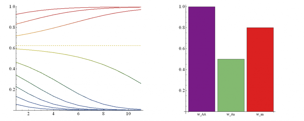
In the illustration above, on the right is a plot of genotype fitnesses. Underdominance is the case where heterozygotes (Aa, green bar) have a lower fitness than either homozygote (AA, purple, aa, red). On the left is a plot of the predicted change in allele frequencies over 10 generations (x-axis) from a range of starting frequencies (y-axis). If the "a" allele starts at a low frequency it declines and is lost in the population. However, if it starts at a high enough frequency it can actually increase to 100% over the next few generations. (The population ends up as all "aa" homozygotes, despite the fact that they have a substatially lower fitness than "AA" homozygotes!) The boundary between these two regions (where the "a" allele increases or decreases) is indicated by the dashed line.
I've made an animation (that runs too fast, but I don't know how to slow down the frame rate yet) that shows the change in trajectories over a range of fitness values. I will put a link to it here
Underdominance Animation (click to see)
and, at least for the time being, it is uploaded to the index page of this site.
This is still not interactive. I am thinking of exploring using the Processing programing language next to see if this might be a way to fully implement this.

