 Jolene Sutton is starting a tenure track position as a new assistant professor in the Biology Department at UH Hilo this fall!
Author Archives: Floyd A. Reed
Harmonics, Convergence, and the Diffusion Approximation
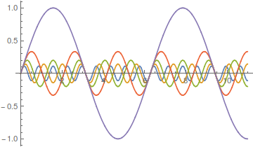
Lot's of different wave forms can be made by adding together harmonic series in certain ways. A simple sine wave can have harmonics that vibrate twice as fast, three times as fast, etc. Here is a plot of the odd numbered harmonics of a sine wave.
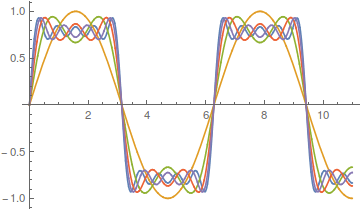
As the wavelength is reduced the amplitude of each wave is also purposely reduced. It turns out that if you add these waves together you start approaching what is called a square wave.
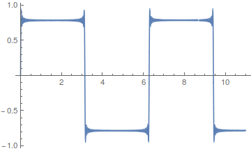
However, the approach can be slow. There is a lot of wiggle in the waveform. Below is a plot with 50 odd numbered harmonics added together;  .
.
Closer, but you can still see the oscillation at the height of each peak.
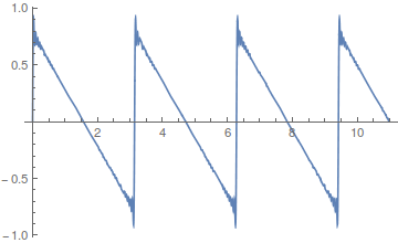
If you add together the even harmonics,  , you get a sawtooth wave.
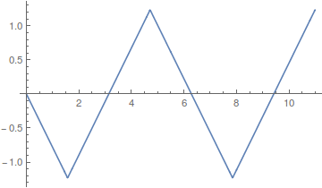
Odd harmonics with a different weighting scheme,  , give triangular waves that converge quite fast.
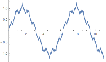
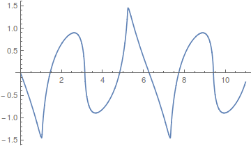
Almost any waveform is possible, 
including this, 
Okay, so where am I going with this; there is a point here that ties back into population genetics. Complex curves can be built up from the sum of a series of simpler curves. However, it is also clear that in some cases the end result can take quite a large sum (the wiggle in the square and sawtooth waves above), in other words the final curve is slow to converge and requires a large number of harmonics.
Kimura's (1955) famous diffusion approximations to model the process of genetic drift in a finite population are built up in a similar fashion. The final curve is a sum of an infinite series of higher order harmonics. The math is messy. It makes use of the hypergeometric function and Gegenbauer polynomials, but the underlying idea is similar to the examples given above.
In the simplest case of the diffusion approximation the series is

In this equation  is the allele frequency,
  is the population size of diploid individuals,
  is the time in generations, which is often combined with
  in a parameter like
  , and
, and  is a hypergeometric function (specifically it is the ordinary Gaussian hypergeometric function
  ; there are many more but this is the most common). In the graph below are the first six odd order curves of the series with
  and
and  .
.
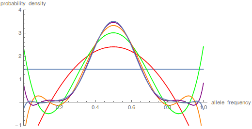
You can see that they tend to build (are positive) near the centre of the x-axis near a frequency of 0.5 and tend to alternative positive and negative near the edges cancelling each other out for a sum near zero.
Plotting these as sums of each new harmonic plus the previous ones gives these curves.
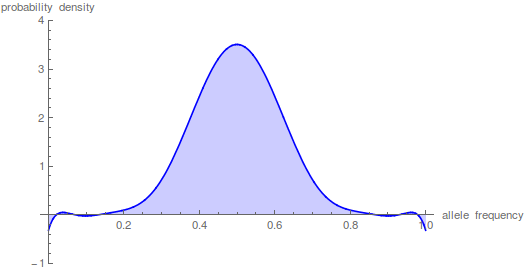
This plot just focuses on the last step, which is the sum up to  in the equation.
This is starting to give us the expected distribution of allele frequencies expected after N/10 generation of genetic drift when starting from a frequency of 1/2; however, the wiggle to positive and negative values near the edges means that it has not yet converged satisfactory.
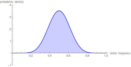
Taking the iterations up to  gives a nice result.
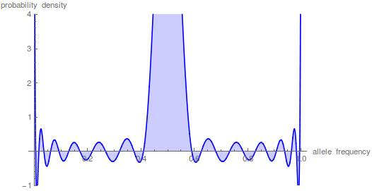
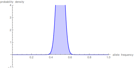
However, what if we want to look at even shorter periods of time. Holding the y-axis scale the same and letting the peak run off the top of the graph look at what happens after just N/100 generations.
The sum has to be taken up to the  to get things to smooth out.
This takes some time on the computer---the hypergeometric function takes a bit of grinding to calculate. Drift over shorter periods of time is precisely some of the situations where we might want to use this type of approach (it addresses standing variation and ignores new mutations that occur over deeper periods of time). This is why I have been exploring a faster alternative with the beta distribution that I wrote about in an earlier post.
By the way, I used mathematica to generate the plots above. Here is the code if you are interested.
t = 10;
n = 1000;
p = 0.5;
m = 100;
(*the frequency distribution (probability) of the polymorphic \
fraction*)
poly =
Plot[Sum[p*(1 - p)*i*(i + 1)*(2*i + 1)*
Hypergeometric2F1[1 - i, i + 2, 2, x]*
Hypergeometric2F1[1 - i, i + 2, 2, p]*E^(-t*i*(i + 1)/(4*n)), {i,
1, m}], {x, 0, 1}, PlotRange -> {-1, 4}, Filling -> Axis,
PlotStyle -> Blue,
AxesLabel -> {"allele frequency", "probability density"}]
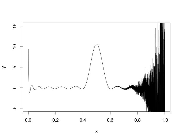
I also tried to plot this in R and got the following.
I'm not sure what is going on but some kind of error seems to be building across the function.
Here is my code
myDiffuse <- function(x,p,t,N,max){
max=25
sum=0
for(i in 1:max){
hypgeosumx=myHypergeoGaussSeries(i,x,max)
hypgeosump=myHypergeoGaussSeries(i,p,max)
sum=sum+p*(1-p)*i*(i+1)*(2*i+1)*hypgeosumx*hypgeosump*exp(-i*(i+1)*t/(4*N))
}
return(sum)
}
myKayAll <- function(i, l){
n=1
for(j in 1:(l-1)){
n=n*(j-i)*(j+1+i)
}
d=factorial(l)*factorial(l-1)
return(n/d)
}
myHypergeoGaussSeries <- function(i, z, m){
h=1
for(j in 2:m){
h=h+myKayAll(i,j)*z^(j-1)
}
return(h)
}
x <- seq(0, 1, len = 10001)
t=10
N=1000
p=0.5
max=5
y<-myDiffuse(x,p,t,N,max)
plot(x,y,type='l',ylim=c(-5, 15))
2015 Tester Symposium
We had a lab presence at this year's annual Tester Symposium. Aki Laruson gave the first presentation of the symposium and unofficially won the award for best dressed showing up in an Icelandic linen suit with suede shoes (and he had aviator glasses to top it off) and gave a very good presentation on his current and planned work in sea urchins. Michael Wallstrom had an awesome poster describing his work with a new invasive algal-associated keratose sponge species. It gained the notice of Dr. Jeremy Jackson (the invited distinguished guest and keynote speaker) who came over to chat with him about it.
Cantor-SageMath-Maxima
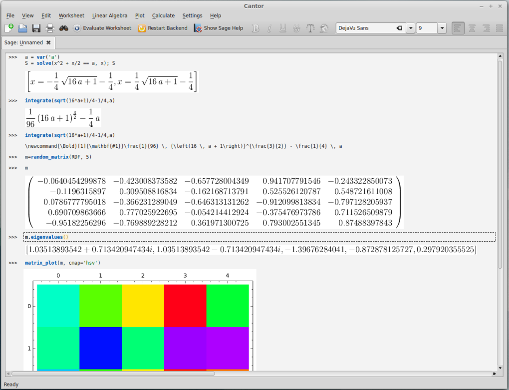
I like a lot of things about Wolfram's Mathematica software; it is an extremely useful tool for symbolic mathematical manipulations and visualization of various functions. However, it is expensive software so recently I have been exploring if there is a free alternative. In doing this I came across Cantor that can run SageMath as a backend, which in turn is built on top of Maxima and other packages.
In the screenshot above I took it for a test drive. In the first lines I set up an equation  and told it to solve for
  . In the next lines it integrated one of the solutions,
 .
.
Right after that I had it display the TeX code for typesetting the equation, which I can reuse to get it displayed below.

Next is a five by five matrix of random numbers, from this the eigenvalues (a summary of how the matrix transformation tends to behave when applied to a system) are calculated and in this example two of them happen to be complex numbers (which indicates that the system has a rotational quality in two of its five dimensions). Last there is a plot to visualize the matrix entries but it is cut off at the bottom of the window in this image.
I am impressed. It is still not capable of all the tools built into mathematica but I am glad I came across this.
Some pictures in review
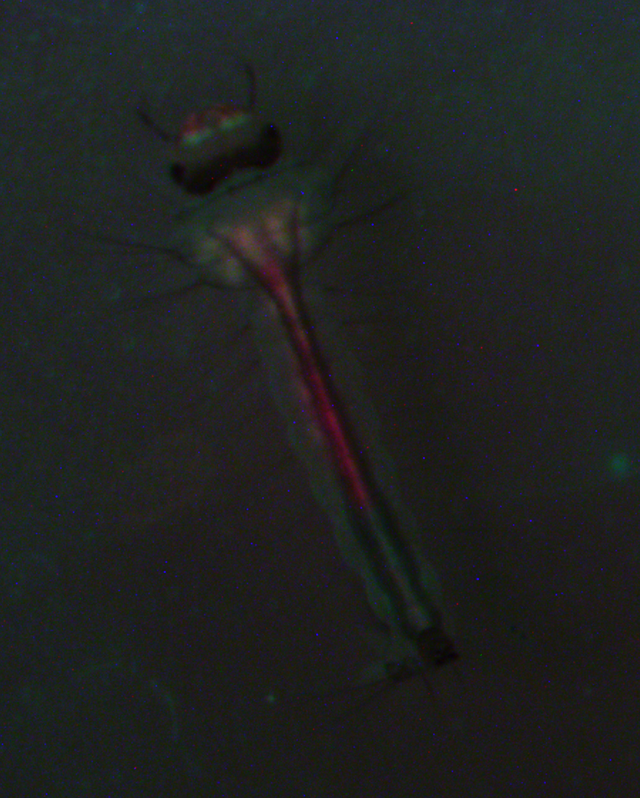
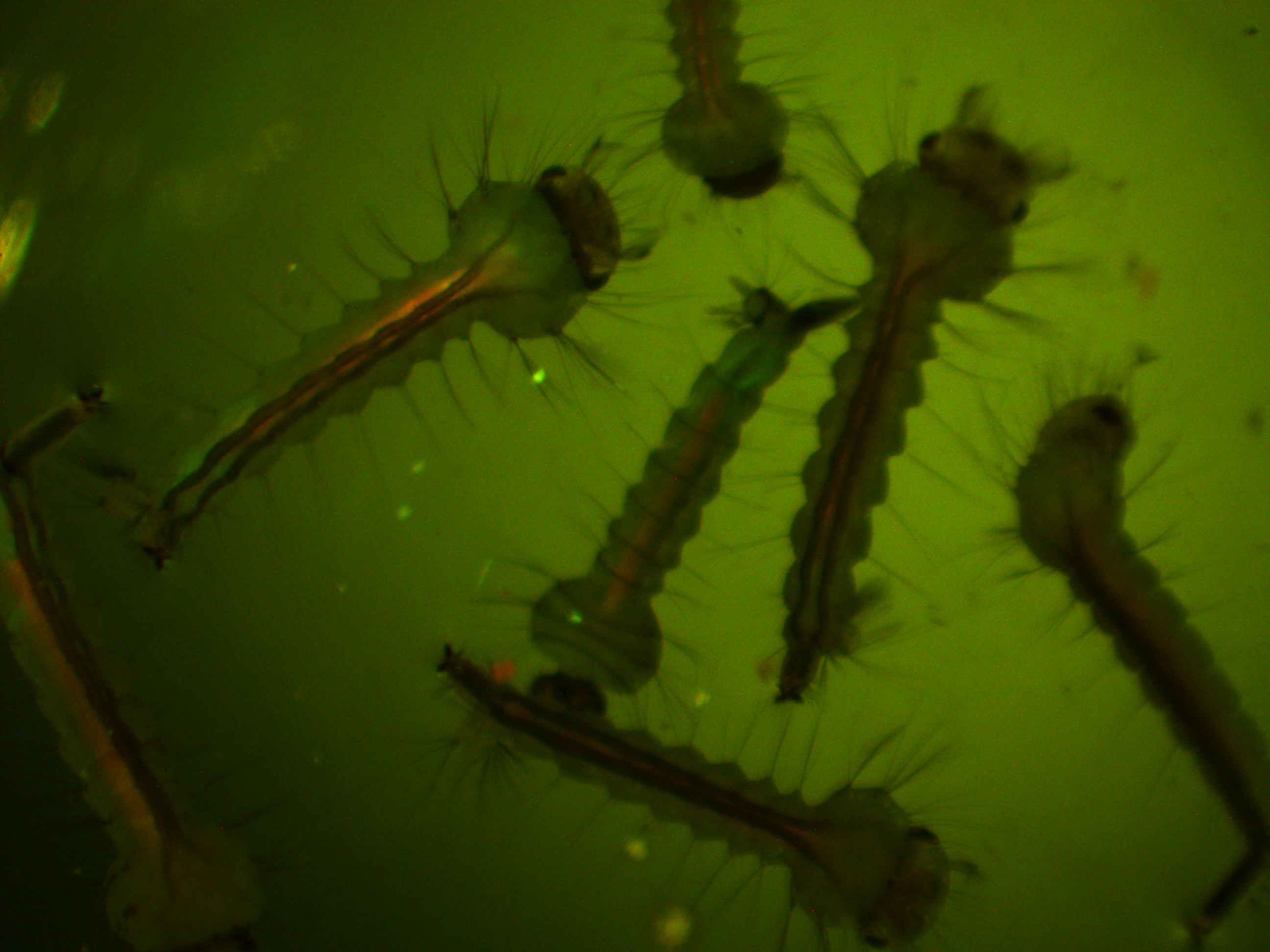
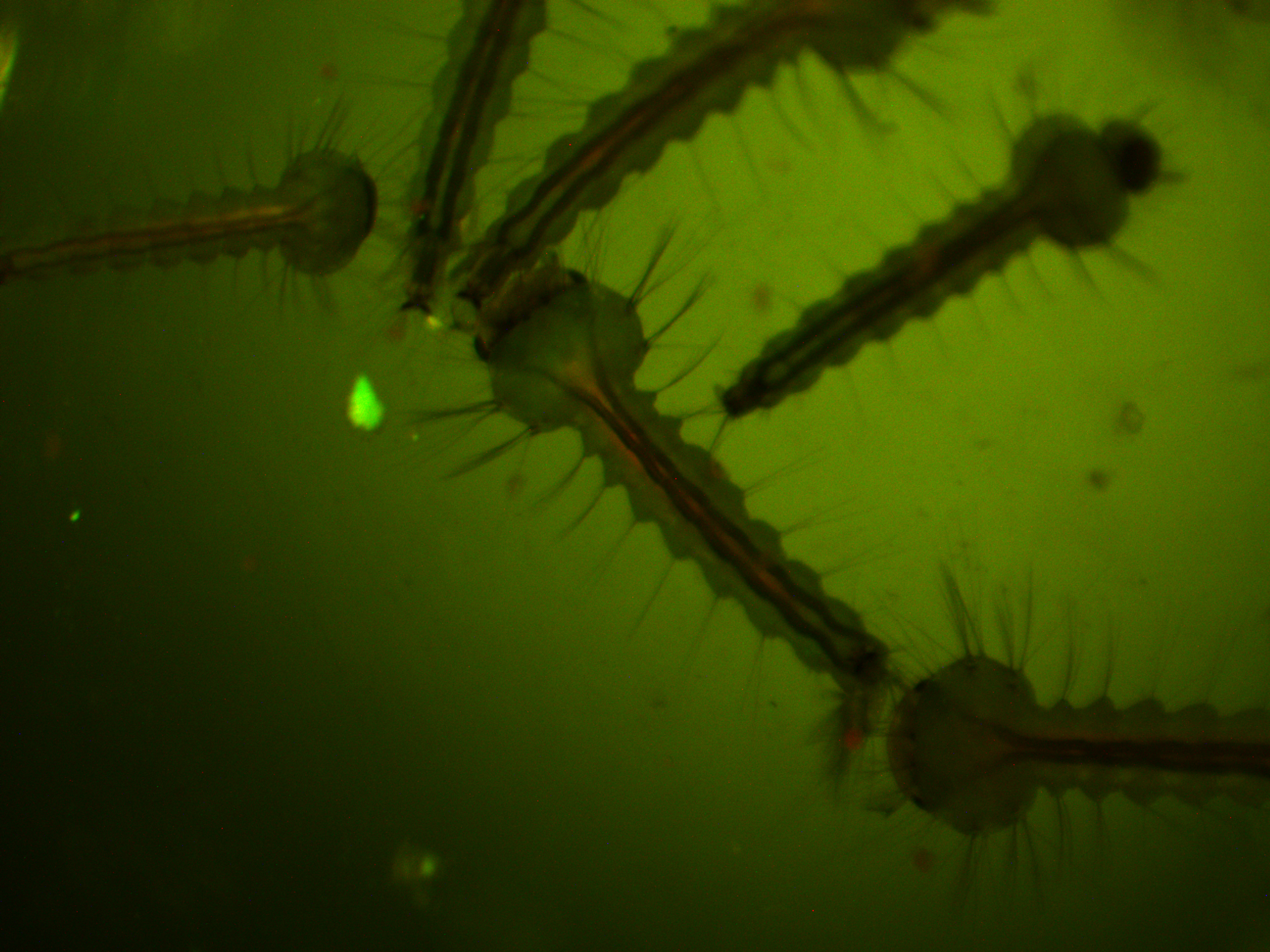
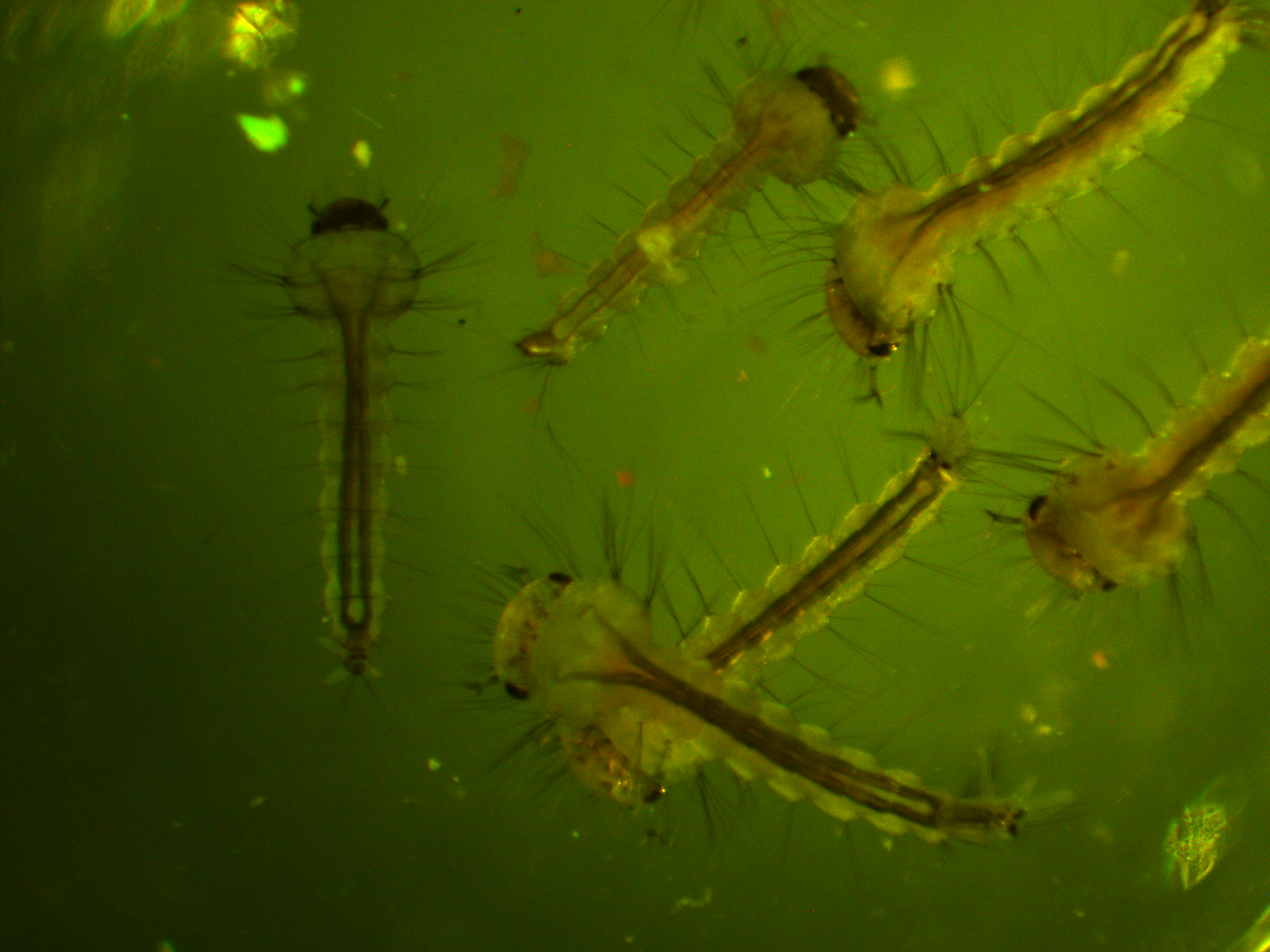
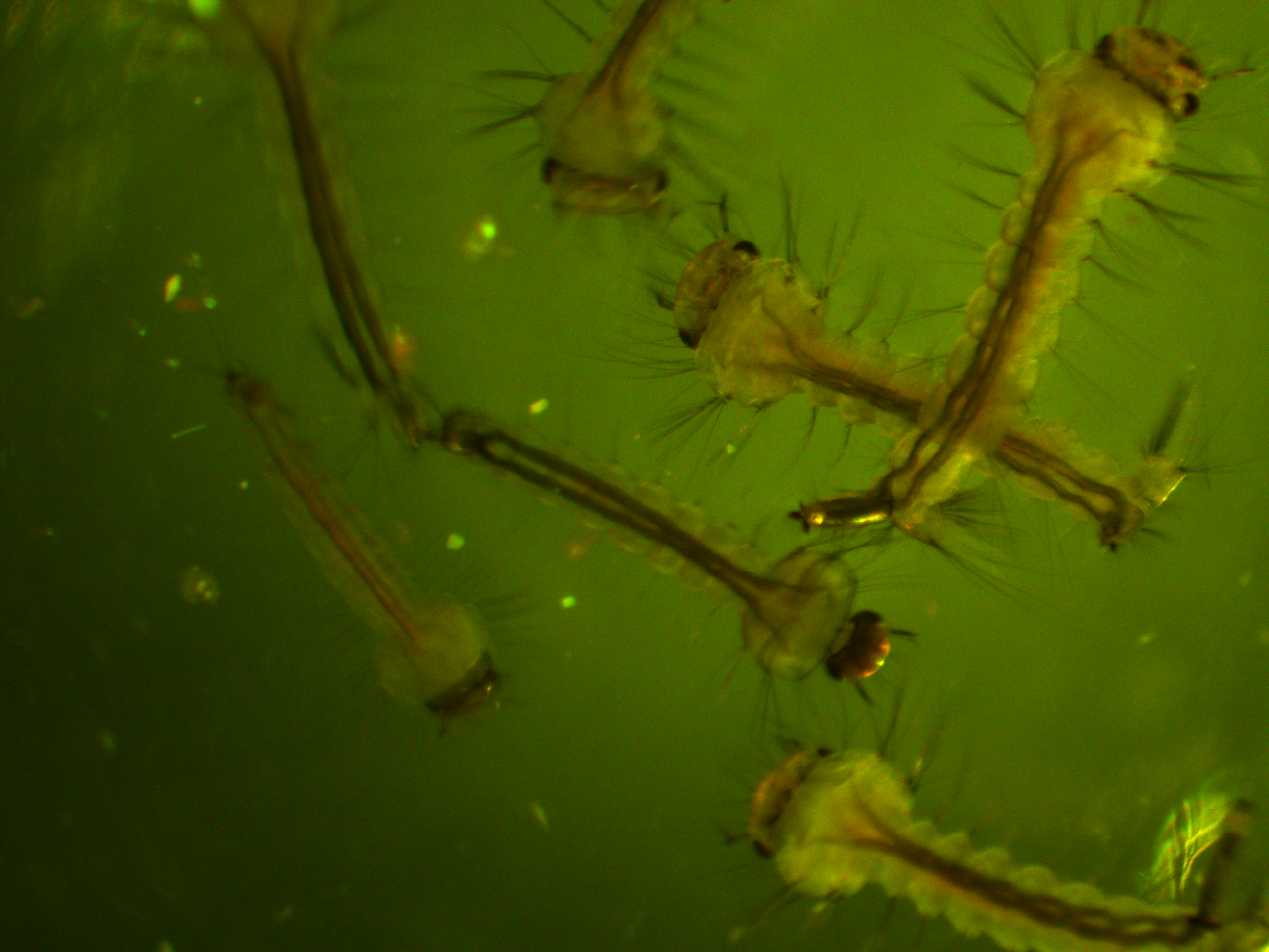
We had a bit of cautioned excitement but it turned out to be a false alarm with our mosquito transformation project (link). To illustrate, the above image is what we expect to see with the mosquito larvae under UV light. It is dark because we need to minimize the regular light to see the fluorescent pattern; plus we are limited to short exposures because the larvae move around. Three is some autofluorescence in the thorax (green) and gut (red) but in general the head is dark. We were injected a 3xP3 plasmid and we expected a green glow in a band in the head if the germline transformation was successful. At the end of January Jolene found a few mosquitoes that looked like this.
The image is really dark because the larvae would not stop moving, so we tried to snap the image as fast as possible. I am avoiding messing with the image too much because I want to present it as close to what we saw as possible. If you look toward the top you can see that there is a green band in the head that was not there before. This is kind of what we were looking for but it was not exactly right. We expected 3xP3 expression to be more associated with the eyes and there is also red expression nearby. Long story short it was not a successful transformation. It appears to have been an artifact of the food and algae of the water they were in and it faded over the next few days. Stay tuned, we are continuing injections and are now using a different set of plasmids...
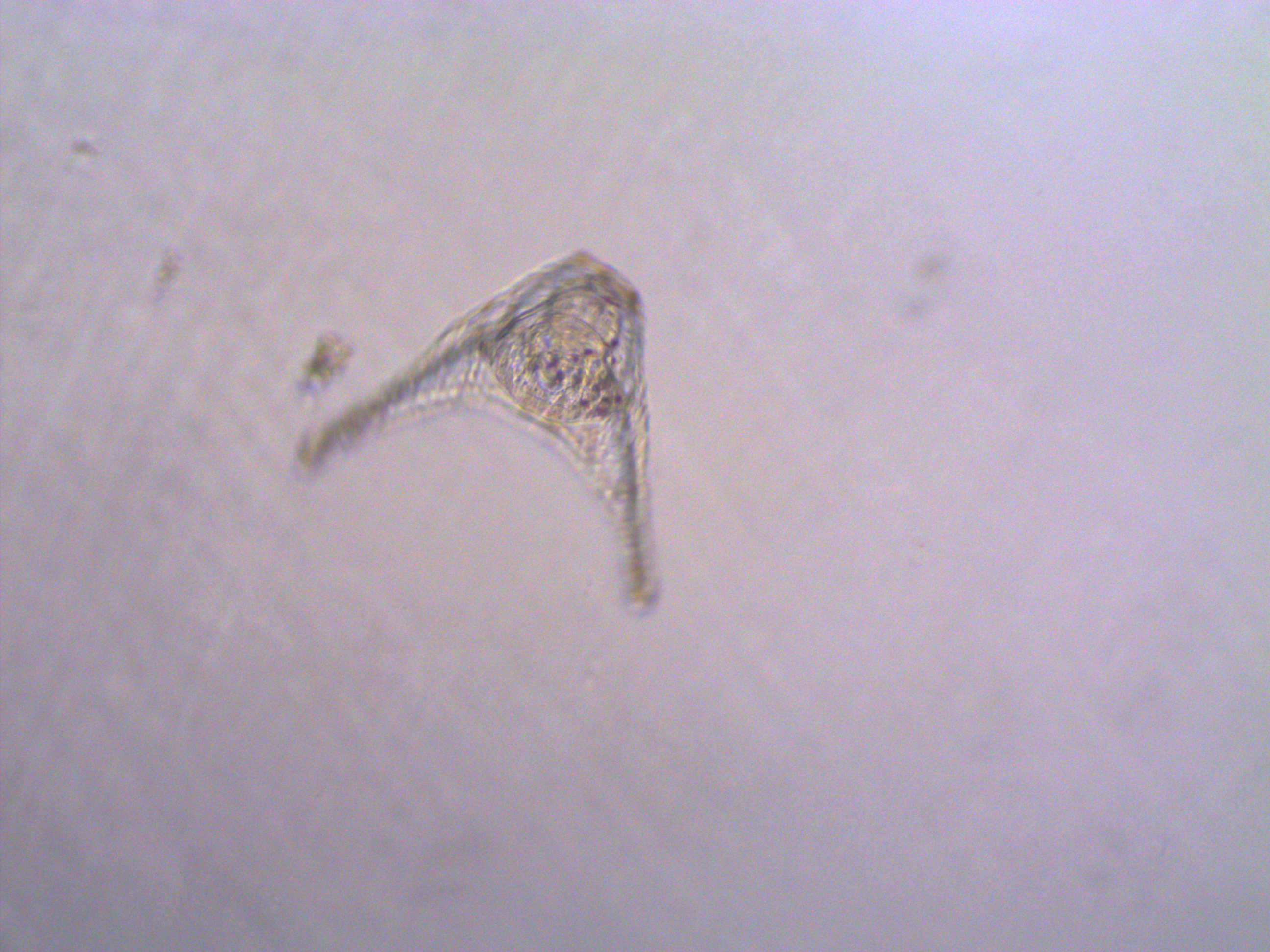
In other news, I showed some images of newly fertilized sea urchin embryos and mentioned ageing them a few days to the pluteus stage (link). We did that but I never showed any pictures. Well here is one, but it is a little fuzzy because the little things zoom around in the sea water scooping up food; this one was rotating so the center is more focused than the exterior.
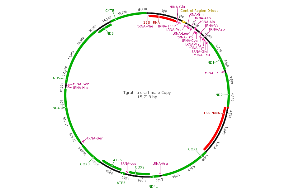
Aki has extracted RNA from them and it is being sequenced by a genomics facility. He currently has over 9 million reads with over 16,000 genes from around the genome identified. I am purposely avoiding posting too much online about his project before he has a chance to analyse and publish the results himself, but here is an image of a tiny part of the genome from his data, less than 16,000 base pairs. This is the newly sequenced, never seen before, circular mitochondrial genome of Tripneustes gratilla, the collector urchin.
If you flatten the DNA out into a linear sequence and map the RNA reads to it you can see the relative expression levels of the different genes (the blue hills above the different features).
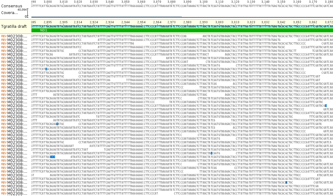
Zooming in you can see the individual sequences that are assembled by aligning overlapping sequences to reconstruct the complete gene sequence. Below is an example from the ND1 gene.
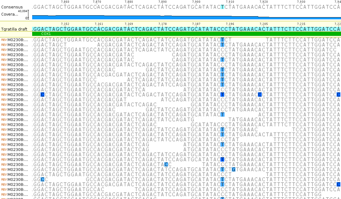
The bases highlighted in blue are disagreements due to occasional sequencing errors. Sometimes these are common however and are due to real genetic variation among the individual sampled. Here is a look at one of these sites, zoomed in even closer, in the COX1 gene.
There is a C/T site that is at approximately 50/50 frequency and these sequence reads are made up of a sample from two different individuals. In other words this position is a real genetic difference among individuals that are out there in the population.
Finally, some time for some Drosophila pictures.
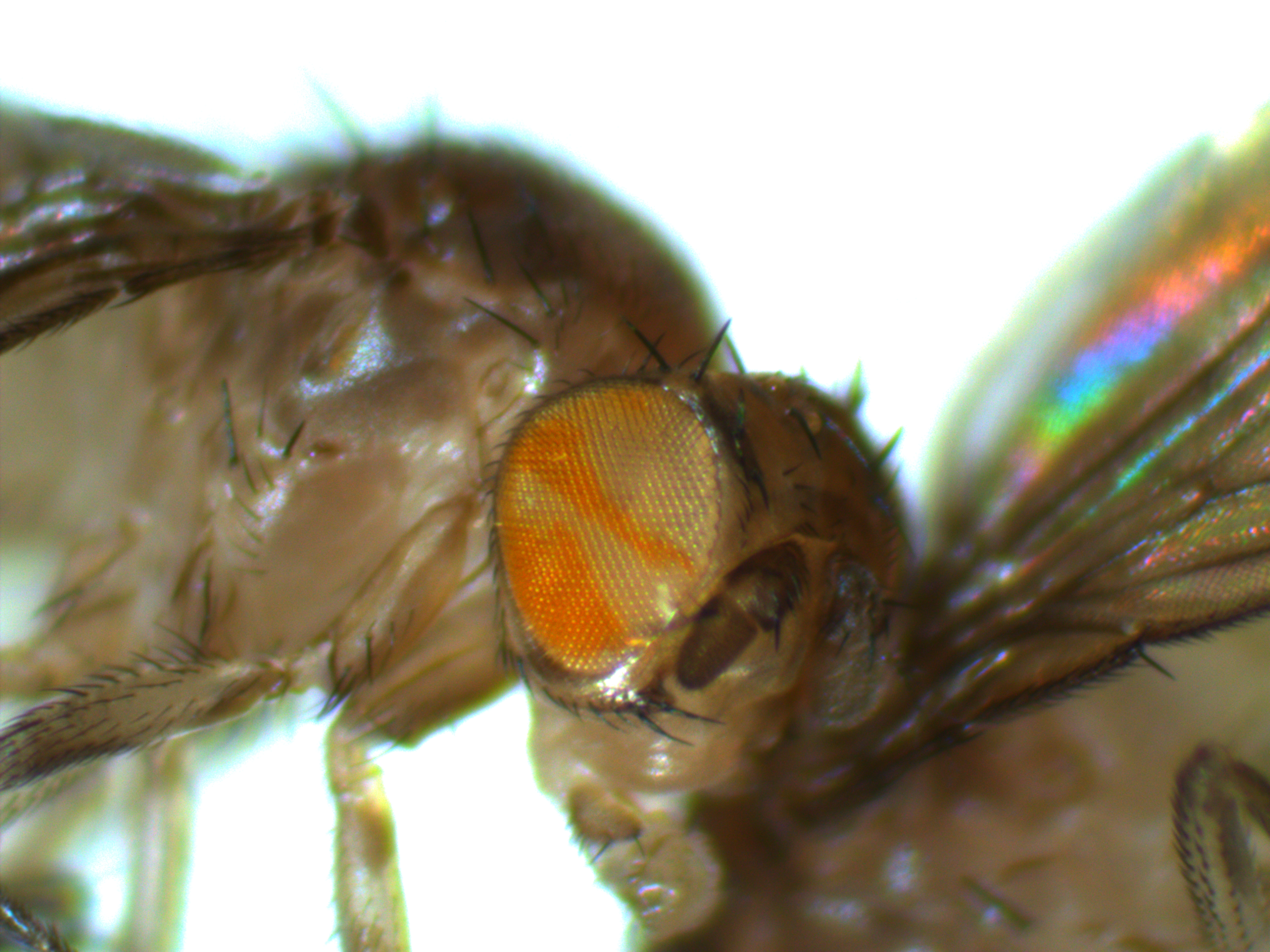
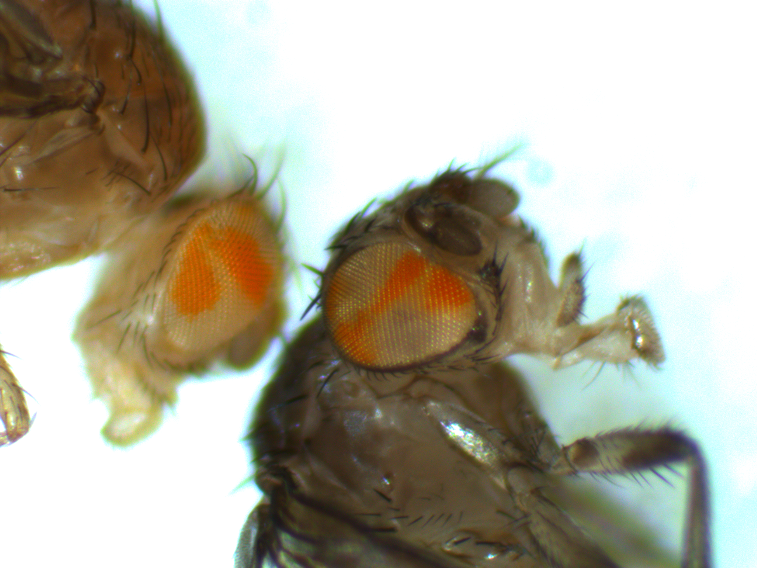
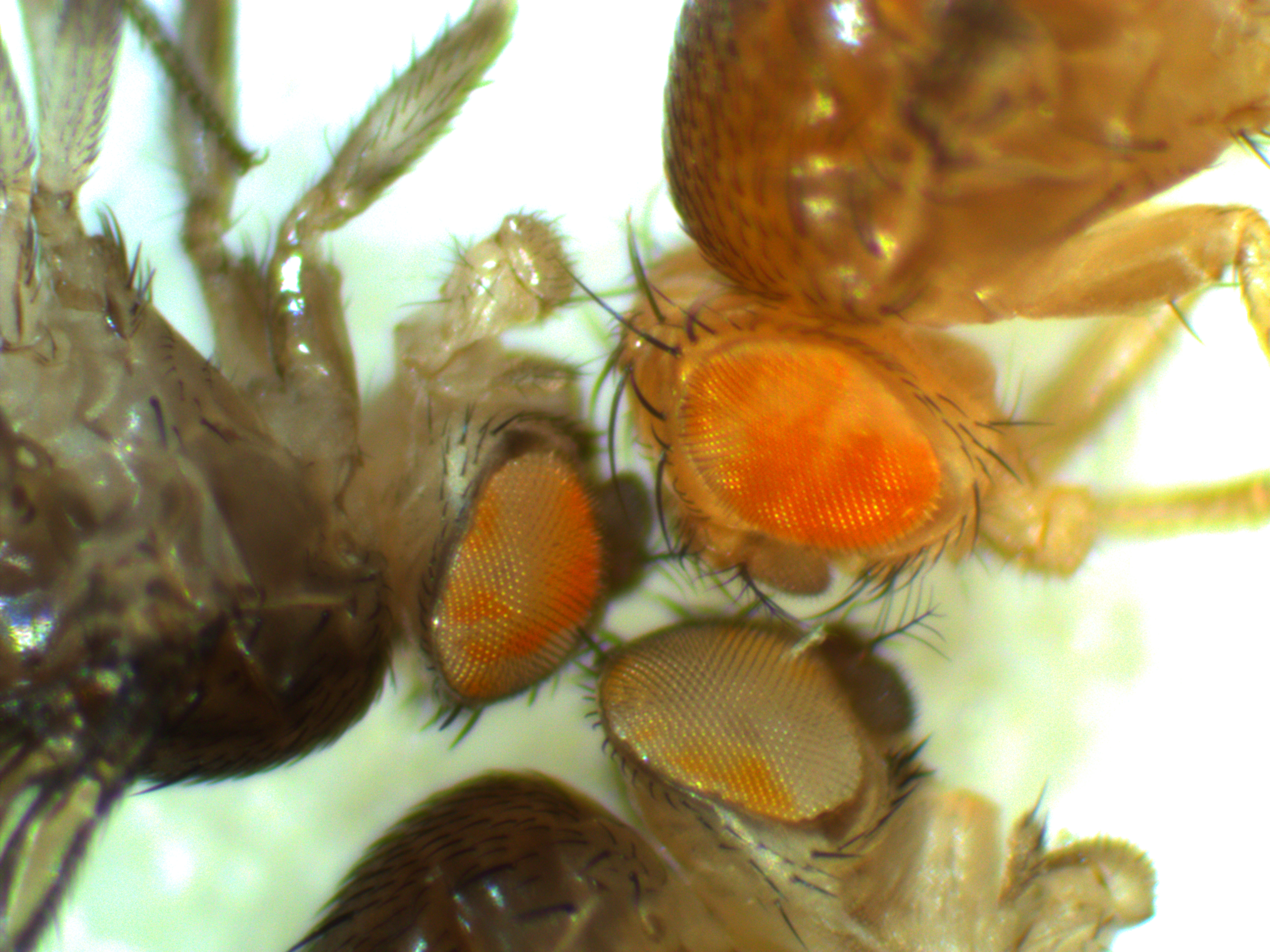
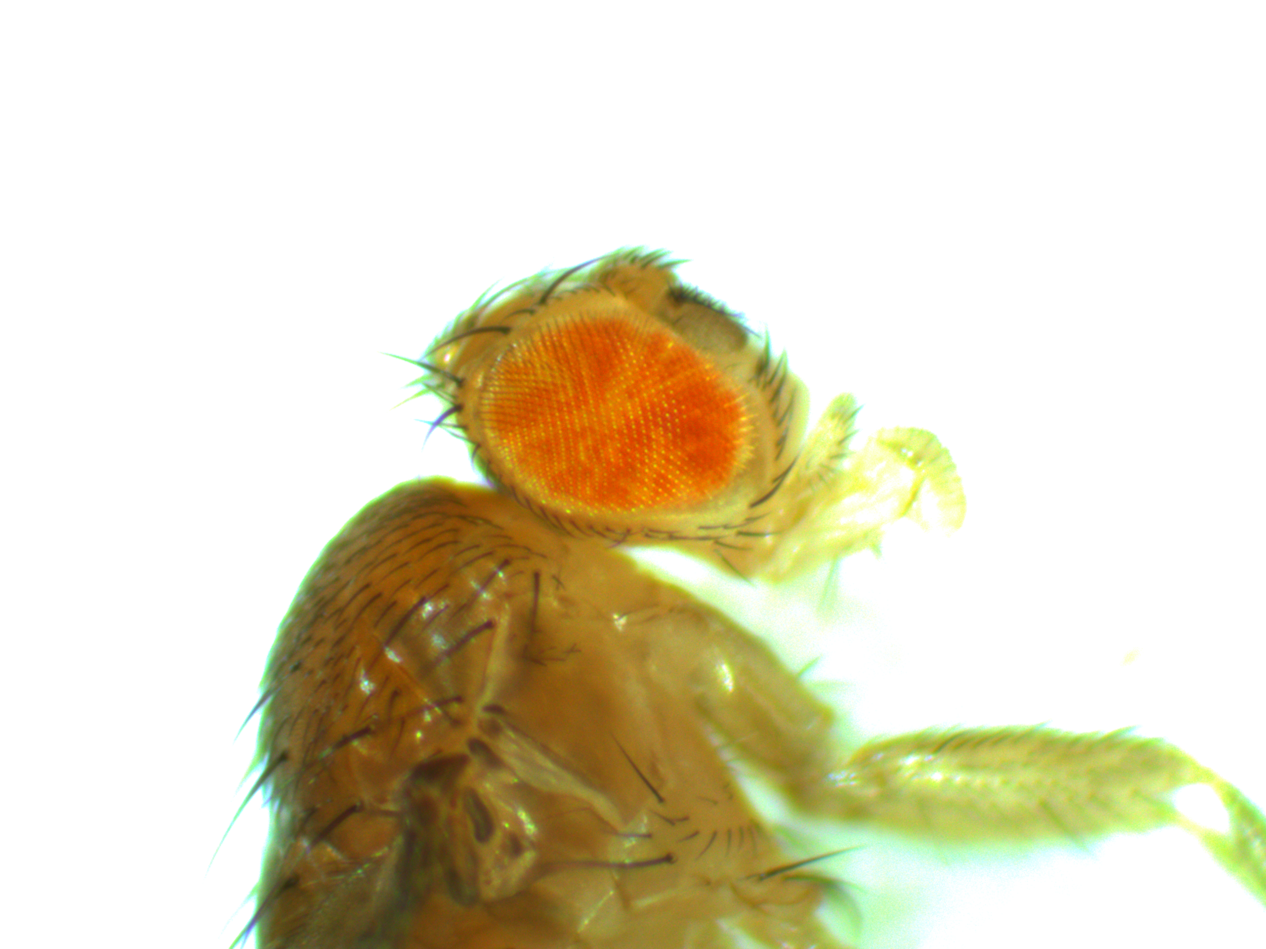
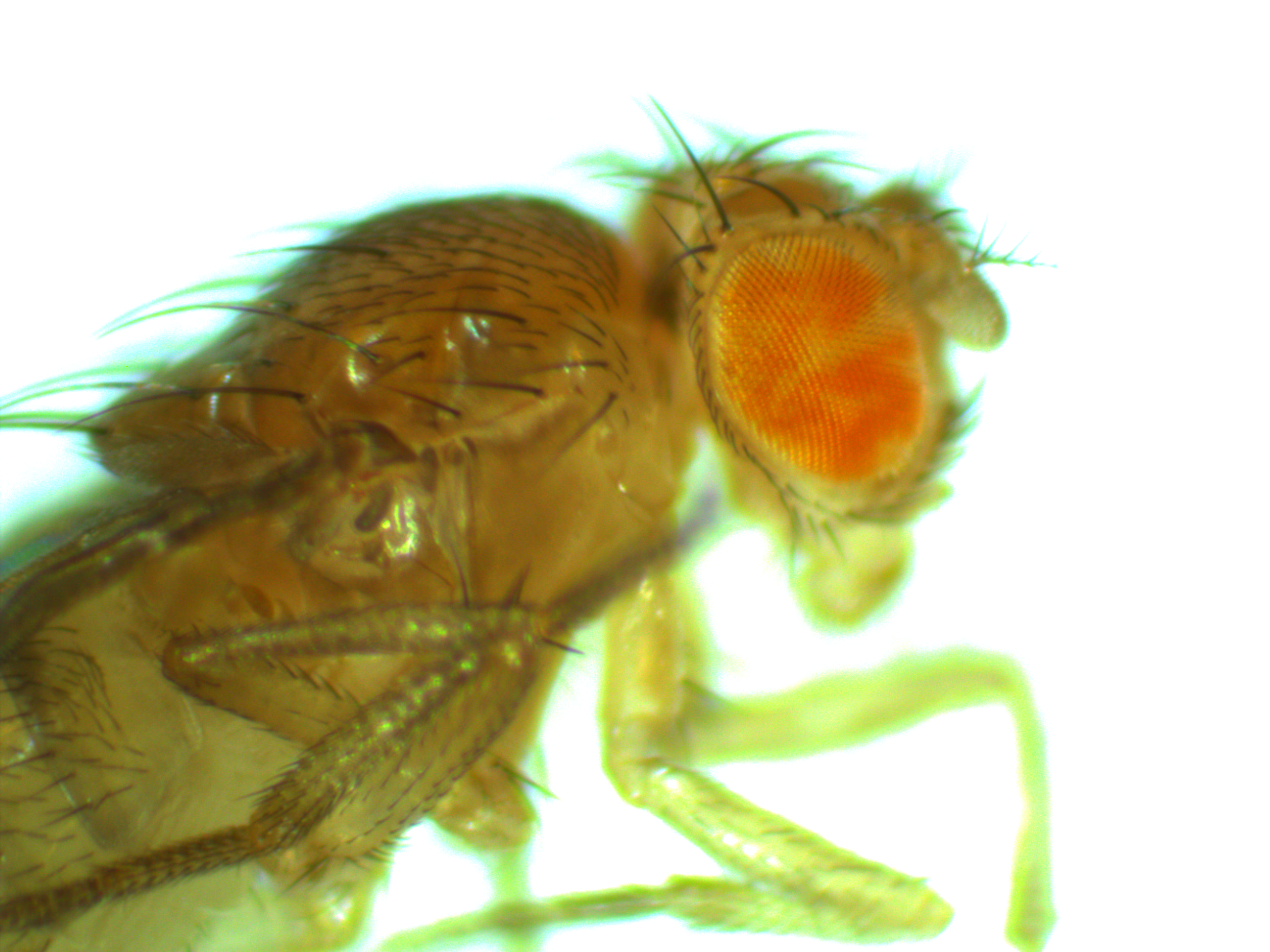
As the FRT/FLP flies emerge from the vial that was heat shocked (link) the mosaic pattern is encompassing larger and larger sectors (for a reminder, the eyes should either be all red or all white because the cells within an organism are (essentially) genetically identical; the cells in these fly's eyes are genetically different from each other). The flies in these pictures were younger at the time of the heat shock (compared to the earlier post) so the cells that had the genetic rearrangement have larger numbers of daughter cells. This gives us some indication of the physical pattern of relatedness of groups of cells on the body and it doesn't always follow what we might expect.
Somatic genetic mosaics
For today I want to show something from a side-project that Aki Laruson is involved in. The aim here is to generate some preliminary data for a later grant application to expand the project in the near future. Here are pictures of two flies we generated that are genetic mosaics. They have groups of cells throughout their bodies that are made up of two different genotypes at a single chromosomal position (usually we think of all cells in our bodies as being genetically identical to each other, although that is overly simplistic for the most part it is true). In most tissues the genetic difference in these flies does not result in a visible genotype but in the eyes we can see the different cells in the flies. There are groups of cells that are either red or white phenotypes depending on their underlying genetic make-up. (Normally a Drosophila fruit fly would either have all red or all white cells in its eyes depending on what alleles it inherited from its parents.)
This was done using genetic sequences from a yeast plasmid (the two micron plasmid or  plasmid) that are inserted into the fly's genome (pioneered by Golic and Lindquist 1989 (PubMed, Google Scholar)). There is an enzyme called flippase (FLP) that recognizes (binds to) and cuts a specific sequence known as the Flippase Recognition Target (FRT), 5'-GAAGTTCCTATTCtctagaaaGtATAGGAACTTC-3'. In yeast the FLP-FRT system causes rearrangements to the plasmids structure that allow it to amplify in numbers in the cell when the cell undergoes DNA replication (e.g., Chan et al. 2013 (PubMed, Google Scholar)).
Here in flies the two FRT sites have been positioned on either side of part of the white gene sequence and FLP is placed under the Drosophila heat shock promoter (Hsp70). We exposed the larvae to 37 C temperatures (by immersing vials containing the larvae in warm water for an hour) to induce the expression of FLP by the flies normal gene activation reaction to heat, which then recombined the two FRT sites together and caused inactivation of the white gene, by deleting part of the gene sequence that was between the FRT sites, resulting in a loss of pigment in the cells of the eyes that are descended from cells in which this deletion happened in the larvae. (By the way, a common misconception is that the white gene encodes an eye pigment gene. It does not, but it is in a pathway that is required for the eventual production of several eye pigments in addition to other important molecules.) There are two broad categories of cells that we are interested in here, somatic and germline cells. Only germline cells produce gametes that result in the next generation so only the DNA from germline cells get passed on to the next generation; however, most of the cells in a multicellular animal's body are somatic cells that contain DNA that does not get passed on to the next generation. Ultimately we want flies that have the DNA rearrangement in all the cells of their body. We can see that the FLP-FRT rearrangement worked in some cells by the mosaic pattern in the eyes but we do not know if this has affected the germline of each individual fly. If it has, then any offspring arising from these affected cells will contain the genetic rearrangement in all of their cells (all of the cells will be descended from the same two starting gametes, genetic mosaics of this type should not be able to be passed on from generation to generation). Now we will breed these mosaic flies together and select for all white eyed flies that contain the deletion in all the cells of their body. Then it's on to the next stage of the experiment.
Nothing in biology makes sense...or does it?
Theodosius Dobzhansky (1900-1975) was a very influential geneticist and one of the architects of the modern synthesis of genetics and evolutionary biology; I heard that he also liked to make French-toast for breakfast. He is in my academic lineage as my Ph.D. advisor's advisor's advisor's advisor---sort of my academic great-great-grandfather.
There is a famous essay he wrote in 1973 that is widely quoted and referenced; "Nothing in Biology Makes Sense Except in the Light of Evolution" (The American Biology Teacher 35:125-129). This is repeated over and over in the literature, grant applications, department and lab websites, and class teaching materials, etc., dare I say it, ad nauseum (e.g., Varki, A. (2006). Nothing in glycobiology makes sense, except in the light of evolution. Cell, 126(5), 841-845; Valas, R. E., Yang, S., & Bourne, P. E. (2009). Nothing about protein structure classification makes sense except in the light of evolution. Current Opinion in Structural Biology, 19(3), 329-334; Seyfried, T. N. (2012). Nothing in cancer biology makes sense except in the light of evolution. Cancer as a Metabolic Disease: On the Origin, Management and Prevention of Cancer, 261-275).
However, there is odd and little known historical detail behind this that Fred Gould (NCSU) pointed out to me in a conversation we had last year. Almost 10 years before, in 1964, Dobzhansky published an address entitled "Biology, Molecular and Organismic" (American Zoologist 4:443-452). If you scan through it there is a familiar line in an unfamiliar context (p. 449) "I venture another, and perhaps equally reckless, generalization---nothing makes sense in biology except in the light of evolution." To put this into perspective, in the article he is arguing against a reductionist hierarchy in science, "the proposition that chemistry and physics are sciences more 'advanced'" and that "the aim of biology is, then, to describe life in terms of first of chemistry, and eventually of physics." Dobzhansky goes on to argue that biology should proceed on two fronts, one a mechanistic reductionism and another that studies higher order emergent properties of the evolutionary process. "Both the mechanistic and evolutionary explanations are pertinent to, and are made use of, in molecular as well as in organismic biology. These explanations are not alternative or competing; they are complementary, without, however, being either deducible from or reducible to each other. ... To treat molecular biology instead as a bludgeon with which to destroy, or to reduce to insignificance, the organismic biology is to basically misunderstand the nature of life."
So, Dobzhansky first made the statement "nothing makes sense in biology except in the light of evolution" as an example of an argumentum ad absurdum, a ridiculous extreme that was not true. Rather, he seemed to intend that not everything in biology makes sense when only considering evolution or molecular biology independently; they must be both considered together for a more realistic understanding of biology. Evolution does not do a good job of explaining hydrogen bonding between two DNA strands, chemistry does; yet, this understanding is needed to work with DNA in the lab and better understand how genetic inheritance works, which is squarely biological. Conversely, neither chemistry nor physics can even begin to explain why we have nonfunctional remnants of a gene (GULO, a.k.a, GLO and GULOP in humans) involved in vitamin C synthesis on our eighth chromosome (e.g., Drouin, G., Godin, J. R., & Pagé, B. (2011). The genetics of vitamin C loss in vertebrates. Current Genomics, 12(5), 371; Helliwell, K. E., Wheeler, G. L., & Smith, A. G. (2013). Widespread decay of vitamin-related pathways: coincidence or consequence? Trends in Genetics, 29(8), 469-478). Chemistry and physics tells us it is there, but how did it get there? Neither one nor the other views are complete. Biological evolution proceeds with what it has to work with, including the opportunities and constraints provided and imposed by chemistry and physics as well as other aspects of biology itself (such as existing gene interactions, behavior, and anatomical patterns---famous examples being the panda's "thumb," and the giraffe's recurrent laryngeal nerve).
In this light it is odd that Dobzhansky then used the statement as the title of his 1973 essay, without the balanced arguments made earlier. The line then became famous and his earlier address faded into obscurity. I guess it goes to show that to be successful it often pays to make an extreme and simple statement rather than a more accurate and complete statement. "Nothing succeeds like success" (Dobzhansky 1964).
Genetic drift with a beta approximation
There are several ways to model or simulate genetic drift (random changes in allele frequencies) in a population over time. Some of the simplest and most direct are 1) binomial sampling and 2) forward simulations, where every allele copy is kept track of in every generation. However, these more complete approaches can be very slow (computationally intensive) with large populations over many generations. Another approach is a 3) diffusion approximation that generates a probability distribution of allele frequencies at a given time point. Yet another widely used approach is the 4) coalescent. Coalescent simulations are very efficient because they only track the ancestral lineages of a sample of allele from the population (most allele transmission events can be ignored because they do not contribute to the last generation).
I have worked with all of these approaches in one form or another and they all have pluses and minuses that depend on the question being asked. The diffusion approximation has generated many insights into population genetics; however, in generating outcomes (say for simulation) it can be inefficient. The probability distribution is generated by a sum of a series of Gegenbauer polynomials, and these are slow to converge. I was thinking about this recently and wondered if the diffusion approximation could itself be approximated by a beta distribution. This might be more computationally efficient.
Beta distributions have two parameters,  and
and  . The mean (expectation) of a beta distribution is
  . In genetic drift, if we imagine a large number of populations drifting away from the same starting allele frequency, the average allele frequency across all of these populations is not expected to change. Genetic drift does not push allele frequency change in a direction. Alleles are just as likely to increase or decrease in frequency. So, if we have
  as the initial allele frequency then we expect
  and that this remains constant over time. Incidentally, you might also see that
  because these are both fractions out of the total.
On the other hand, the variance in allele frequencies between replicate populations is expected to increase over time as the populations diverge due to genetic drift. The variance of a beta distribution is  . Right away we can rewrite this as


Under the diffusion approximation the variance in allele frequencies after  generations in a population of size
  diploid individuals is

We want to match the variance of a beta distribution to the variance of the diffusion approximation so we can generate beta distributions in terms of the spread of allele frequencies after  generations have passed.

We can cancel out  to get

Then rearrange

Realizing again that  and
and  are fractions out of a total we can define them as


And now we have a beta distribution that is defined in population genetic terms as an approximation to a diffusion approximation. As a side note, sometimes very "bad" distributions can be used as approximations in population genetics and be surprisingly reasonable. For example, Kimura used a uniform distribution to model binomial changes in allele frequencies between populations and it works well. Sometimes a process can be relatively insensitive to underlying distributions. In another example, Crow worked on a problem of truncating selection and the shape of the area (of the state space) exposed to selection had little effect. (I'll add in some references here later.)
Does this beta approximation work?
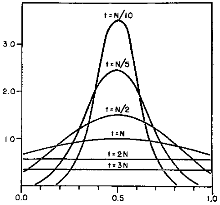
Here is a classical result plotted by Kimura (1955, PNAS 41, 144). It shows the distribution of allele frequencies at a range of  generations after starting from
  .
.
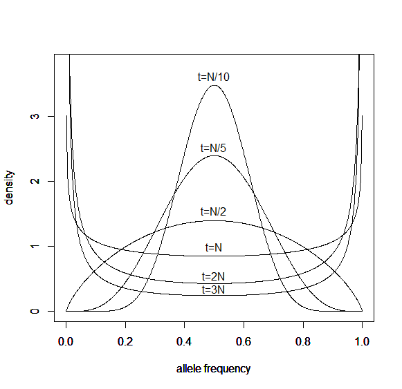
And here is the corresponding beta approximation.
Right away you can see that is is a very good match, especially for short times and intermediate allele frequencies. The big difference is at the edges. The diffusion approximation allows for complete loss or fixation of an allele in a finite population. The beta approximation does not. An allele frequency can get arbitrarily close to zero or one but variation is never completely lost. This is why the distribution "stacks up" near the edges.
By the way, I am still working on learning R and used an R script to generate these plots. Here is the code if you are interested.
driftcoefficient<-function(tau){
  z<-1/(1-exp(-tau/2))-1
  return(z)
}

p<-1/2 # allele frequency
h<-3.8 # upper plot limit

x <- seq(0, 1, length = 1001)

tau<-0.1 # t/N generations
y<-dbeta(x, p*driftcoefficient(tau), (1-p)*driftcoefficient(tau))
plot(x,y,type='l', ylim=c(0,h),xlab='allele frequency',ylab='density')
text(0.5,3.62,'t=N/10')
par(new=TRUE)
tau<-0.2 # t/N generations
y<-dbeta(x, p*driftcoefficient(tau), (1-p)*driftcoefficient(tau))
plot(x,y,type='l', ylim=c(0,h),xlab='allele frequency',ylab='density')
text(0.5,2.53,'t=N/5')
par(new=TRUE)
tau<-0.5 # t/N generations
y<-dbeta(x, p*driftcoefficient(tau), (1-p)*driftcoefficient(tau))
plot(x,y,type='l', ylim=c(0,h),xlab='allele frequency',ylab='density')
text(0.5,1.55,'t=N/2')
par(new=TRUE)
tau<-1 # t/N generations
y<-dbeta(x, p*driftcoefficient(tau), (1-p)*driftcoefficient(tau))
plot(x,y,type='l', ylim=c(0,h),xlab='allele frequency',ylab='density')
text(0.5,1,'t=N')
par(new=TRUE)
tau<-2 # t/N generations
y<-dbeta(x, p*driftcoefficient(tau), (1-p)*driftcoefficient(tau))
plot(x,y,type='l', ylim=c(0,h),xlab='allele frequency',ylab='density')
text(0.5,0.55,'t=2N')
par(new=TRUE)
tau<-3 # t/N generations
y<-dbeta(x, p*driftcoefficient(tau), (1-p)*driftcoefficient(tau))
plot(x,y,type='l', ylim=c(0,h),xlab='allele frequency',ylab='density')
text(0.5,0.35,'t=3N')
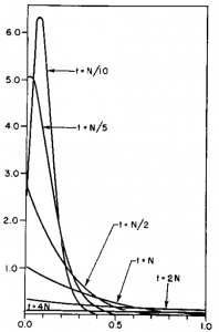
Here is another example starting from an initial allele frequency of  .
.
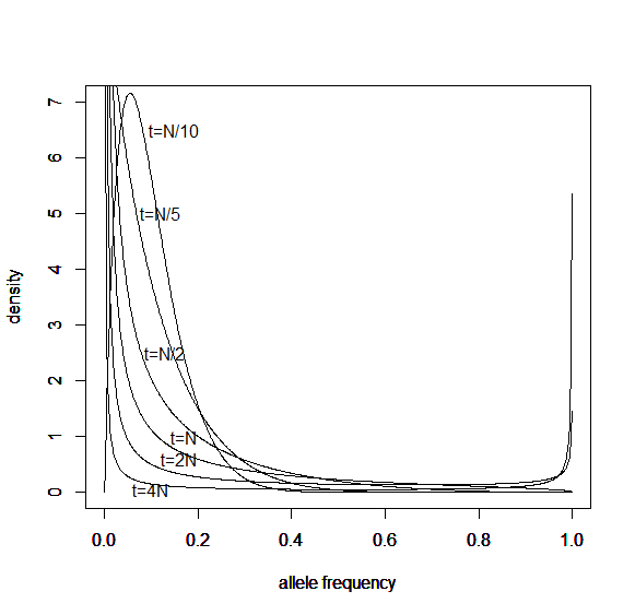
And the beta approximation.
Again, you can see that it does well in the intermediate frequencies and diverges near the boundaries of the distribution.
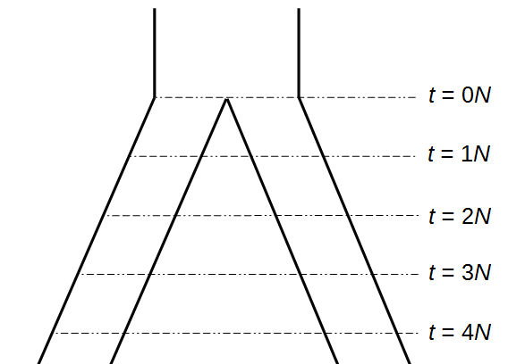
Okay, lets use this beta approximation to play with a model of two populations splitting and evolving over time. Time is measured in terms of  generations after the splitting event.
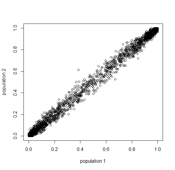
Here is an example of what we might expect to see over time. The plot below is just  generations after the splitting event. (In human terms we have an effective population size of 10,000 and a generation time of 30 years, so this is about 3,000 years.)
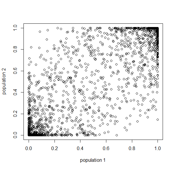
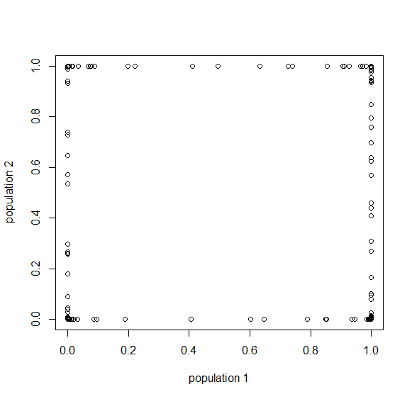
This is from 10,000 randomly generated SNPs (assuming beta-distributed standing variation in the original population). Most SNPs are near a frequency of zero or one, which is what is typically seen in natural populations. However, some are at intermediate frequencies. The SNPs are highly correlated in frequency between the two populations but have begun to diverge.
Here is a plot at  generations (30,000 years on a human timescale).
Then  generations.
Then  generations.
And  generations after the division.
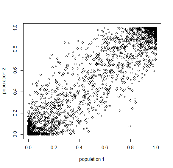
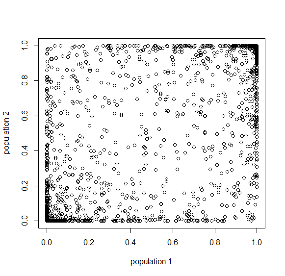
A common theme in population genetics is that after  generations of genetic drift the initial starting point is essentially lost and an allele that is variable (not fixed or lost) can be at essentially any frequency (a uniform distribution). You can see this in the distribution plots earlier in this post and can get a feeling for this in the interior of the plot above.
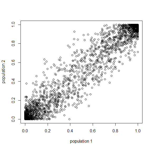
Below is the plot at  generations (600,000 years in human time). Many of the alleles have reached fixation or loss in at least one of the populations. We are also starting to see alleles that are reciprocally fixed and lost between the two populations (in the upper left and lower right corners).
Okay, logically following this we get  generations.
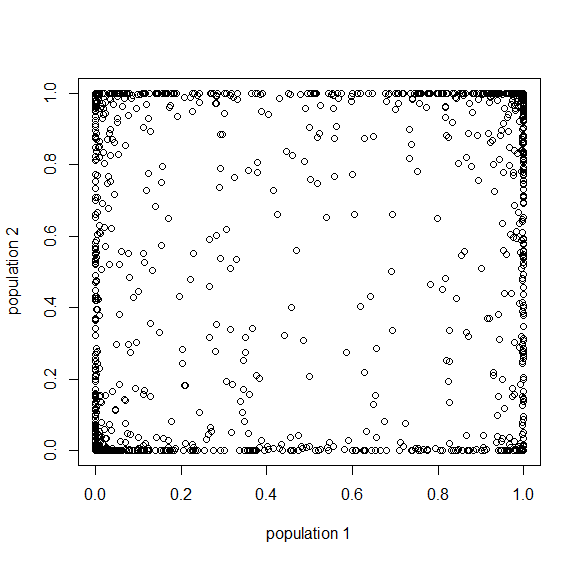
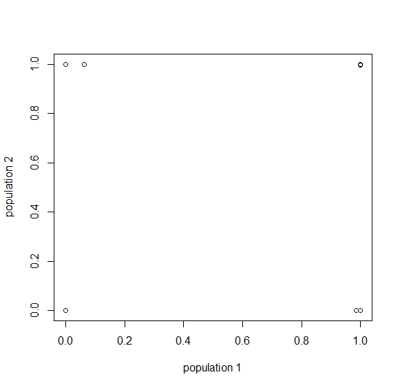
Then  , where no allele is polymorphic in both populations simultaneously.
Then  , where the starting polymorphism is almost completely lost.
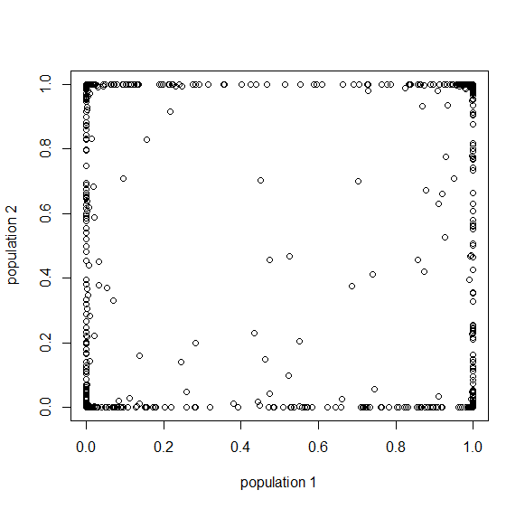
And finally  generations results in complete fixation or loss for all 10,000 simulated SNPs.
However, this simulation ignores new mutations that occur over time (which in general will be unique to a population) and gene flow by migration between populations (which will dramatically slow down the divergence between the populations even with small numbers of migrants each generation). All of these can be added in to elaborate the model. However, I am pleased that this beta approximation tends to fit general population genetic expectations well. The problem is with alleles that have almost lost all polymorphism (near the edges of the distribution); however, there is a strong ascertainment bias in population genetic datasets. For various reasons, we tend to ignore alleles with little variation in favor of alleles that are highly variable across populations, and this is precisely where the beta approximation tends to behave well. Furthermore, in populations that are connected by gene flow, if an allele is polymorphic in one population it is never really lost (over the long term) in another population. So perhaps the beta approximation could work well in more realistic scenarios.
Here is the code for the SNP plots in the second half of this post.
driftcoefficient<-function(tau){
  z<-1/(1-exp(-tau/2))-1
  return(z)
}

tau1<-0.01 # t/N generations
tau2<-0.01
snps=10000
thetau=0.05
thetav=0.05
initial<-rbeta(snps, thetau, thetav)
y<-rbeta(snps, initial*driftcoefficient(tau1), (1-initial)*driftcoefficient(tau1))
z<-rbeta(snps, initial*driftcoefficient(tau2), (1-initial)*driftcoefficient(tau2))
plot(y,z,xlab='population 1',ylab='population 2')
Sea urchin eggs and early divisions
Aki's project has brought some fun elements to the lab that I have not been directly involved in before. He is sequencing RNA from across the genome from various male and female urchin tissues and needed some larvae to get RNA early in development before the urchins have settled out to the sea floor and are dispersed in the plankton.
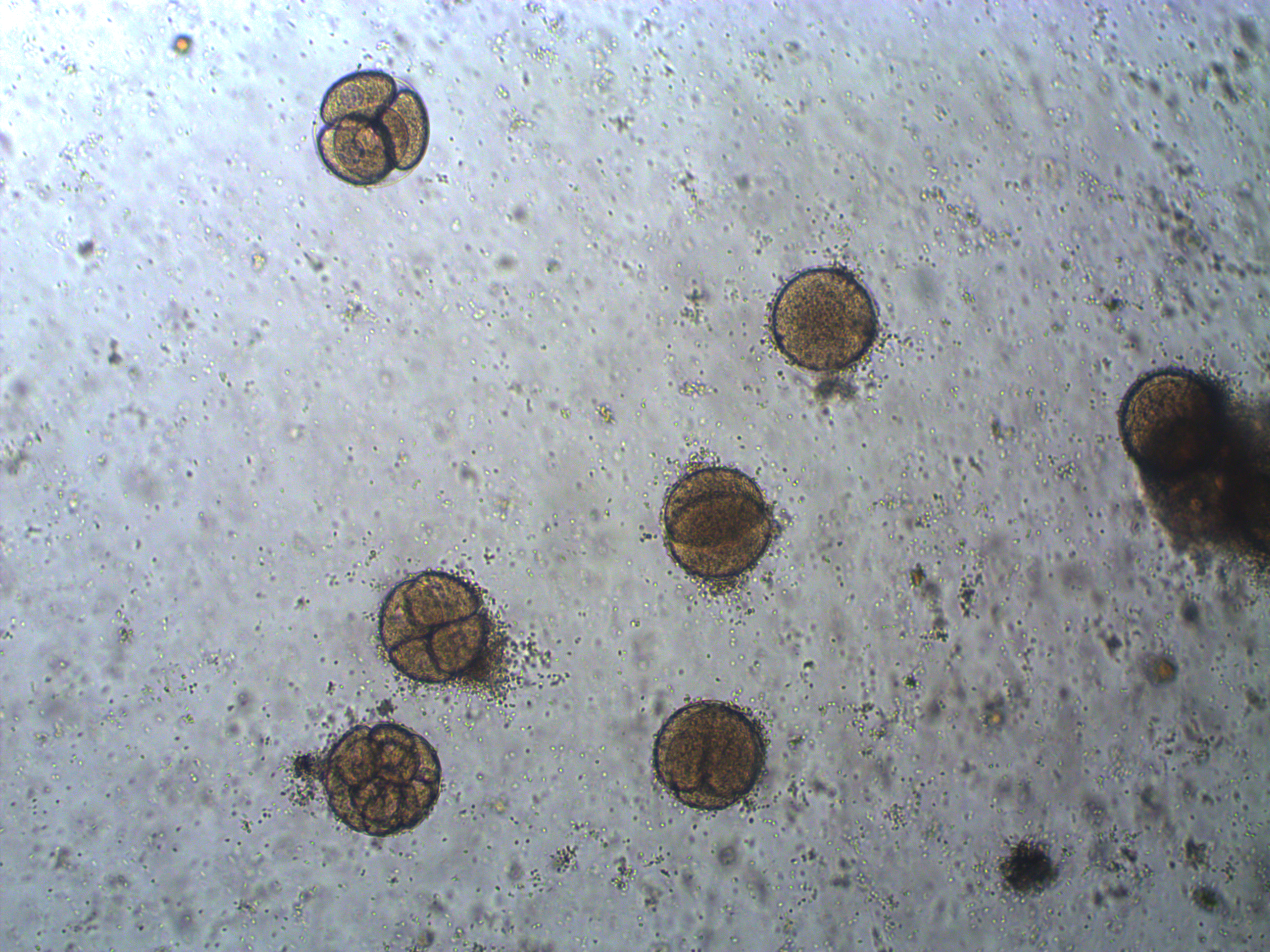
So, how do you find microscopic sea urchins larvae in the ocean, much less, how do you know if they are the right species? It is practically impossible, instead it is simple to make your own---sea urchins are a classic model organism to study early animal development in the lab. We went out on two different weekends to collect adult urchins and bring them back to the lab. It tuns out that if you inject them with potassium chloride, or even easier, give them a good shake so they think they are being eaten, they panic and release their gametes. You can collect them and mix them together. We also added some heat killed sea water (brought to boiling them back down to room temperature) and took a look at the eggs a day later under a compound microscope.
In the image above are several fertilized eggs at the initial stages of division. Slightly up and right from the center (about 1 o'clock) is a single undivided cell. Just down from that near the center is a cell that has divided into two. In the upper left is an zygote that has divided again into four cells (one is on top of the others, stacked like a tetrahedron). Moving down from there to the lower left of the image, is a zygote that has divided again into 8 cells. The initial cell divisions follow a power of two,  (where
  is the cell number and
  is the number of divisions), before the cells become specialized and divisions proceed at different rates.
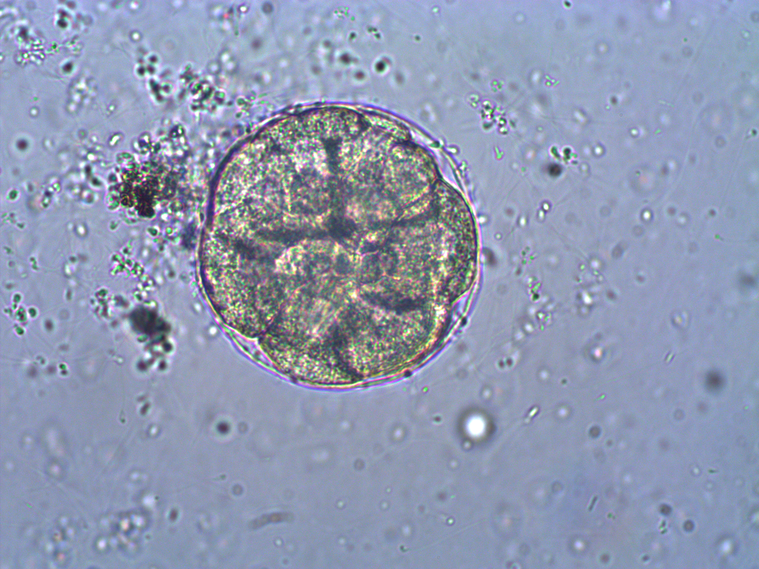
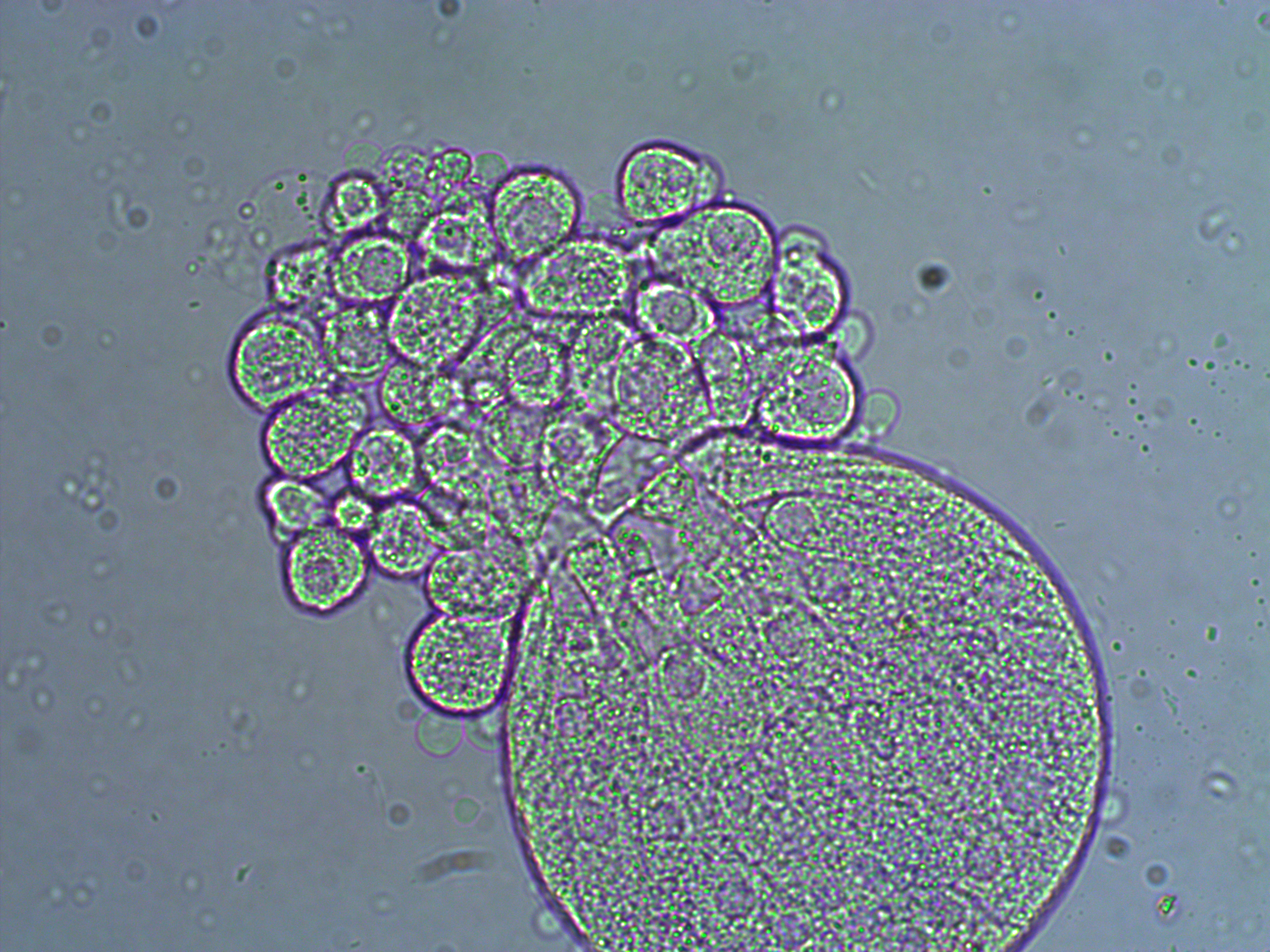
Below is a closer view of an embryo that has divided into at least 8 cells. If you look closely you can make out the cell nuclei. The upper left one is the best defined in the image; it is a smaller circle within the cell. And there are also hints of sperm flagella in the sea water around the cell (they look like faint lines like individual fibers that are out of focus in various directions).
And below is an embryo that is entering the blastula stage. The cell nuclei appear slightly more purple in the image.
And a close up at two different focal planes.
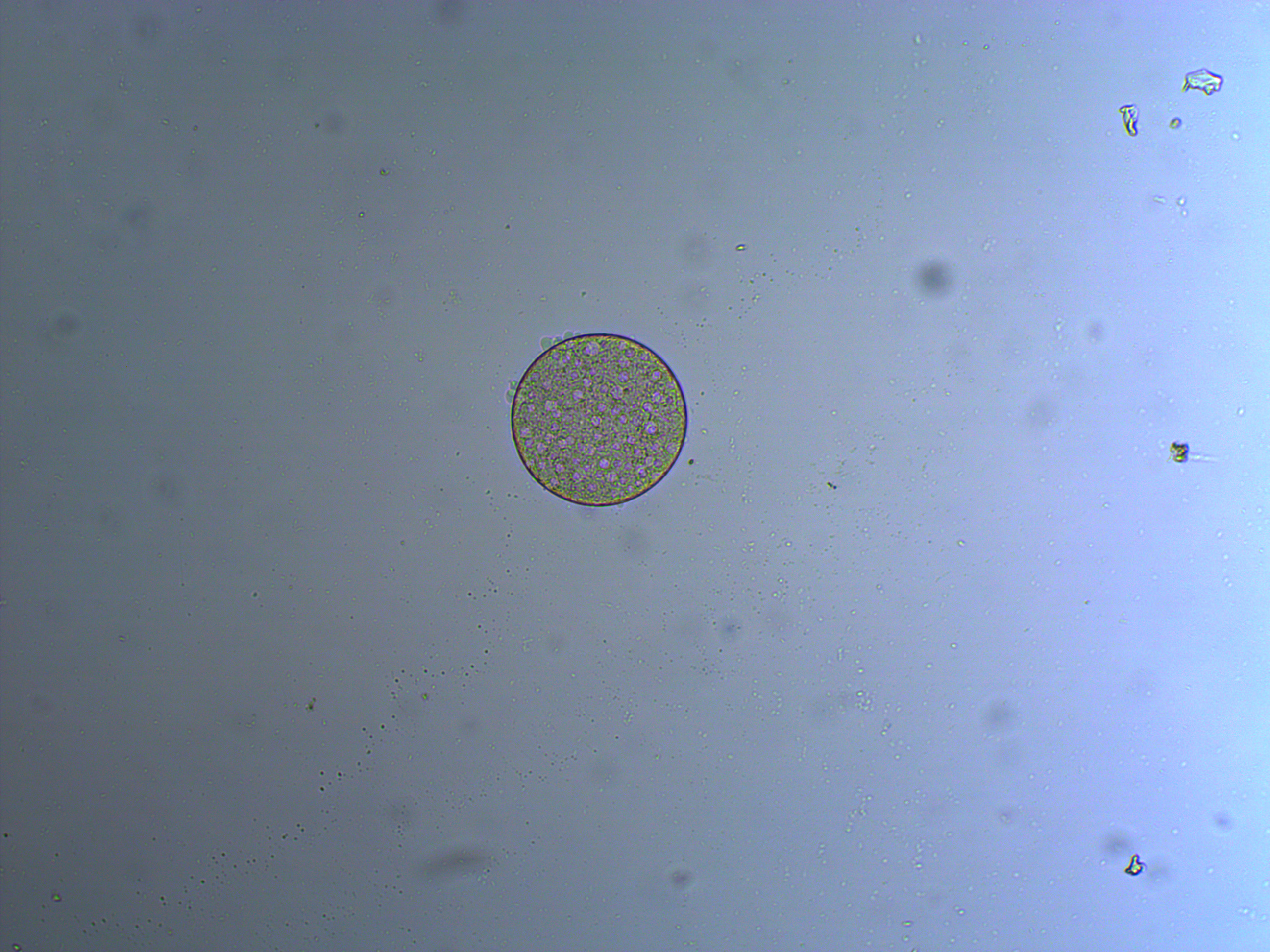
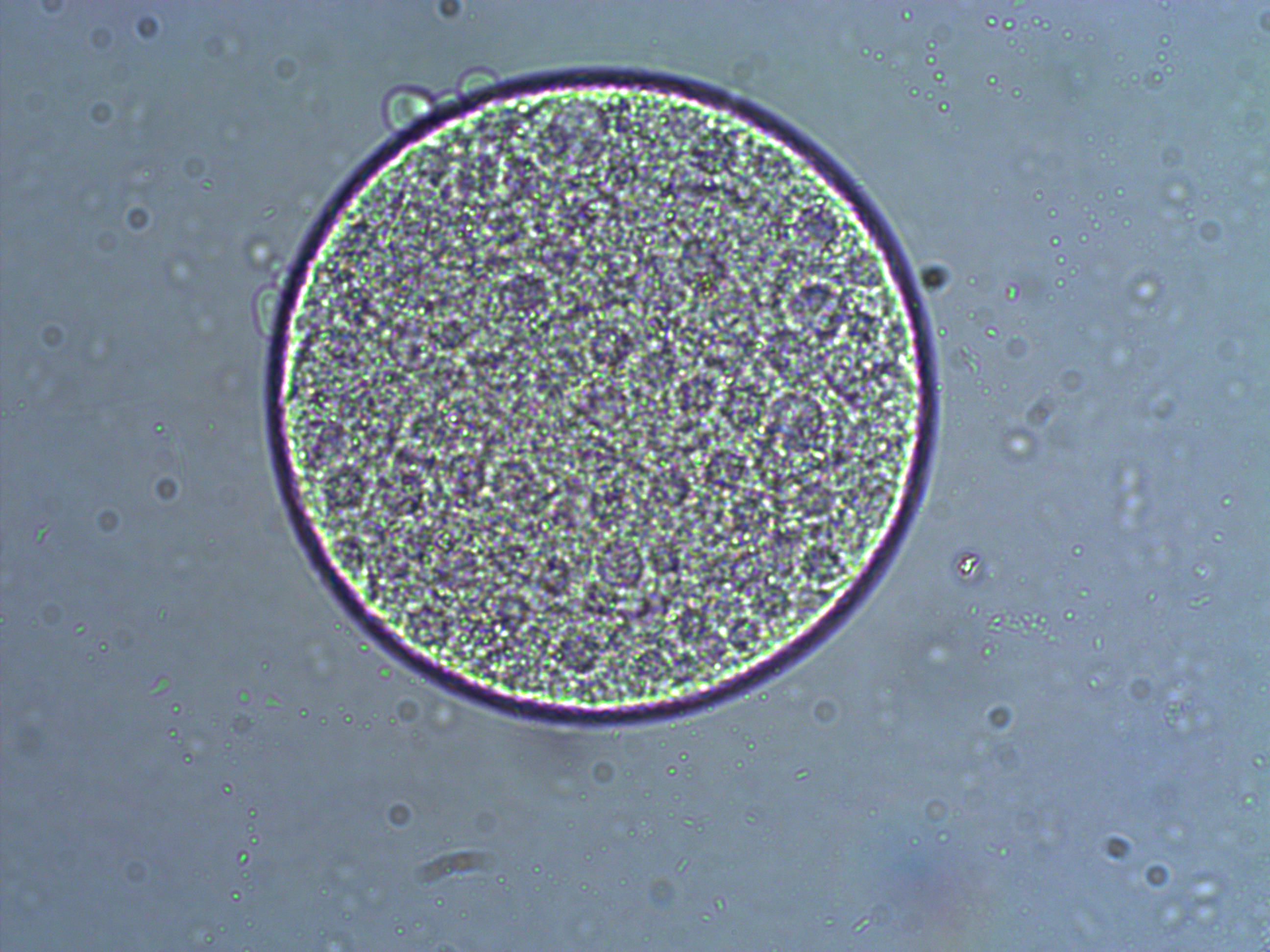
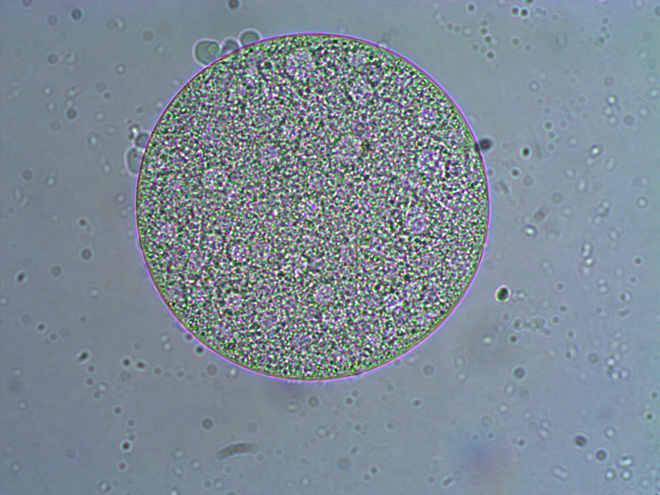
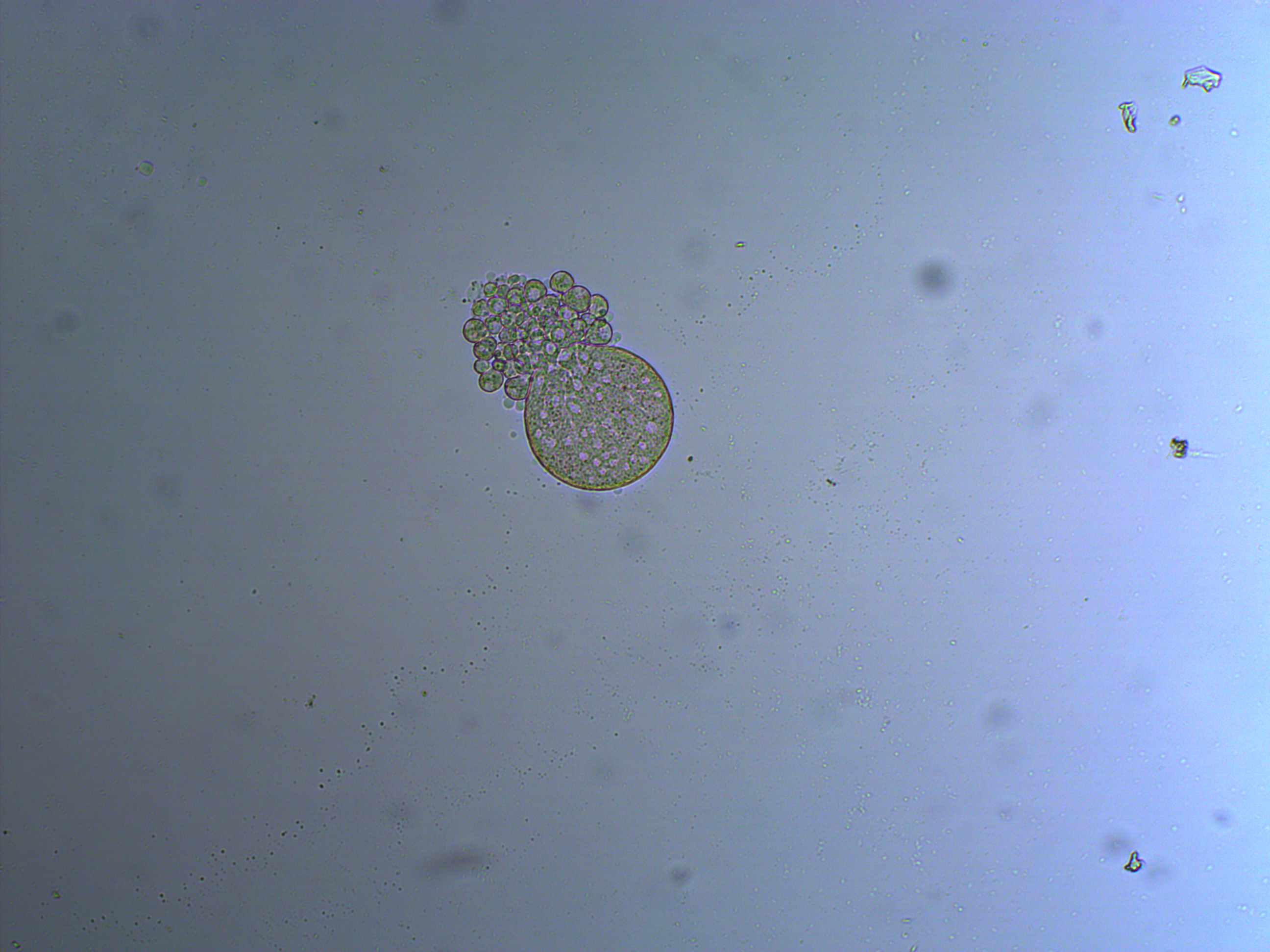
In the next images the cover slip pressed down too hard and the egg coat (egg shell?) has ruptured and spilled out some of the individual cells. Interestingly, urchins zygotes can loose up to 3/4 of their starting cells and still develop into normal adults.
Mosquito Injections!
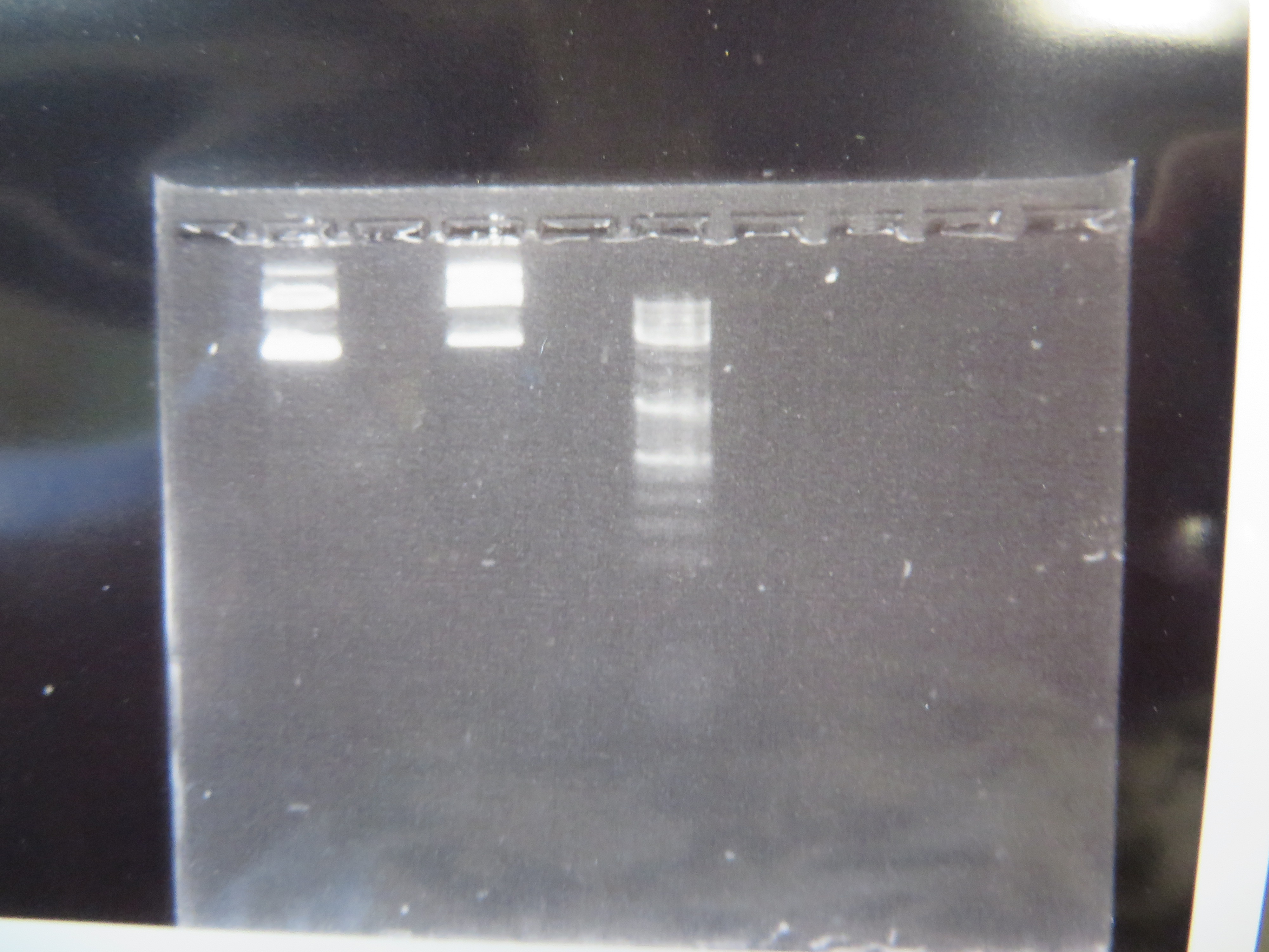
We've taken another big step forward recently. We are now microinjecting Culex mosquito embryos with genetically modified transposable elements that can potentially integrate into their genome. We are starting with a test system to save time. I cloned, grew, and isolated two plasmids (kind of like small artificial chromosomes) in E. coli bacteria that have a piggyBac transposable element system (originally from a species of moth, Trichoplusia ni). One plasmid (the "helper" plasmid) is immobilized but produces the transposase enzyme that can integrate DNA into the genome. The other "donor" plasmid is mobile with flanking piggyBac sequences but does not produce its own transposase (Wimmer 2003). Instead it contains GFP (green fluorescent protein, originally from Aequorea victoria jellyfish) under an artificial 3xP3 "eyeless" promoter that should express in the eyes (which may be occluded by pigments) and larval optic nerve (Sheng et al. 1997; Berghammer et al. 1999). Here is an image of the two isolated plasmids run on a gel.
The first two lanes to the left show the plasmids and the third lane is a "ladder" to measure sizes. The lowest band is a supercoiled plasmid. The higher bands are plasmids that have single strand or double strand breaks in the DNA sequence (and so are less compacted and run slower through the gel).
We loaded the plasmids in the microinjection needle and injected newly laid eggs. This was a trial run to get the system worked out (injection pressure, egg age timing, slide set up, etc.). Some of the mosquitoes survived the procedure and were large enough for us to take a good look at them this week under the microscope. We don't really expect this first batch to contain any genetically modified individuals, although it is possible. However, even if some cells contained insertions the individual would be a genetic mosaic and may not be transformed in the germ line. The next generation offspring are the real test. At this point we are establishing more of a baseline of what the larvae look like.
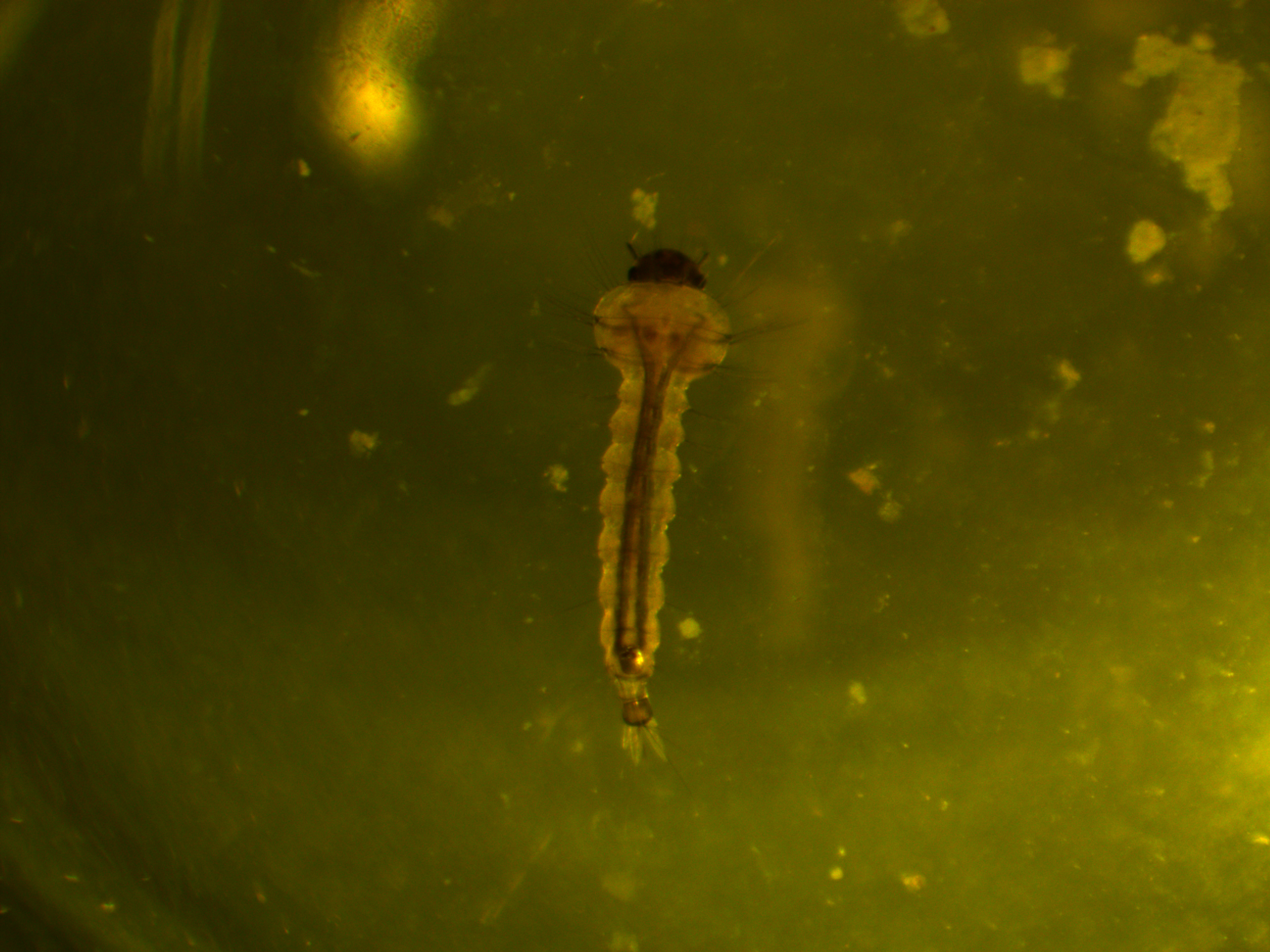
First of all, here is a larvae under normal light.
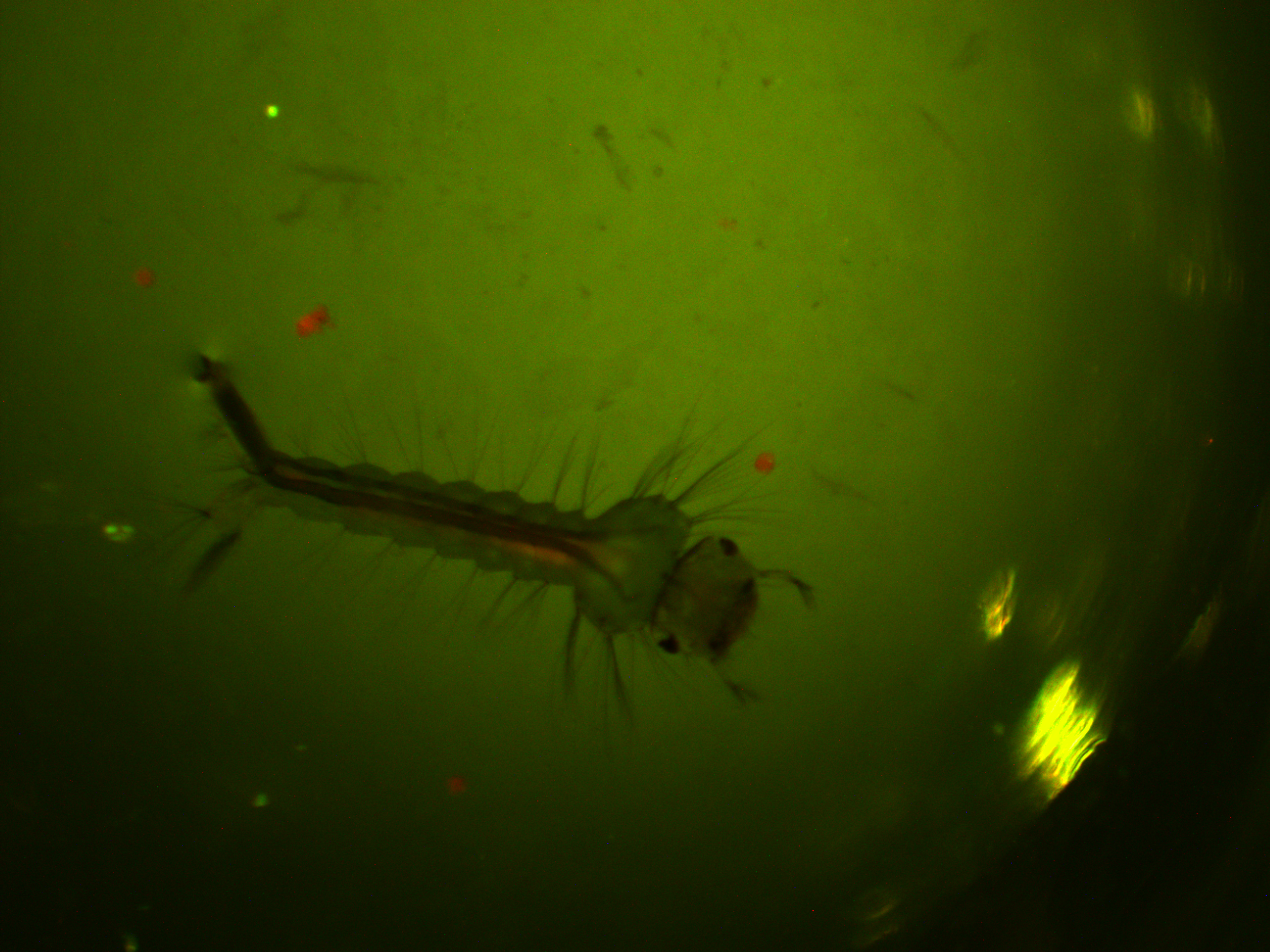
We are interested in the pattern of fluorescence under higher energy / bluer light. This is what they look like in that case.
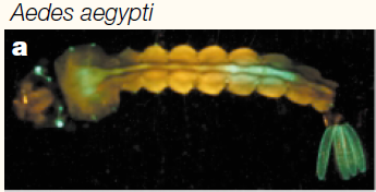
You can see some red and green autofluorescence. Part of this probably results from the food we give the larvae which shows up as flecks of green and red in the water---the reason to establish this kind of baseline. Here is the type of pattern (from another mosquito species) behind the eyes (green lines) that we would expect with a 3xP3-EGFP transformation:
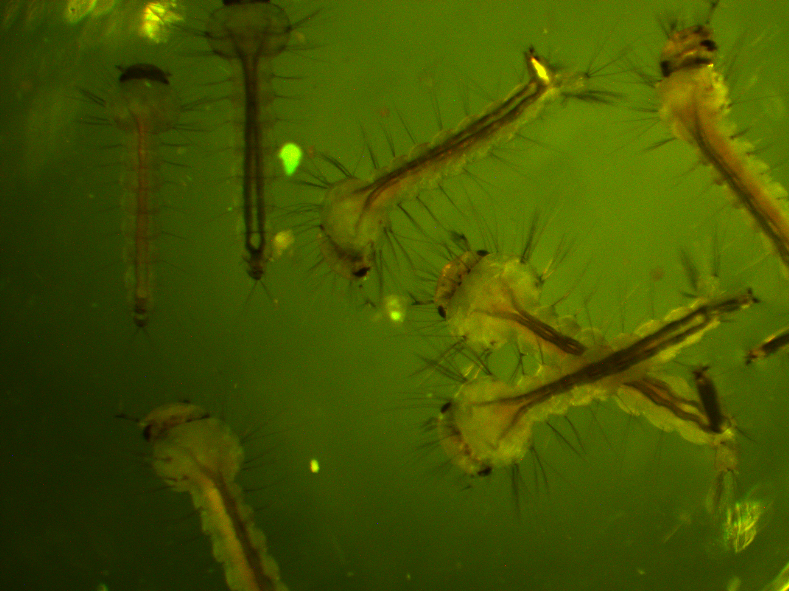
In the following images I turned up the regular light a bit so that they are under both light sources.
We will let you know how the next generation turns out...
Berghammer, A. J., Klingler, M., & Wimmer, E. A. (1999). Genetic techniques: a universal marker for transgenic insects. Nature, 402(6760), 370-371
Sheng, G., Thouvenot, E., Schmucker, D., Wilson, D. S., & Desplan, C. (1997). Direct regulation of rhodopsin 1 by Pax-6/eyeless in Drosophila: evidence for a conserved function in photoreceptors. Genes & Development, 11(9), 1122-1131.
Wimmer, E. A. (2003). Applications of insect transgenesis. Nature reviews genetics, 4(3), 225-232.
