Monthly Archives: August 2013

Ancestry Assignment of Chromosomal Segments: The Example from my Genome

Here is another result from personal genotyping at 23andme.  As a part of the service they infer the population of ancestry of chromosomal segments based on allele frequency probabilities in comparison to reference population samples (I'll make a separate post about the details of that later).  Here is my result after the chromosomes are phased with my parents genotypes:

FAR-ancestry

I will digress a bit into some personal family history to provide some background: We have always known about the Native American (Cherokee) ancestry from my paternal grandmother's father's side of the family.  My grandmother and her ancestors were from the rural Southern Appalachians and she even knew the Cherokee words for some wild plants, etc.  Years ago when they were still living I asked both of my grandmothers more about our family history and that is when I first heard the term "Black Dutch" also mentioned, which, one step leading to another, led me to look up information about the Melungeons (Black Dutch also has a different meaning on another side of my family that I will bring up in a later post).  Melungeon history is enigmatic but various family and historical traditions contain references to Portuguese, Mediterranean, Spanish and Cherokee ancestors.  It is also well known that the Spanish had a colonial presence in the South long before the English colonists spread into the area, including the Appalachian foothills with the Spanish Fort San Juan, which is currently being studied by my alma mater Warren Wilson College and former professor David Moore.  The interesting thing about my genetic result is that the Native American sections are flanked by Southern European segments and specifically "Iberian" on chromosome two, suggesting an association between my Spanish/Portuguese and Cherokee ancestors.  There is also an apparent North African segment on Chromosome five (also from my father's side of the family) which also fits into Melungeon origins.  For example an Appalachian Melungeon family, the Baldwins, have preserved a Levantine sash that has been passed down in their family for centuries, suggesting a Middle Eastern connection.

sash1

Confirming family history is fun, but the surprises are also entertaining.  The real surprises for me are the Finnish ancestry and the tiny segment of South Asian ancestry; we have (almost) no family/genealogy history of either, but I will go into more detail about those later.

An allele frequency spectrum example, with ascertainment bias

After my earlier post about the expected distribution of allele frequencies due to genetic drift in a population I wanted to use some data to provide an example of the frequency spectrum of alleles in humans.

I downloaded HAPMAP data from NCBI from here:

ftp://ftp.ncbi.nlm.nih.gov/hapmap/frequencies/latest_phaseIII_ncbi_b36/fwd_strand/non-redundant/

and plotted the results from 312,957 SNP genotypes along the 1st chromosome in a sample of Yoruba from Ibadan, Nigeria.

YRI-chr1-raw-SNP-freq

Above is a plot of the binned (1% bins) frequency of the reference allele.  5,769 SNPs had a reference allele frequency of zero and 73,603 were fixed at a frequency of 1 (these went off the scale of the plot).

Ignoring the sites that are not variable, from the earlier post we expect a U-shaped plot of polymorphisms.  From the plot above you can see that it starts off fairly uniform but then climbs quickly after a frequency of 50%.  This is one type of bias that has affected this dataset and is simply due to the fact that the most common allele tends to be chosen as the "reference" allele.

The data can be adjusted for this by averaging reciprocal allele frequencies ( and ) making the plot symmetrical around 50%.

YRI-chr1-sym-SNP-freq

This transforms the blue curve into the red curve in the plot above and the data looks a little more U-shaped like we expect.

Now for the theoretical comparison.  As I stated in the earlier post, it is not possible to normalize the predicted curve to an area of one under the curve, so I used a constant to fit the curve to the middle frequencies in the range of .

YRI-chr1-sym-pred-SNP-freq

You can immediately see what is missing.  The very low and very high allele frequencies are underrepresented in the actual data compared to their theoretical prediction.

Why?  SNPs are typically discovered in a small sample and then genotyped in a larger sample.  A small sample is less likely to contain variation for rare alleles.  In the simplest case imagine genotyping a single person; they contain two chromosome copies and are likely to be heterozygous with a probability of , which is 1/2 for but only 0.02 for .

We can write down this probability.  The probability of discovery of a SNP in a sample of individuals is one minus the probability of not discovering it.  To not discover the SNP the same allele would have to be sampled times (each person has two chromosomes copies).  This could either be the allele with a frequency of or the alternate allele with a frequency of .  So,

,

which gives the following plot for various sample sizes and allele frequencies:

prob-discovery-snps

In the previous plot of predicted and observed allele frequencies we can take the difference divided by the expected to find the fraction of SNPs missing due to sample size ascertainment bias.

SNP-AB-fraction-missing

This climbs from over 25% missing at a frequency of to over 50% missing at to over 80% missing SNPs at and less.

If we multiply the predicted allele frequency curve by the expected discovery curve (i.e., the SNP has to be discovered to be genotyped and included in the data and exists at a certain frequency),  (where is a rescaling constant), and adjust the sample size to minimize the difference we end up with a nice match:

AB-fit-SNP-data

This fit curve indicates that effectively only about 13 chromosomes, or 6 1/2 individuals, were used as a sample to discover the SNPs.

Caveats: Of course discovery sample size varied across different SNPs and there are more sophisticated ways to estimate this distribution using maximum-likelihood but that is beyond what I want to mention here.  There are other types of ascertainment bias that can affect the data, such as the SNPs being discovered in a population that is different from the one genotyped.  Also, there are other forces that can skew the distribution, such as higher mutation rates and population size changes and other demographic dynamics, but these issues will be saved for later posts and the sample size effect addressed here is likely a large force in skewing the allele frequency distribution.

Moving

The renovations are finished!  I have been in temporary offices and lab spaces since arriving but over the last couple weeks we were finally able to move in.

I have a nice new office that I have already moved into and set up :

IMG_0015

(I didn't notice the orange ribbons on the ceiling until I looked at the picture.)

And we have a large shared lab space:

IMG_0018

It is already getting filled with boxes of lab equipment as people move in.

Here is my corner of the lab:

IMG_0019

We have a dedicated room that can be isolated for future mosquito work! (below)

IMG_0017

And here is a shot of the shared equipment corridor:

IMG_0020

The outside and front of the building is still under construction/renovation.

Genetic Genealogy

I sent my DNA sample to 23andme for SNP genotyping a little over a month ago.  I just now received my results and my head is swimming from all the details.  It is a bonanza of results to go over--I'm not even sure where to start.  I plan to make a series of blog posts detailing some different aspects.

One service that they provide is the potential to contact and communicate with people who have matching chromosomal segments--i.e. relatives that share common ancestors.  Of course I share half of my (autosomal) genome with each of my parents; and half of that (1/4) with each of my grandparents, 1/8 with my great grandparents, etc.  The genome of an ancestor gets whittled away by recombination and the luck of transmission each generation down to us.

The expected size of the chromosome segment that gets passed on intact approximately follows a geometric distribution, which is a discrete form of the exponential distribution.  One interpretation of this is the waiting time, distance, until an event, recombination, happens.  The average length in Morgans is where is the number of generations, because an exponential expectation is the inverse of the rate parameter (generations X recombination).  The variance is and the square-root of this gives us the standard deviation.

geometric-ibd-track

So in the graph above, after 10 generations we expect no recombination events within a chromosomal region with an average size of 10 cM.  This can be thought of in either direction in time, the size of the region you pass on to descendants or the region you inherit from ancestors, or in both directions at once, back to a common ancestor and forward to a cousin--in this case 10 generations would be the distance to a 4th cousin.  There is a wide variance, so 95% of the time you expect the identity-by-descent (IBD) tract to be less than 40 cM (plus two standard deviations).  The lower bound on the interval size goes to zero and indeed, after a few generations we start loosing representation of ancestors in our genome (the number of ancestors grows exponentially, initially, and our genome is finite in size).

So, another individual, "M", that has also been genotyped by 23andme came up with some similarities and was flagged as a potential match.  We contacted each other and found a shared 16.5 cM segment on chromosome 3 (the blue bar in the genome schematic below) consisting of over 2,000 genotyped SNPs (this is not just random chance).

m-shared

This size segment is expected with six to twelve (+1 s.d.) generations between us.  We compared genealogies and sure enough, we are descended from a family that lived in the 1800's in North Carolina.  The parents of the family were Moses Pace (1781-1868) and Margaret Barclay (1793-1883).  We are actually descended from two brothers that were their sons.  William H. Pace (1826-1904) and Leander J. Pace (1816-1893).  Here are pictures (this is the best image quality I have at the moment) of W. H. Pace (left) and L. J. Pace (right):

WHPaceLJPace

The pictures were made when the men were at different ages but they do look like they could be brothers.  W. H. Pace is my g. g. great grandfather, five generations back.  L. J. Pace is M's g. g. great grandfather, also five generations back.  So we are 5th cousins separated by twelve generations, this is perfectly consistent with the expected size of the IBD.

Taking a step back for a moment and thinking about this, this result more or less proves the chain of ancestry back to these two brothers--through the intermediate ancestors.  It is possible that the shared ancestry is from a different individual that we do not know about, but since we do have a paper trail and family tradition genealogy to this family, and the genetic results are consistent with the genealogical distance, it is a far simpler proposition to accept that this is indeed the relationship.  Further matches with other descendants can help support or refute this.

The other interesting thing to realize that we have done here is reconstruct a bit of the genome, approximately 8 million base pairs of one chromosomal copy, of these two brothers (this can also help us phase the data but that is a different topic).  We don't know exactly which parent the shared segment was inherited from, Moses Pace (1781-1868) or Margaret Barclay (1793-1883), but we do know (with the caveats above) that these brothers shared this segment.  The more modern people that are genotyped and share their results the more we can reconstruct parts of ancestral genomes.  This gives us genetic information that might be used to infer more about these individuals, not just predispositions to diseases but even things like possible personality traits and responses to stress.  If the reconstruction is dense enough small gaps might be interpolated based on linkage and haplotype frequencies.  It also might be possible to begin making shared ancestry links between reconstructed ancestral genomes to move even deeper into the past--this result has gone back about 200 years, another similar jump between ancestral relatives would put us back into the early 1600s!  Finally, the parents of these brothers were born in the late 1700's; it is amazing to me that we can learn more about this family by the patterns shared in our DNA today.

Bitter Taste Blind

This is another topic related to the undergraduate genetics teaching lab I am running this fall. There is a lot of variation among people in bitter taste perception, and one form of this is strongly affected by alternative alleles at a single gene.  It is safe and easy to test both the genotype and phenotype, provides students with a first hand experience genotype-phenotype connection, and is "safe" in terms of potential medical stigma--there are no directly relevant medical issues associated with differences in bitter taste perception among the students, unlike some other traits we could test.  We can also use the genotype data in other class projects such as calculating F-statistics for the class as a whole.

Humans have five types of taste perception; sweet, bitter, sour, salty and umami ("savory" discovered in Japan in 1908).  Three of these are produced by ligands (ligands are molecules that bind to proteins) binding to taste receptor proteins that span cell membranes in the tongue, mouth and throat.  This causes a conformation change in the receptor gene that is a component of a signal transduction cascade that finally results in opening of ion channels and a nerve impulse (action potential) travels to the brain to be interpreted and perceived as a flavor.

Type 2 taste receptors govern the detection of bitter taste (Type 1 govern sweet and umami perception).  There are 43 Type 2 receptors in humans encoded by "TAS2R" genes.  One of these, TAS2R38, is very well characterized and is polymorphic in human populations with both tasting and non-tasting alleles.  In the image below from the UCSC genome browser you can see a schematic representation of the 7th chromosome at the top with the area of detail outlined in the red box out on the "q" (long) arm.  Under this is a plot of genes in the magnified area with TAS2R38 in the middle (listed just under CLEC5A).

tas2r38ch7

It is not far from a small cluster of other bitter taste receptors to the left (TAS2R3, 4 and 5) between SSBP1 and PRSS37.

The ancestral functional allele of this gene can detect some synthetic compounds, such as PROP (6-n-propylthiouracil) and PTC (phenylthiocarbamide), as well as bitter compounds in some plants like cabbage, broccoli and brussels sprout.

     PTC $$\chemfig{**6(---(-NH-[2](-[3]H_2N)=[1]S)---)}$$

     6-n-propylthiouracil $$\chemfig{-[:30]-[:-30]-[:30]*6(-[,,1]N(-H)-(=S)-N(-H)-(=O)-=)}$$

I like cabbage, broccoli (I like to snack on tasty raw broccoli) and yes, brussels sprouts, on the other hand my wife strongly dislikes brussels sprout and is not fond of uncooked broccoli.  PCT can be used to test for TAS2R38 activity because tiny amounts of it can be soaked into paper strips and it causes a strongly bitter sensation in people, like my wife, that can taste it--she immediately rinsed her mouth out with water after tasting it.  On the other hand, when I taste PTC there is only a faint "chemical" taste; it is definitely not strongly bitter or unpleasant.

Below is my sequence from PCR amplifying a section of the TAS2R38 gene.

tas2r38trace

Part of one of the primers used is indicated by the light green bar on the right.  The amino acid translation of each set of three nucleotides is indicated by single letters just under the top DNA sequence.  At position 239-241 I have a valine (V) (underlined with the yellow arrow box above) whereas many people have an alanine (A).  This is because the second nucleotide in the codon (with the small yellow box below it) changed from a C to T, changing the codon from GCT (coding for alanine) to GTT (coding for valine).  The trace file is "clean," there does not appear to be both a C and T peak at the same position, indicating I, like 30% of the other people in the world, am homozygous and have two copies of the altered allele.  The valine form of the protein does not change conformation when these types of bitter compounds are present.  However, the phenotype associated with this allele is recessive.  Having at least one functional copy (like the 70% of the rest of you) means you can detect PCT and related molecules.  This may explain the difference in food preference between my wife and I.

There is also anecdotal evidence of an inverse effect with other compounds: Henkin and Gillis 1977 "Divergent taste responsiveness to fruit of the tree Antidesma bunius" Nature 265: 536-537.  The fruit of the bignay tree seems to be sweet to people with TAS2R38 "taster" alleles and bitter to people who cannot taste PTC.  The bignay is used as food in Southeast Asia and Northern Australia.  Interestingly, the frequency of PTC tasters is not uniform around the world but ranges from a high of over 90% among Native Americans to less than 60% among Native Australians and New Guinea--where the bignay grows.

The steady state allele frequency spectrum: the contradictory case of no mutations

I have been trying to start with some basics and build these posts upon each other, so I can reference back to earlier posts for background.  However, I just found out something that interests me and wanted to share it before I forget the details so I will jump ahead a bit.  It turns out that although this is in some ways a strange example, in other ways it is easy to understand and perhaps does not need that much background.  (Although, it does build a bit on the Bernoulli distribution in my last post; the reason I went ahead and made that post first.)

I haven't really talked about genetic drift yet on this blog.  Long story short genetic drift is evolutionary sampling error.  When you take a sample from a larger population you are likely, by chance, to over- or under-represent certain categories in your sample.  The larger a sample you take the smaller this error is as a proportion out of the total.  The same things happens biologically in sampling alleles from a population to make up the next generation.  The larger the sample (the more parents there are) the smaller the error is.  In other words, generally speaking, the larger the population the less alleles change in frequency between generations.  Conversely, genetic drift and allele frequency change is accelerated in small populations (or in populations where very few individuals are reproducing).

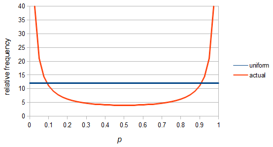
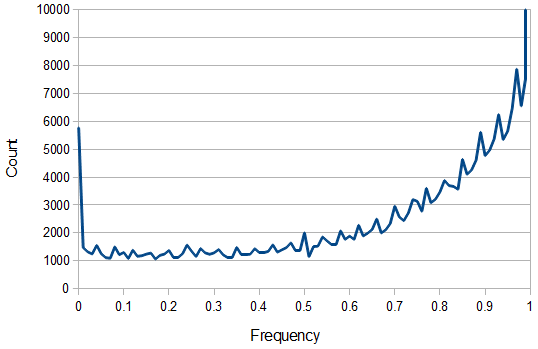
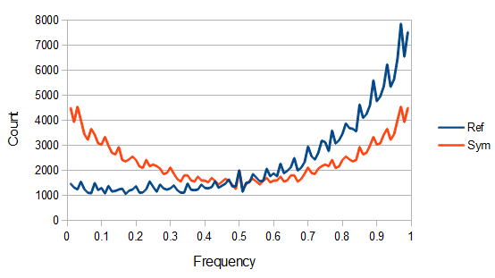
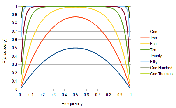
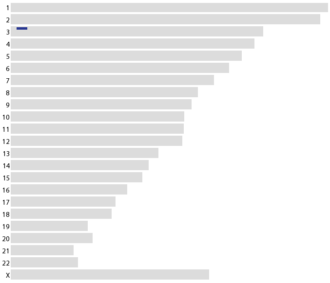
SNPs are single nucleotide polymorphisms that are found all across the genome.  In general they have two alleles, a C and a T for example.  If we genotyped a lot of SNPs across the genome what frequencies would we expect to see the alleles at?  It turns out that we do not expect to see a uniform allele frequency distribution.  There are not the same number of alleles at 10% frequency in the population as there are at 20%, 30%, etc.  Instead there is a U-shaped distribution where most alleles are at very high and low frequency (if one allele in a pair is at 5% then the alternative alleles has to be at 95% so the curve is symmetric) and fewer alleles are at intermediate frequencies.  These two types of curves are plotted below:

sfs

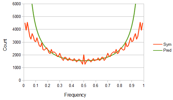
So what is the actual shape of the expected curve?  To understand that we have to first realize that allele sampling is a binomial process, either one allele or the other is sampled, this is repeated several times, and the new collection makes up the next generation.  Like the Bernoulli distribution the variance in a binomial process is greatest at the middle frequencies and is 
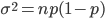
. If we normalize this on a scale of zero to one dropping for the moment this is identical to the curve for the Bernoulli variance.

bern-var

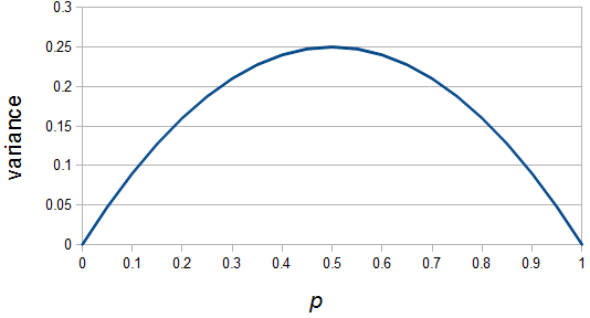
When an allele is rare, it only gets a chance to be sampled a few times, and does not have much opportunity to change in frequency.  The most dramatic change is if it is lost from the population completely in the next generation and this is not really a big change because it was rare to begin with.  If alleles are at intermediate frequencies there are many chances to be sampled so the possibility of "error" at each individual sampling is magnified.

So, the change between generations is largest at intermediate frequencies.  Now imagine people migrating within the continental US.  Say that people move very little each generation on the East and West coast.  A family's children tend to live in the same city as their parents or at most move to a neighboring city.  However, on the Great Plains in the middle of the country families tend to move around a lot.  So one families children may grow up to live 100s or over a thousand miles from their parents.  Over time, with this pattern, we expect people to accumulate on the east and west coast and, over the span of several generations, to spend less time in the geographic center of the country.  This predicts the greatest population levels on the coasts and the lowest population in the middle.

So, because of the binomial variance, we expect alleles to spend less time at intermediate frequencies where the change in frequency is greatest due to genetic drift, and spend more time at high and low frequencies where drift and variance are lower.  In fact, so long as this process is only driven by genetic drift this is the only factor that we need to consider and we expect the population of allele frequencies to be the opposite or inverse of the variance.  So the frequency of different alleles is expect to follow this distribution:

And gives the following curve:

sfs2

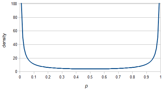
This curve is known as the site frequency spectrum and is expected as the alleles reach a mutation-drift equilibrium.  The alleles themselves however are still drifting up and down in frequency but the ones that move away from each frequency are exactly replaced by ones moving into that frequency class so this is a steady state distribution (rather than an equilibrium distribution in the usual sense--specific alleles do not remain at a single frequency value).

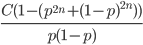
Up till now I think this is very straightforward and understandable (at least to the limit of my writing skills).  We can use this curve as-is to make some insights into the genotype distribution.  For example, according to Hardy-Weinberg heterozygotes are most common at intermediate frequencies and follow but alleles are least common at intermediate frequencies, so we can combine these to see what the distribution of heterozygous genotypes looks like in terms of actual relative numbers across loci (sites in the genome).  Interestingly these two curves cancel out when multiplied together: 
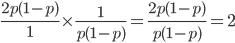
.  The number of heterozygous genotypes is not a function of 
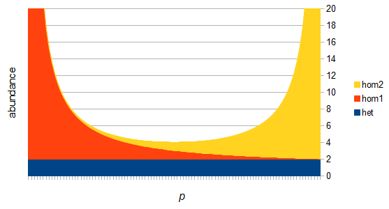
and is uniform for all values of .  So, for example, even though there are many more homozygous genotypes than heterozygotes at low frequency, there are many more alleles in the genome at low frequency, so the actual number of heterozygous genotypes remain the same as the number seen at intermediate frequencies.

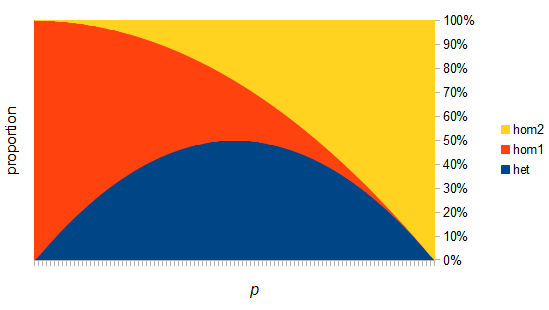
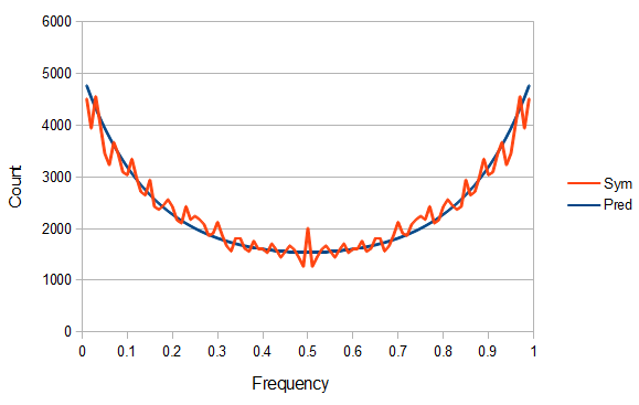
There are two graphs below, the first one shows the relative abundance of the different genotypes within the predicted site frequency spectrum; the second is the relative frequency of the genotypes to each other, which is basic Hardy-Weinberg proportions.  To generate the curves for the first homozygote the equation is 
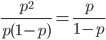
, the second homozygote is

sfs-genotype-abundance

hw-genotypes

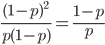
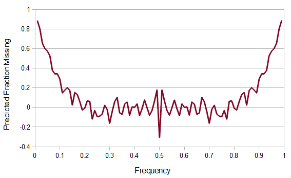
However, this site frequency spectrum curve has one interesting problem.  These kinds of distributions are usually normalized so that the area under them sums to one (100%).  This curve can not be normalized because the area under it is infinite.  In the graphs above you can see that it increases sharply at the edges of zero and one.  The curve approaches infinity as it moves toward an edge value of .  In several other cases it is possible to have a finite area under a curve of infinite length, but the area of this curve does not converge to a finite value; it approaches zero and one too slowly (the spikes on the edges are too "fat") and accumulates an infinite area.  (The integral  is an improper Riemann integral of the second kind. In fact the factors and also have improper integrals.)  This may seem like a nuisance but this difficulty can give us a little more insight into what is going on here.

In defining this curve, , to figure out what the site frequency spectrum looks like we made a critical assumption--that there are no new mutations and the distribution is only governed by drift.  We assumed the system was only affected by drift for convenience, but what we are really interested in is a mutation-drift equilibrium process.  How can there be alleles and variable sites if there are no mutations?  We could assume that mutations stopped at some point in the recent past and that we are looking at the distribution of the remaining alleles, but then the system would not be at equilibrium.  The key contradiction here is that without mutations we can not have variation remaining at equilibrium, so it is nonsensical, in a way, to talk about the site frequency spectrum in this case--except at two points, and .  Mathematics has "attempted" to resolve our contradictory assumptions by forcing this result to a ridiculous extreme that actually kind of makes sense.

The reason we can not integrate this curve is because all of the mass is infinitely close to zero and one, but can not quite be equal to zero and one, so it gets stacked up to infinity.  Even though we see a curve at intermediate frequencies the area under it is an infinitely small fraction of the total and we would never expect to actually see any alleles at these frequencies (under these model assumptions); the relative fraction of probability is infinitely close to zero, which is zero.  So this actually makes sense, we expect all the alleles to either be fixed or lost, at zero or one, at mutation-drift equilibrium when the mutation rate is zero.  The curve we see at intermediate frequencies is a sort of mathematical "ghost" that is left behind at the extreme limit of a zero mutation rate; we will never see alleles at these frequencies but, if we did, this is the curve we would expect them to follow.

This does not mean that the curve is not useful.  For all practical purposes the SNP mutation rate is quite small, so (speaking on a simplistic level) we might well expect actual allele frequencies to closely follow the "ghost" curve and for results from studying it to generally hold, such as the uniform heterozygous genotype abundance.  In reality though, with non-zero mutation rates, an allele can never be completely fixed or lost in a population of sufficient size, so the area of the curve infinitely near zero and one will be zero, which suggests the curve (under modified, more realistic assumptions) can be integrated and converges to a finite area...  but this will be the subject of another blog post.