Monthly Archives: June 2013

Highlights from the Meeting

I had a nice time at the Evolution meeting in Utah--this was my first Evolution meeting.  There are some presentations that I attended that have stuck in my mind and I thought I should mention them here.

I attended a phylogenetics workshop on the first day.  Joe Felsenstine (U. of Washington) gave a talk that segued from a historical overview to some current problems in phylogenetics.  He gives entertaining talks that sometimes border on the cynical but are humorous.  I especially liked his funding sources in the acknowledgements that included the Felsenstine foundation who's slogan is "instead of painting the house."  On the more serious side he brought up the issue of inference of horizontal gene flow versus linage sorting in prokaryotes and archaea.  There are several instances of horizontal gene transfer where DNA sequence has moved from one species to another in bacteria, but how many of these are actually "incongruent" lineage sorting in bacteria with very large ancestral species population sizes?  On the other hand, rates of recombination in bacterial genomes are actually quite low, so if selective sweeps are frequent in bacteria (a later talk by R. Lenski is very relevant to this), perhaps effective populations sizes are indeed small and these are true horizontal transfers?  He also brought up the possibility of looking at QTLs/heritability across multiple species to have power to get at what is under selection in correlated traits.

Brant Faircloth (UCLA) talked about using ultraconserved elements (UCEs) to reconstruct various phylogenies including helping to resolve the placement of turtles among birds and reptiles (which turns out to be an unresolved problem).  There is a temptation to sequence and compare whole genomes of a range of species, especially since sequencing has become so cheap, but in the end a lot of the data is thrown out because it is hard to align, etc.  There are various ways to focus down on smaller parts of the genome for comparison such as genome-wide exon (exome) sequencing from mRNA (exons are typically more conserved across species), DNA enrichment by sequence capture (seqcap) of exome DNA with tethered oligonucleotide probes, and finding variants around restriction endonuclease sites across the genome with RadSeq and RadTags.  Another approach is to focus on regions that are highly conserved across a wide range of species (UCEs), there is a website dedicated to using these (http://ultraconserved.org/); these UCEs seem to contain a lot of binding sites for transcription factors that are deeply shared across metazoans (Ryu et al. 2012).

Later in the same workshop, Stacey Smith (University of Nebraska-Lincoln) gave one of the clearest, well organized, and informative (to the novice to phylogenetic inference) talks I have seen.  (Many presentations I have seen on this topic have been cryptic and hard to follow, which often reflects a lack of detailed understanding by the people presenting.)  She has also made her slides available online (link: http://www.iochroma.info/links) and said that anyone can use her graphics in their own presentations if they want!  She went over parsimony, maximum likelihood, and Bayesian inference for discrete and continuous traits, the inference of relative rates of change and ancestral states and ways to visualize and interpret the results.  Again, she gave an excellent presentation!

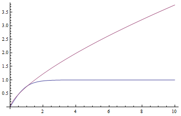
In a special address, Richard Lenski (Michigan S.U.) talked about some new results from his long term (25 year) artificial evolution experiment in E. coli.  The experiment is now up to 50,000 generations and is still going.  He has kept samples of the bacteria over the generations and can compare them to each other.  One overall result is that fitness has been increasing over time from new mutations.  Early in the experiment he thought the curve of fitness increase was hyperbolic, which asymptotically approaches a limit, but with more generations he showed that the change in fitness fits a power law curve significantly better, which does not have a limit.  The implication is that fitness will continue increasing forever and will never reach a peak.

The image below compares an example hyperbloic curve, tanh(x), to a power law curve, (x/1.5)^0.7.  The two curves may be similar early on, but diverge by a greater amount as time becomes large.

power-vs-hyperbolic-curve

He also talked about the implications of one of his replicates that evolved citric acid metabolism.  They screened a huge number of cells and did not see this occur again independently.  But in the line where it did occur, if they went back to the generations just before this appeared, it did evolve again repeatedly (if I understood correctly what he was saying).  There was also a great deal of evolutionary fine-tuning of the novel citric acid metabolism after it appeared.  This demonstrated the steps of potentiation (setting the stage for a particular adaptation to be able to occur), actualization (the final mutant step that results in the new function), and refinement (additional changes to improve the system).  They are working on nailing down the precise mutational steps that have happened in this lineage and a gene duplication (in citrate transport) is involved.  He also discussed several lines of reasoning that this population of E. coli can be considered to have evolved into a new bacterial species--one of the defining features of E. coli is that it does not use citric acid as a carbon source, and intermediates have reduced fitness.

In other talks, Mingzi Xu talked about honest signals of fitness in male dragon flies.  The dragon flies she works on use mie scattering of light (which also makes clouds white) from fat deposits on their wings to give them white bands that females are attracted to.  The males don't seem to be able to cheat and produce a large white band if they are smaller and have less resources because the fat residue uses a lot of energy to create.  She is going on to estimate heritability of the trait among offspring, etc.

Carl Bergstrom talked about "Timing of antimicrobial use influences the evolution of antimicrobial resistance during disease epidemics." Missing antibiotic doses extends the time it takes to get rid of infections--perhaps in a very predictable way--and missing doses early in a program is far worse that missing them later in a program in terms of the possibility of antibiotic resistance arising. I think this is because there are many more microbe cells present early in the program that could mutate to resistant varieties.

William Soto talked about "Adaptive Radiation of Vibrio fischeri During the Free-living Phase and Subsequent Consequences for Squid Host Colonization." Vibrio genus bacteria in Hawai'i are something I have become more interested in lately so I attended this to talk to get some more background information. Bioluminescent Vibrio fischeri are both free living in seawater and symbiotic with nocturnal bobtail squid; however, there may be different morphologies that are differentially adaptive in colonizing versus free living stages.

Benjamin Parker talked about immune response in aphids.  They can generate winged and unwinged aphids that are genetically identical but develop differently and test how well they fight off infections.  There is a cost to producing wings and the winged aphids also do not stop infections as well as the unwinged aphids; the immune response genes are not expressed as highly, etc.  There are some parallels with costs of immunity in bumble bees.

Tyler Hether showed that the effects of mutations depend on the ways that genes interact (epistasis).  The pattern depends on the type of regulation, positive or negative.  This distorts the state space that can be traveled by a sequence via mutations so that change in some directions is faster than others as a function of the type of interaction among genes--the gene interaction network has an effect on the direction of evolvability.  In general networks constrain adaptation; the space to transverse by mutations to get between states was larger with epistasis than the null model of no interaction between genes.  This possibly relates to issues of phenotypic robustness despite mutational change in the underlying genes.

Benjamin Liebeskind gave a great presentation titled "Sodium Channels and the Origin(s) of Animal Behavior."  This is a very difficult question to approach: what are the origins of animal behavior.  Animals use sodium channels (similar to calcium channels), which also exist in protists, to create charge potentials and propagate signals along neurons.  By looking at the gene sequences among species he found that these sodium channels predate animals who inherited them from common ancestors with modern protists.  The channels started off as an "EEEE" holoenzyme, which evolved to a heterogeneous "DEEA" then a "DEKA" sodium channel holoenzyme.  Interestingly there has been convergent evolution in cnidarians and bilaterians in sodium channel evolution and possibly origins of complex behavior?

Then I gave a presentation on engineering underdominance to transform wild populations (link to PDF of the slides).  It was much more applied than the other talks but I still got some nice feedback from people that saw my presentation.

M. Slatkin (UCB) talked about inferring the number of genes underlying a complex trait (like stature that is influenced by many genes and the environment) from a very subtle signal in the covariance of the trait among parents and offspring.  It requires huge sample sizes to work, on the order of thousands; however, these kinds of sample sizes exist for many traits.  For example, each year I have my genetics class report height for themselves and their parents, if they can, to illustrate quantitative genetics (regression/heritability); this is a sample of about 200 each year so by the end of this fall I will have a total of about 600 parent offspring trios for a single trait.  Perhaps the sample will be large enough in the coming years to use his approach with the students data to illustrate estimating the number of genes affecting the trait to the class?

Rebecca Chong (CSU) talked about rates of evolution in rearranged mitochondrial genomes.  If I understood correctly, there is an acceleration of substitutions in genomes that have been rearranged, but this can not be explained by changes in mutation rate due to their position (single stranded DNA is more susceptible to mutation and the process of replication of the mitochonrial genome makes some areas single stranded longer than others) nor can it be explained by simple relaxation of selection (based on dN/dS ratios).  So the question is, what is driving the changes in these genomes?

There was also a presentation followed by a question and answer session by program officers from NSF to explain more about applying for funding from NSF and some issues with the new application procedure.  I appreciated them doing this and I learned some things, but honestly I did not get a lot out of it because I already read all the instructions, and follow them, for the application.  Long story short--and they did not say this--we need to do a better job of petitioning congress (mailed letters, not emails, are the best way to do this) to provide funding to NSF.  (I also received some comments back on my last application, but I will write about these in a later post.)

One talk that I missed that I really wanted to see was "The convivial origins of life on the Earth: A cooperative network of RNA replicators" by Niles Lehman (PSU).  I have had a side interest in RNA evolution for a long time, but I couldn't be in two places at once...  There were also a couple presentations about evolving robots that might have been fun to see, but the scheduling was bad for me.

Finally, there was a talk by Joan Strassmann (WU) on the discovery of bacterial farming in social amoebas.  I liked the talk, but toward the end of the meeting things were starting to blur together.  In a similar vein, I saw a presentation about strategies to minimize infections (undershooting versus overshooting a minimal infection threshold) during flu outbreaks--there is an interesting social (public versus private interest) conflict dynamic involved--but I can't remember now who gave the talk, sorry.

There were also poster sessions and one that jumped out at me was a poster by David Gokhman (HUJ) "Reconstructing the DNA Methylation Map of Extinct Human Species."  Simplistically put, DNA methylation can "turn" genes "on" or "off."  These are interesting because this process can explain a lot of things in genetics including trans-generational environmental effects on gene expression.  There are ancient genomes that are being sequenced and Gokhman et al. used a mutation bias between methylated and unmethylated C's in the DNA sequence.  (Methylated C's are deanimated to T's, unmethylated C's are deanimated to U's and lost from the sequence.)  The Denisovan genome (lived until 30,000 years ago in Siberia and likely S. to S.E. Asia) was studied.  Ancient methylated DNA sequences are, according to this mutation bias, expected to have higher C-to-T ratios and this can be compared to known methylation patterns in modern humans--the two are correlated. However they found 41 genes (e.g., EBP, HOXD9, UPF3B, NBEA, MAB21L1, miR-291-2, etc.) that are inferred to be differently methylated between the Denisovan and modern humans--these are genes affecting things like limb development and psychiatric disorders when they are disrupted.

There were also some displays related to teaching resources...(listed briefly here):

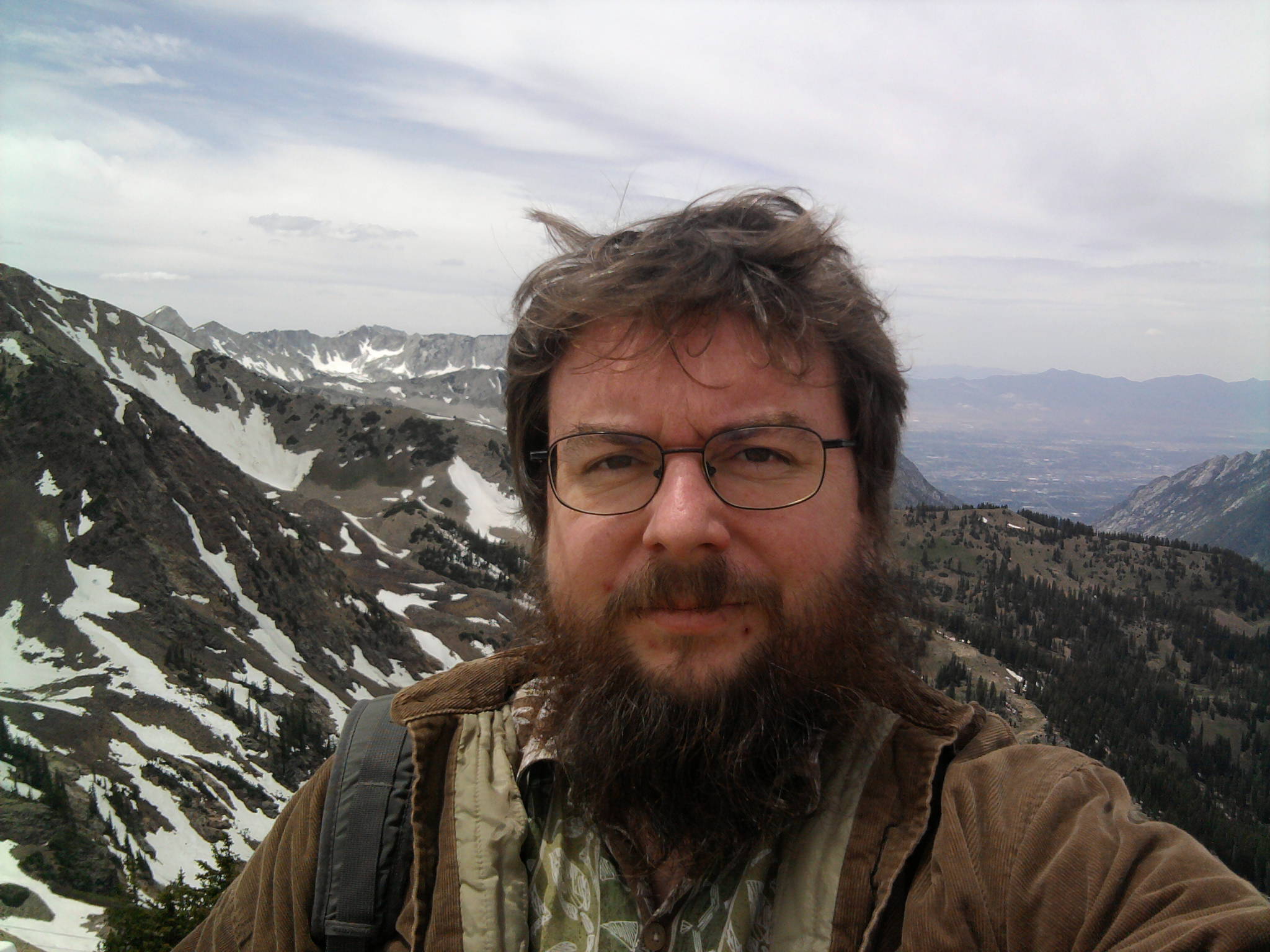
There were no presentations Monday afternoon, so I went on an outing to the top of a nearby mountain (11,000 ft elevation) and took this picture of myself at arms length with my phone's camera (yes, that is snow in the background, in June).  In the valley in the distance are the Sandy and West Jordan suburbs of Salt Lake City.

Photo0257

chemfig: Chemistry in WordPress

I just learned about adding chemical graphics in wordpress using the QuickLaTeX plugin and the chemfig package (links: QuickLaTeX, chemfig and chemfig).

Here is my first attempt, starting with something simple: molecular hydrogen.

 \begin{verbatim} \chemfig{H-H} \end{verbatim}

This code gives:
  \chemfig{H-H}

And now for a double bond: molecular oxygen.

 \begin{verbatim} \chemfig{O=O} \end{verbatim}

  \chemfig{O=O}

Putting these together we get water.

 \begin{verbatim} \chemfig{H-O-H} \end{verbatim}

  \chemfig{H-O-H}

However a water molecule actually has an angle of about 104.5 degrees. The angle below is raised 75.5 degrees because it would normally be 180 degrees between the hydrogens, .

 \begin{verbatim} \chemfig{H-O-[:+75.5]H} \end{verbatim}

  \chemfig{H-O-[:+75.5]H}

The oxygen has a higher affinity for electrons (is highly electronegative) and develops a negative charge while the electrons pulled away from the hydrogen give them positive charges from the proton nucleus.

 \begin{verbatim} \chemfig{H^+-O^{-}-[:+75.5]H^+} \end{verbatim}

  \chemfig{H^+-O^{-}-[:+75.5]H^+}

These charges result in hydrogen bonds between water molecules, which allows water to be a solid and a liquid at higher temperatures than is usual for a molecule of its size.  This also is responsible for the expansion of ice compared to the liquid form (the molecules take up more space to arrange themselves with optimal hydrogen bonding).

 \begin{verbatim} \chemfig{H^+-O^{-}-[:+75.5]H^+-[::+0,,,,dash pattern=on 2pt off 2pt]O^{-}(-[:+104.5]H^+)-H^+} \end{verbatim}

  \chemfig{H^+-O^{-}-[:+75.5]H^+-[::+0,,,,dash pattern=on 2pt off 2pt]O^{-}(-[:+104.5]H^+)-H^+}

And here is an actual reaction (the bond angles in the water come from :

 \begin{verbatim} \chemname{\chemfig{O=O}}{Oxygen} \chemsign{+} 2 \chemname{\chemfig{H-H}}{Hydrogen} \chemrel{->} 2 \chemname{\chemfig{H^+-[:-37.75]O^{-}-[:+37.75]H^+}}{Water} \end{verbatim}

  \chemname{\chemfig{O=O}}{Oxygen} \chemsign{+} 2 \chemname{\chemfig{H-H}}{Hydrogen} \chemrel{->} 2 \chemname{\chemfig{H^+-[:-37.75]O^{-}-[:+37.75]H^+}}{Water}

Switching gears with carbon, here is methane.

 \begin{verbatim} \chemfig{C(-[:0]H)(-[:90]H)(-[:180]H)(-[:270]H)} \end{verbatim}

  \chemfig{C(-[:0]H)(-[:90]H)(-[:180]H)(-[:270]H)}

Actually methane is organized into a tetrahedron with approximately 109.5 degree angles between the hydrogen atoms (, , ). Projecting above and below the plane of the image can be indicated with Cram-style bonds.

 \begin{verbatim} \chemfig{C(-[:90]H)(<:[:-9.75]H)(<[:-29.25]H)(-[:199.5]H)} \end{verbatim}

  \chemfig{C(-[:90]H)(<:[:-9.75]H)(<[:-29.25]H)(-[:199.5]H)}

Now for cyclic hydrocarbons! Benzene is:

 \begin{verbatim} \chemfig{C*6((-H)-C(-H)=C(-H)-C(-H)=C(-H)-C(-H)=)} \end{verbatim}

  \chemfig{C*6((-H)-C(-H)=C(-H)-C(-H)=C(-H)-C(-H)=)}

And as is typically done for hydrocarbons, we can leave out the hydrogen atoms and just show the carbon backbone:

 \begin{verbatim} \chemfig{*6(=-=-=-)} \end{verbatim}

  \chemfig{*6(=-=-=-)}

Finally, the delocalized pi-bonds can be illustrated as a ring which better reflects the aromatic p molecular orbitals (these give benzene and similar aromatic hydrocarbons enhanced molecular stability):

 \begin{verbatim} \chemfig{**6(------)} \end{verbatim}

  \chemfig{**6(------)}

Glucose! (the most common form at least) I actually had help on this one; I started to put it together than found it already assembled in Section 11.3.4 P. 37 of the ChemFig Documentation.  I just modified it slightly:

 \begin{verbatim} \setcrambond{2pt}{}{} \chemname{\chemfig{HO-[2,0.5,2]?<[7,0.7](-[2,0.5]OH)-[,,,, line width=4pt](-[6,0.5]OH)>[1,0.7](-[6,0.5]OH)-[3,0.7]O-[4]?(-[2,0.3]-[3,0.5]OH)}}{$\alpha$-D-Glucopyranose} \end{verbatim}

  \setcrambond{2pt}{}{} \chemname{\chemfig{HO-[2,0.5,2]?<[7,0.7](-[2,0.5]OH)-[,,,, line width=4pt](-[6,0.5]OH)>[1,0.7](-[6,0.5]OH)-[3,0.7]O-[4]?(-[2,0.3]-[3,0.5]OH)}}{$\alpha$-D-Glucopyranose}

Finally, let me have a shot (double entendre) at putting together caffeine.  First the hydrocarbon shorthand:

 \begin{verbatim} \chemname{\chemfig{*6(-N(-)-(=O)-N(-)-(=O)-(*5(-N(-)-=N-=)))}}{Caffeine} \end{verbatim}

  \chemname{\chemfig{*6(-N(-)-(=O)-N(-)-(=O)-(*5(-N(-)-=N-=)))}}{Caffeine}

Then the full version with all the atoms labeled:

 \begin{verbatim} \chemname{\chemfig{*6(C-N(-C(<:[:-9.75]H)(<[:-29.25]H)(-[:199.5]H))-C(=O)-N  (-C(<:[:+129.75]H)(<[:100]H)(-[:-40.5]H))-C(=O)-C(*5(-N(-C(<:[:+180]H)  (<[:+170]H)(-[:-307.5]H))-C(-H)=N-C=C)))}}{Caffeine} \end{verbatim}

  \chemname{\chemfig{*6(C-N(-C(<:[:-9.75]H)(<[:-29.25]H)(-[:199.5]H))-C(=O)-N(-C(<:[:+129.75]H)(<[:100]H)(-[:-40.5]H))-C(=O)-C(*5(-N(-C(<:[:+180]H)(<[:+170]H)(-[:-307.5]H))-C(-H)=N-C=C)))}}{Caffeine}

GMO Forensics with PCR

The Polymerase Chain Reaction (PCR) is a very powerful technology invented in 1983 by Kary Mullis.  We use it routinely today in molecular genetics labs and it is easy to take it for granted.  What makes this reaction particularly significant is not only that it uses a enzyme catalyst that remains unchanged while driving the reaction, but also that it results in an exponential amplification of a defined DNA sequence.  Human intuition tends to underestimate the power of exponential amplifications.  Casually imagining that you get paid a penny on the first day of a job and that your pay doubles each day (two pennies on the second day, four pennies on the third day) seems like it would take a long time to make much money--at the end of the week you are only up to $1.28.  However, you would have well over 10 million dollars ( pennies) by the end of the month!  Kary Mullis was only given a $10,000 bonus for inventing PCR by Cetus, the company he worked for; but in 1993 he was finally awarded the nobel prize in chemistry for his invention.

PCR works like this on DNA.  A stretch of DNA is designated with a set of primers (short single stranded DNA segments that can be synthesized).  A DNA polymerase enzyme attaches to one end of the primers and synthesizes a new DNA strand in one direction matching the original template DNA.  There are cycles of heating ("melting" the DNA by breaking hydrogen bonds between the strands), annealing of the primers to single stranded DNA, and extension of the new strands by the polymerase.  Importantly, the newly synthesized DNA strand can be used as a template in the next round, so, in theory, the amount of DNA between the primers is doubled each round.  If you do this for 30, 35, or even 40 cycles, you can amplify enough DNA to work with and sequence from even a single starting molecule.

Here in Hawai'i there is currently a GMO food labeling debate.  Unlike the EU, crops that are genetically modified do not have to be indicated on food labels in the US.  This fits into the larger GMO crop debate and is something that the students in my class are very interested in learning about.  In fact, just after I arrived here in August 2011 there were newspaper headlines about acres of transgenic crops destroyed on the big island and rewards for information (link).  This led me to thinking about a lab activity that would capture their interest--detecting GMO food ingredients by PCR.

Almost all GMO crops use the same strong constitutive promoter (highly expressed and always on because of a high affinity for RNA polymerase) from the cauliflower mosaic virus (CMV35S) to drive expression of the inserted gene and a "nos" (from nopaline synthase) terminator from the Agrobacterium tumefaciens Ti plasmid to stop transcription of the gene on the opposite side.  Primers to detect these parts of the genetic insert are already published so I ordered some to try out.

The image below is an overview of a 9+ kbp (over nine thousand base pairs) genetic modification inserted into transgenic papayas to combat the papaya ringspot virus (the virus devastated the papaya industry here in Hawai'i over the last 50 years).  The type of insert varies for each application, but as you will see later on, there is a reason I picked the GM papaya to illustrate.

papaya-insert-zoomout2

And below I've indicated the positions where three sets of primers are predicted to anneal: one set in the nos terminator and two sets in the CMV promoter indicated by the green triangles.

papaya-insert-zoomout

Below I have zoomed in a bit to see more detail; the sequence is so large it has to be wrapped on the screen so moving off to the right comes back on the next row down on the left.  In light green promoters are indicated, protein coding genes are in yellow and terminator sequences in orange.

papaya-insert

Below is a closer picture of part of the CMV promoter with "forward" and "reverse" primers. This promoter is used to drive expression of a coat protein from the ringspot virus, to prime the papaya's immune response to the virus--this particular genetic modification is often credited with saving the papaya industry here in Hawai'i.  The particular primer pair I tried as of this moment was the nos pair and one pair in the CMV promoter; I have not tried the second CMV pair yet.

CMV-promoter

Now it's time to go out and get some samples to try them out on.  In the US the big three are soybeans, corn and cotton (the image below is from here).

adoption_of_genetically_engineered_crops_in_the_u.s

I couldn't think of a source of cotton with enough DNA to easily test, so I focused on corn, soybeans and--here in Hawai'i--papaya.

At the local grocery store I found "unlabeled" corn from the US:

IMG_0025

"Green Giant Nibblers" also grown in the US:

IMG_0027

And "GloriAnn Sweet Corn" a product of Mexico:

D18

The only soybeans I found were all products of China.  "Shirakiku Edamame":

IMG_0030

"WelPac Shelled Edamame":

IMG_0032

And "Safeway Kitchens Shelled Edamame":

IMG_0034

For Papayas I found "Diamond Head Papaya":

D17

Anonymous "Papaya" from a different store:

IMG_0037

And "Solo" variety papaya from a farmer's market:

IMG_0026

So we have three of each of corn, soybean and papaya samples.  After extracting DNA samples, running the PCR and running a gel to view the results, this is what I found:

IMG_0039

To the left are the CMV primers and to the right the NOS primer pairs.  Three lanes in each showed up positive for amplification of the corresponding DNA.  The positive bands are faint so I indicated them with arrows in the image below.

IMG_0039-arrows

These primers amplify a short DNA sequence which does not stain with much dye to see on the gel.  The CMV promoter primers worked "better" i.e. are easier to see.  If you look closely you can also see a fainter band just below the positive samples that is "primer dimer".  This happens when the primers anneal to each other and amplify an even shorter sequence from just the primers.  Primers are designed in pairs to minimize this effect however.

In the gel below I tried different combinations of the CMV and NOS primers together in the same PCR reaction to try to amplify the larger sequence of DNA between them.  In this case these primers were not designed to work together and the primer dimer is much stronger at the bottom of the lanes.  There are three lanes that gave a large (did not move as far down the gel) band in the upper right (CMVf, NOSr).  The PCR in the second lane in from the top left didn't seem to work at all, this could be due to a PCR inhibitor that was co-extracted with the DNA.

IMG_0040

So what were the three positive samples?  They were the three papaya samples, two from the store and one from the farmer's market.  To nail this down a bit more I sequenced the DNA that was amplified to make sure it is what I suspected.

sequence-matches

Above, the short sequences from the three samples (gray bands in the lower part) are mapped to the papaya insert as a reference sequence.  As expected they map to the CMV promoter.  Below I zoomed in some more on a section so you can see the DNA sequence, it is a match to the promoter sequence.

sequence-matches-2

Above, two matches to the "right" promoter and below one match to the "left" promoter.

sequence-matches-3

Below is the longer sequence I recovered from the CMV-NOS primer pairs.

sequence-matches-long1

Zooming in more below you can see (hopefully) it is a match to the uidA gene in the genetic modification insert.  (The colors in the trace file correspond to the different colored bases in the reference sequence at the top.)

sequence-matches-long2

uidA is a gene from E. coli and produces the enzyme beta-D-Glucuronidase.  When plant tissues are treated with a bromine containing compound (X-Gluc) that is cleaved by beta-D-Glucuronidase and stains the tissues blue.  This provides visual confirmation that the gene in the insert is being expressed (similar to the X-Gal reporter system in E. coli) and is called the GUS reporter system.  The point being here, this is not a gene sequence (with components originating from a virus, CMV, and two different bacteria, NOS and uidA) that would be present in non-genetically modified papaya, but is exactly what we expect in ringspot virus resistant genetically modified papaya.

Let me back up a moment at this point and put a disclaimer in here.  I did this informally in the lab to test for use as a teaching tool in my genetics class in the fall.  There is a chance of a false positive here from DNA contamination between samples.  As I said at the beginning, PCR is so powerful it can amplify a single DNA molecule so this is something to always keep in mind.  There are ways to address this with multiple independent extractions in different labs, amplification from different parts of the insert between different samples, looking for unique genetic differences between the samples (if they exist), etc. but I am not going to go into that detail here.

Also, while we are on a cautionary topic, the CMV promoter is from the cauliflower mosaic virus.  It is possible that cauliflower and related brassica may show up positive even if they are not genetically modified from natural CMV infection.  Agrobacterium infects certain plants naturally and even E. coli can contaminate fruits and vegetables from contaminated water sources (which can be a serious health problem).  But you would not expect to find the CMV - uidA combination above.  That is proof that these papaya (or at least one if we are being hyper-cautious) are transgenic genetically modified.

I was surprised that the "solo" variety from the farmer's market showed up positive for the ringspot virus insert.  This is not supposed to be a genetically modified variety.  However, if you do a search for the terms "papaya gmo seed contaminated" you can find that it is quite common for papaya varieties, solo included, to contain the genetic modification here in Hawai'i, unknown to the growers, sellers and buyers using them.

U.S. Supreme Court unanimous in prohibiting patents on naturally occurring human genes

(link to Reuters article) (link to ACLU article)

A victory in the courts!  Finally the law is catching up with reality on gene patents.

A basic fact about patenting is that naturally occurring substances cannot be patented.  I cannot patent water, gold or air and charge you a royalty if you use them.  There has to be an "invention" involved where you have created something new as a prerequisite for patenting.

At the center of this current debate is Myriad Genetics and their patents of BRCA1 and BRCA2.  Having mutant alleles at BRCA1 or 2 elevates a woman's lifetime risk of breast cancer.  The patent allowed Myriad to legally prevent people from testing if they had these alleles unless they bought a $3,000+ testing kit from Myriad.  These are alleles that are a biological part of the people seeking to be tested.  Myriad does not own these people, how can they have a patent on part of their genome that the people naturally inherited from their parents?

I am fine with patenting genetic constructs that are novel and involve creativity in their design--constructs that do not already exist in nature.  I am also involved in a gene patent application based on our work to engineer underdominance via haploinsufficiency (M 10021/RN Max-Plank-Society for the Advancement of Science).  These kinds of patents can be potentially valuable to the institutes that own them and help drive research into new areas.

However, patents on naturally occurring substances can seriously inhibit medicine and research (see Paradise et al. 2005 and references therin).  Also, not having humanitarian and research exemptions can be a problem.  Imagine that you are developing a new line of research in the lab and then the university grants an exclusive license to a company from a patent based on your research.  Suddenly you are not allowed to continue your own research without permission from the company...  (see Andrews et al. 2006).

Incidentally, I am listed as an "inventor" on a human gene patent application (USPTO App. #20080220429) that stemmed from my postdoc work on lactase persistence in East Africa. I did not initiate patenting of the alleles; I was unaware a patent application had been drafted when the work was published; and transferring ownership of the patent to the University of Maryland was a term of my previous employment.  However, there is often confusion by the public that research scientists are responsible for gene patents rather than the companies and people that employ them.  After it was published I found out about an article in South Africa (Jordan 2009) criticizing me personally for this patent application.  (It also contained a number of other misconceptions, for example, I have never been affiliated with the University of Pennsylvania and I have no record of the author ever attempting to contact me for comment.)

When I first heard about the ACLU's challenge to human gene patents in early 2010 I contacted them and offered to help in any way I could--if my unique position as an "inventor" of gene patents and personal opposition to the granting of gene patents was useful.  They wrote back to me and we had a brief correspondence but in the end they did not take me up on my offer.  However, clearly they did not need any help and in the end were successful with today's court ruling.

Basic Hardy-Weinberg and Probability

Everything in genetics starts with mutations, but once we have mutations to study, work with and think about, what follows?  One direction is thinking about the dynamics of these gene differences (alleles) in large populations over time.  In 1922 R. A. Fisher compared this to the study of gases in physics.  The trajectories of the individual molecules are too complex to keep track of individually, but when a large number are considered as a group, individual differences average out and certain measurable and predictable properties arise like the relationship between temperature, pressure and volume.  (The kinetic theory of gases and the ideal gas law.)

An allele is at some frequency in a population.  The frequency has to be a fraction between zero and one (or equal to zero or one).  We can keep track of the frequency with .  For example, if the allele is at 50% frequency we can write .  Most species we think about are diploids and have two copies of most genes.  For simplicity let's say there are only two alleles in a population ( and , for the moment we are not worrying about which one might be designated a mutant or wildtype) and that the population is very large, so that all possible combinations are present no matter how rare.  Let's also say is the frequency of the allele.  If we pick a diploid individual in the population and pick one gene copy, what is the probability it is an allele?  The probability is simply the frequency of the allele in the population, which is equal to ; .

A related question is, what is the probability that both alleles found in an individual are ?  The simplest assumption is that choosing the two alleles is independent; i.e. if one allele is an this doesn't affect the probability that the second allele is or is not an .  So we are asking what is the probability the first allele is and the second allele is .  This is the logical intersect .  One way to think about this is that within the group where the first allele is , which is a frequency of , the fraction that has a second allele of is also had to be drawn twice and the chance of this is for the first copy and within that fraction for the second copy: is also the expected frequency of homozygotes (two copies of the same allele) in the population (probabilities and frequencies work both ways).

What about the frequency of the allele?  Since we are only dealing with two alleles in the population, and the result of all possible outcomes must sum to one, 100%, the frequency/probability of the second allele is the probability it is not the first allele, .  (I like to use the symbol for not because other not symbols can be ambiguous in general contexts.)  So the probability of drawing two alleles is .

This introduces the "and" and "not" rules in probability.  If events are independent, this and that, the probability of the combined outcome is found by multiplying the frequency of the individual events.  If we are talking about the opposite of an event, not that but everything else, the probability (complement) is found by subtracting from 1 (100%).  There is also an "or" rule that comes up quite frequently and that we will use next.  If two events are mutually exclusive, this or that occurred, then the combined probability is found by adding the two individual probabilities together.

So, what is the frequency of heterozygotes, where individuals have one of each allele, and .  Based on what I wrote above you might at first think we should multiply the allele frequencies together, , after all, if choosing the alleles is independent then the first one does not affect the choice of the second.  This is right but not completely right.  The trick that comes up here is that there are two ways to be a heterozygote.  The first allele chosen could be an and the second allele an or vice versa, the first allele  was an and the second an .  This may seem arbitrary; however, a natural way to keep track of the two outcomes to visualize this is the keep track of which allele comes from which parent.  The could have come from an organisms father and from the mother, or was from the father and from the mother.  These two events are mutually exclusive, either one happened or the other (they are not independent, if you are a heterozygote then getting an from your mother means the allele had to have come from your father).  In set theory this is the logical union, , of the two outcomes (and we are keeping track of the order of events), .  This is calculated by adding the two mutually exclusive outcomes together, .

Just for fun, let's substitute in all the logic symbols.

Then substitute in standard arithmetic symbols and for the probability of .

is equal to so these can be added together by multiplying one by two.

HW-40p

Above is a plot to illustrate.  If then the probability of drawing the corresponding allele first is , (blue in the "First" bar above).  Within that class of 40% the probability of drawing the same allele again is 40% of 40% or 16% ("Second"  allele above).  The two types of heterozygotes can be combined (yellow in the "Genotype" bar).  So if is the frequency of alleles then we expect 16% homozygotes, 48% heterozygotes, and 36% homozygotes.  Here is another plot with .

HW-20p

As an allele becomes rare its corresponding homozygote becomes very rare.  Also, rare alleles are most often found in heterozygote form (which makes sense, if you are rare you are most often paired with something else).

OK, so now we have all possible outcomes.  If is the frequency of the allele (and there are only two alleles in the population), the frequency of homozygotes is expected to be ; the frequency of , heterozygotes is ; and the frequency of homozygotes is .  You may still be suspicious about multiplying the  heterozygotes by two, so to check this mathematically the frequency of all possible outcomes must sum to one, if we have done everything correctly (although this doesn't prove we are correct, there are ways to make mistakes that also sum to one, but if it does not sum to one it proves that this is incorrect).  First of all the allele and must equal one when added together. It is easy to see that cancels out, so .   Adding the genotype frequencies gives ; this can be factored to .  As we just saw, .  So and .

If we had not multiplied by two in the heterozygote term we would have had

This is not equal to one (except for the special case where is zero), so not multiplying the heterozygote term by two is incorrect. Also, notice that we end up with one minus half of the heterozygotes (), which also makes sense, half of the heterozygotes are missing by not multiplying by two.

Also, we can see that the genotype frequencies are the binomial expansion of , which is another way of saying that we are combining alleles in pairs (from the allele frequencies in the fathers and mothers in the population).  To illustrate this lets make the frequency equal to to save space ().

HW-square

If we let the sides of this square represent parental allele frequencies and an "m" subscript represents the allele frequencies in males while "f" represents females, then the areas inside the square give the relative proportions of offspring genotypes.  (Notice there are two types of heterozygotes but only one way to get each homozygote.)  It is often assumed that allele frequencies are equal between males and females but this does not have to be the case.  In the plot above .

HW-curves

The plot above gives the relative genotype frequencies expected as a function of .  At each point on this we can plot the corresponding square as in the plots below.

HW-slide1

HW-slide2

HW-slide3

HW-slide4

HW-slide5

So, what can we do with this?  Well, for example, in the EU approximately 1 out of 2,500 people (link) are born with cystic fibrosis (CF) which can cause, among other complications, life-threatening lung infections in affected individuals. CF is caused by recessive alleles at a single gene, CFTR.  We can infer that these affected individuals are homozygotes and have two copies of the allele(s) that result in CF.  What fraction of people in the EU are carriers and have one copy of the disease causing allele but are unaffected because it is recessive?  Well, assuming Hardy-Weinberg genotype frequencies, we can set .  Taking the square root gives an allele frequency of .  Using this frequency estimate the fraction of heterozygote carriers in the population is .  (As a rule of thumb, the frequency of carriers of rare alleles is about twice the allele frequency.)  In other words about four percent, or one out of 25 people in the EU, are expected to be carriers of an allele that results in CF when homozygous--a surprisingly high number.