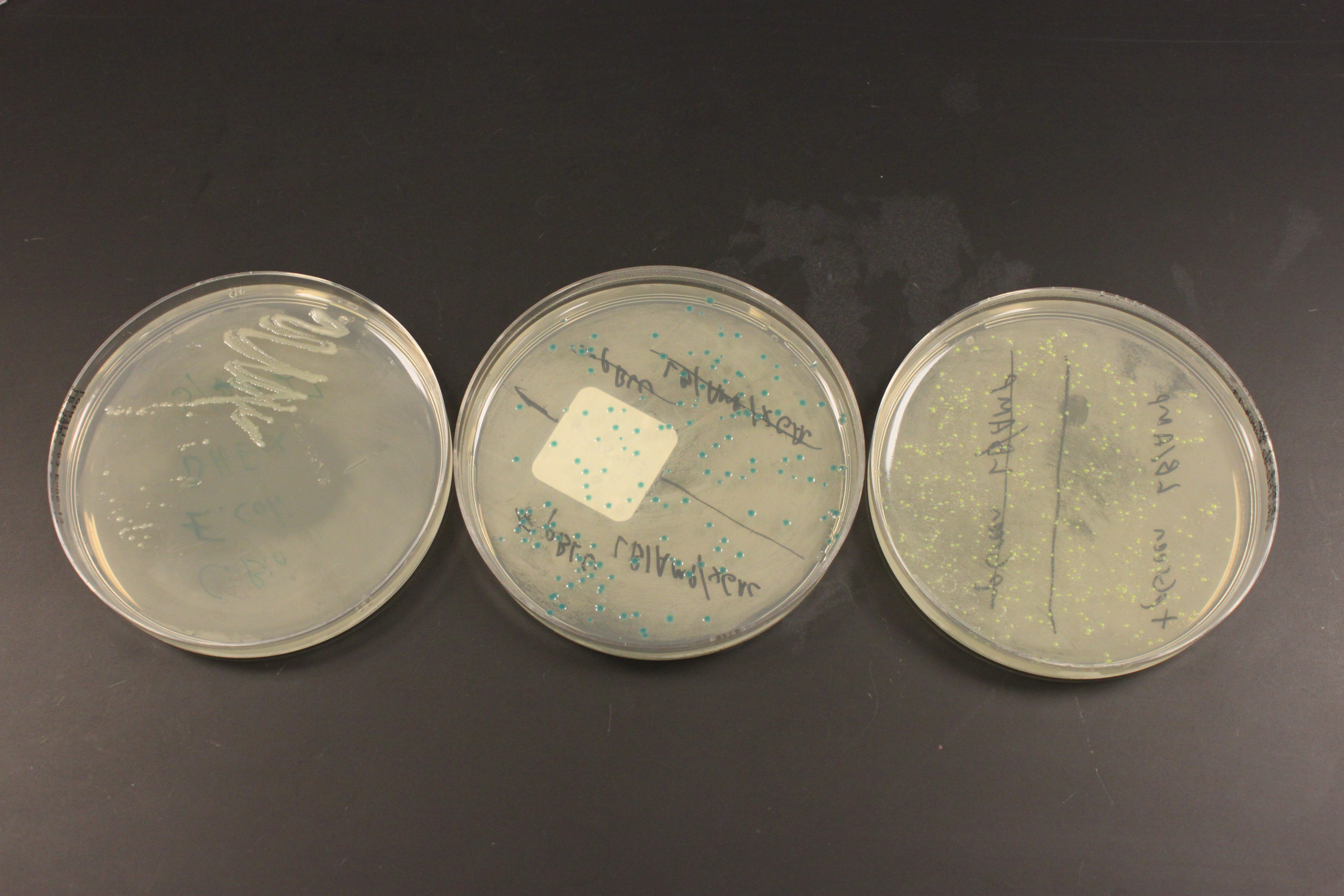
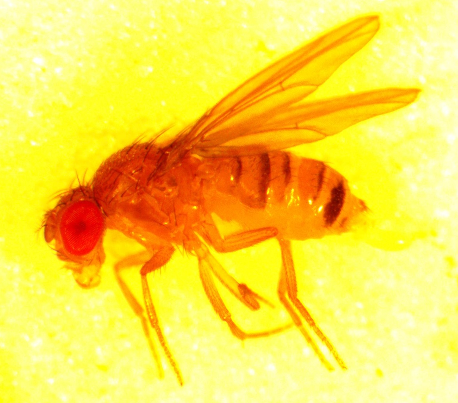
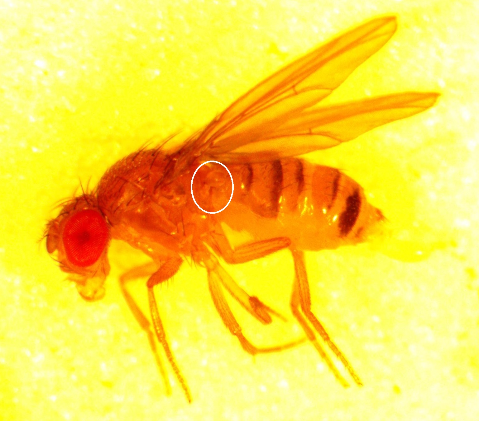
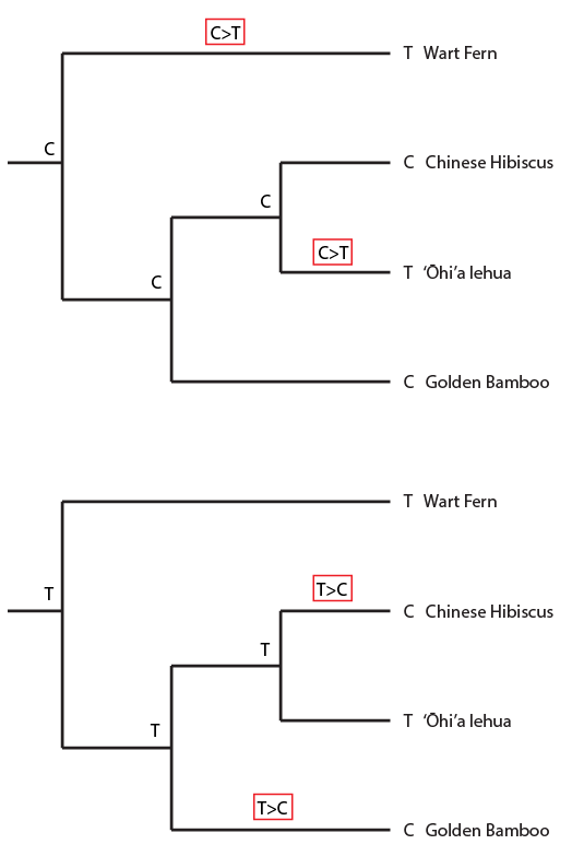
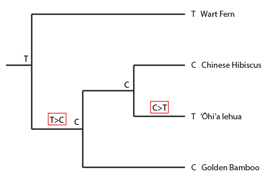
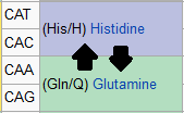
In the previous post about mutation predictions I only considered mutations in one direction (for example, from functional to non-functional gene sequences (while non-functional to non-functional mutations were ignored because the outcome is the same).) However, some mutations can be thought of as reversible. We could think of a nucleotide position mutating from an "A" to any other base-pair state ("C," "G," or "T") and then back again to an "A." Or, we could think about changes in a codon that alternate between two different amino acids. For example "CAT" and "CAC" both code for histidine while "CAA" and "CAG" both code for glutamine in the corresponding polypeptide (protein). The only change is at the third position so a "T" or "C" is one amino acid and an "A" or "G" is the other. As the sequence mutates and evolves between these four bases at this position we could think about this as reversible between two amino acid states.
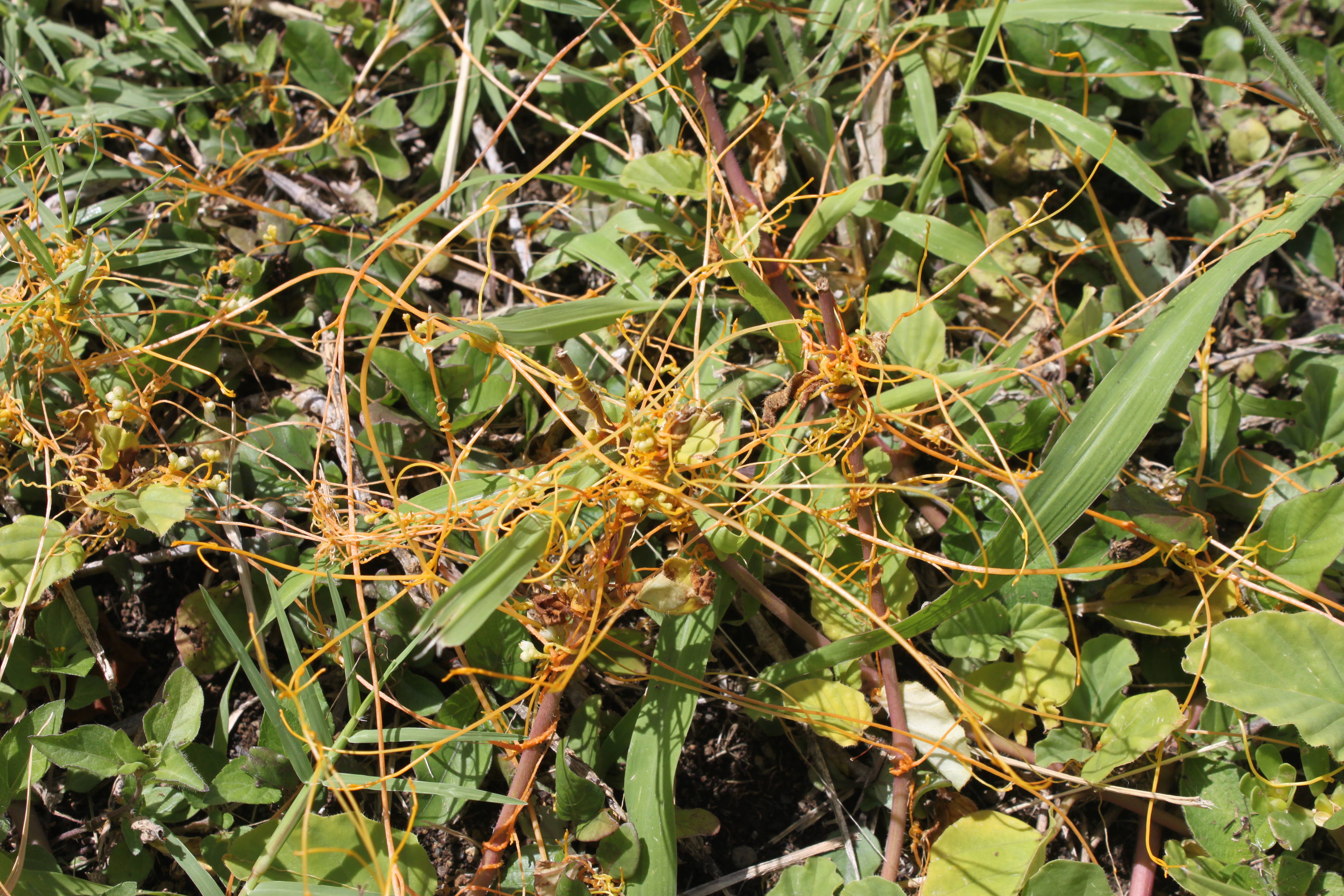
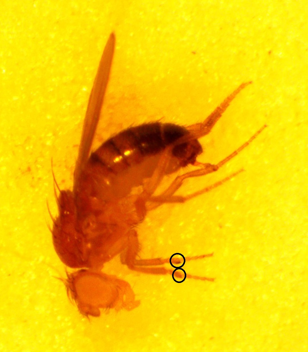
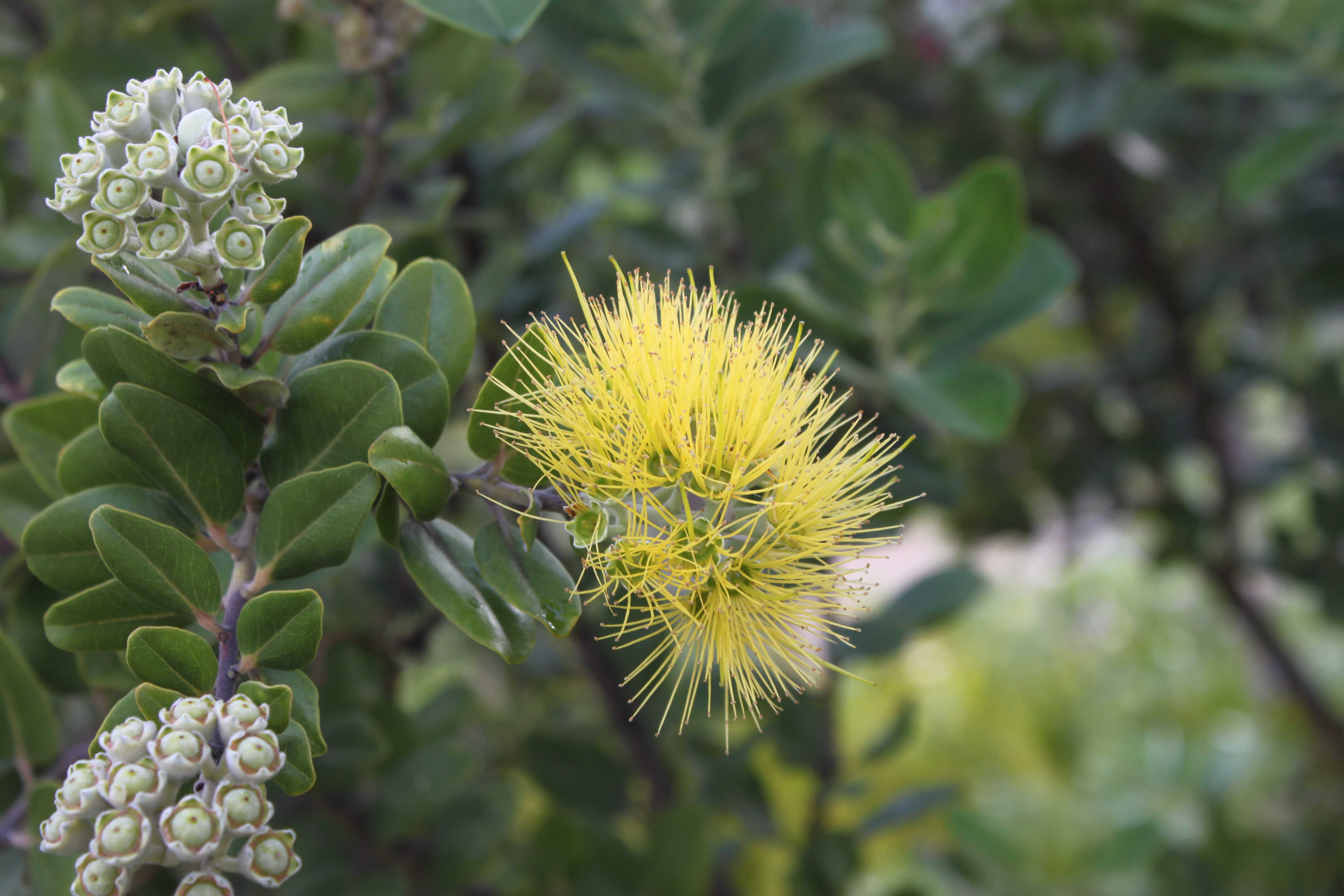
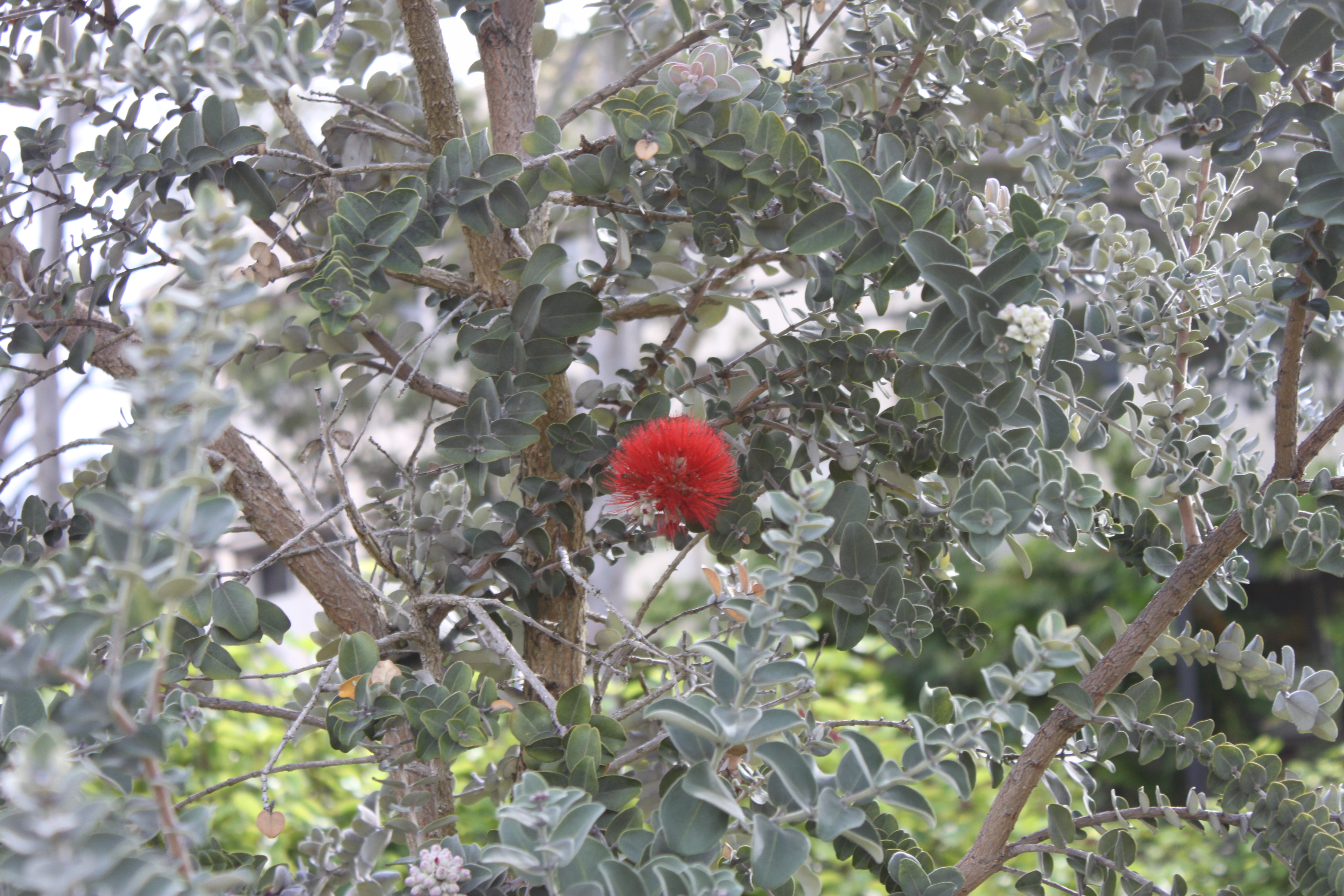
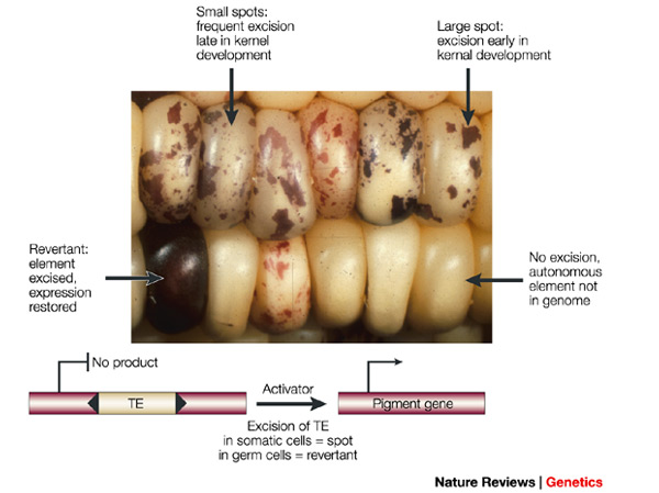
Another type of mutation is even closer to the sense of reversible. Transposable elements are small stretches of DNA that can insert into a gene sequence, sometimes inactivating the gene, and then later excise out of the sequence, which might restore the original function. In fact, transposable elements (or "TE's") are quite common in the genome of many organisms. In the image below is an example from corn (in which TE's were first discovered). Starting with an individual that has a TE inserted into a gene that produces the purple pigment (so no pigment is produced and the kernels are white) the TE can excise in certain cells (giving purple spots) and may even excise in the germ-line cells so that the next generation has completely restored pigment production.
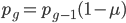
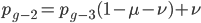
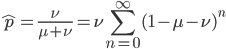
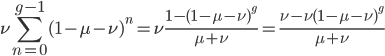
We can write down the expected frequency in the next generation with reversible mutations as a recursion. To be an allele at frequency  in generation
  you are either already a type allele in the previous generation
  and did not mutate away with a mutation rate of
  (red) or you were the alternative allele at a frequency of
  and mutated at a rate of
  (blue). (Incidentally, the "or" in the sentence implies that we add these two outcomes together rather than multiply because they are mutually exclusive; the allele either mutated or it did not; while the two "and"s in the sentence imply multiplying, the mutation rate and the allele frequency are independent events that have to co-occur to have the effect we are focusing on.)
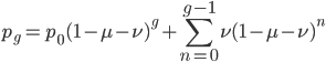
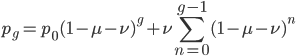
 .
.
We could also write this from the alternative alleles point of view  .
.
 .
.
Either way works the same in the end, but for the rest of this we are using the version.
At equilibrium  so setting the allele frequencies between generations equal to each other gives:
 .
.
Subtract from both sides to get the terms together.

Multiply everything out.
cancel out  on the right
rearrange
factor
subtract from both sides
multiply both sides by negative one

solve for

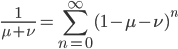
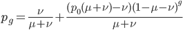
This gives us the equilibrium allele frequency as determined by the forward and backward mutation rates. Equilibrium values are often designated with a "hat" symbol like this:

From looking at this equation you can see the the equilibrium frequency of an allele is given by the mutation rate to the allele state as a fraction out of the total of the mutation rates,  . So for example, if is one half of the total rate of mutations (in other words if
  ) then
  . This seems to make intuitive sense, if different alleles are mutating into each other at the same rate, then over enough time the population will be made up of a 50/50 ratio of the alleles.
Going back to the original equation and multiplying everything out to rearrange the right hand side:


is this helpful?
substituting back in gives:


which is

which can be written in a summation series as
or (pulling out of the sum)
I'm not sure this is very helpful. The sum on the right is hard to work with. It would probably be easier to plot the change over time by simply iterating the original recursion equation. However, one interesting thing about the equation above is the term 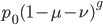 goes to zero as becomes large because a large number of numbers less than one are being multiplied together. This makes sense because as becomes large the equilibrium is approached and the initial condition
  matters less and less. In fact, using this logic, and letting go to infinity,
  , we could write down:
dividing by gives:
which makes sense in the sense that the equilibrium allele frequency is only a function of the mutation rates (again the starting point should disappear because after an infinite number of steps toward a single equilibrium the result will be the same no matter where you started).
Is it known in general that this infinite series reduction pattern is true? If we set  then
then
becomes:
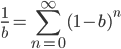 .
.
Then setting  gives:
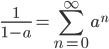
This is a classic result of an infinite sum of a geometric series. (It is called geometric because raising  to the
  is like adding dimensions in geometry.
  is a point;
  is a line of length ;
  is a square with sides of length ;
  is a cube with edges of length ; etc.)
Also, looking at again. If we have a total mutation rate  then the first part of the equation,
  , is basically the same as the simpler model of irreversible mutation,
  . So we can interpret the first part of this equation, , as the fraction of alleles that have not mutated yet. Of course this will disappear as the equilibrium is approached.
Backing up to
and looking at the part on the right. Now that we realize this is a geometric series we might be able to reduce the finite series.
A finite geometric series can be reduced by
 (link)
As above, substituting  and realizing
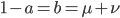
 .
.
Again, as goes to infinity  goes to zero and
 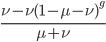 becomes .
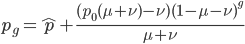
So, to be able to directly calculate the allele frequency at any point along the way as reversible mutations drive the system from a starting point toward equilibrium the equation is:
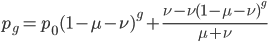 ,
,
which can be simplified to:
 .
.
This can be divided into an equilibrium component and a component quantifying the deviation from equilibrium due to the starting point and the time since starting :
or
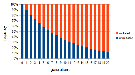
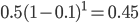
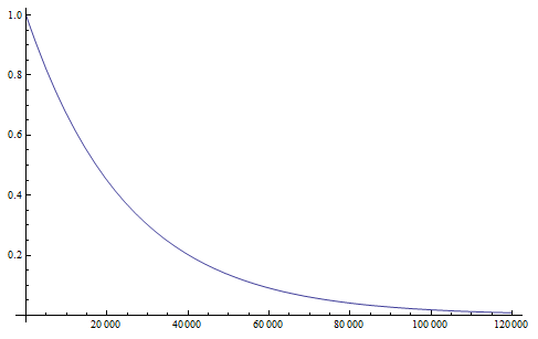
Here is an example plot showing the predicted decline in allele frequency from 100% (blue) and the rise from 0% (red) compared to the equilibrium (yellow) where one mutation rate is a fifth of the other:  and
and  . (Generations is on the x-axis and allele frequency is on the y-axis.)
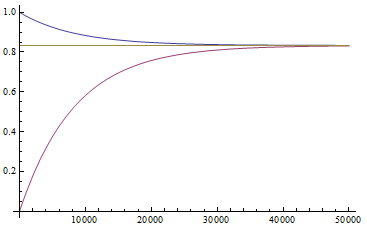
So, by 50,000 generations, which again is not that long compared to geologic timescales, the allele frequency is predicted to essentially arrive at an equilibrium. In this case we expect it to be 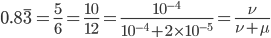
Exactly how long does it take to converge? The allele frequency trajectories asymptotically approach equilibrium so they will never be exactly equal. We could however ask when the difference is below a certain threshold. If we start one  and the other
  this is the largest difference,
  , we can begin with. The difference between the two trajectories is (with zero and 1 substituted for in red):

We can immediately get rid of the difference in the equilibrium components  , which is zero. Also multiplying by one and zero simplifies the equation a little more. Long story short, a lot cancels out and we end up with something familiar:
 ,
,
which makes a lot of sense. We realized above that this was the fraction that had not yet mutated, which is the reason the curve deviates from equilibrium (i.e. starting points are different).
Solving for to get the number of generations gives us:
 .
.
Plugging in the mutation rates from the example above we find that the difference in highest and lowest trajectories drops to less than 1% after 38,375 generations.
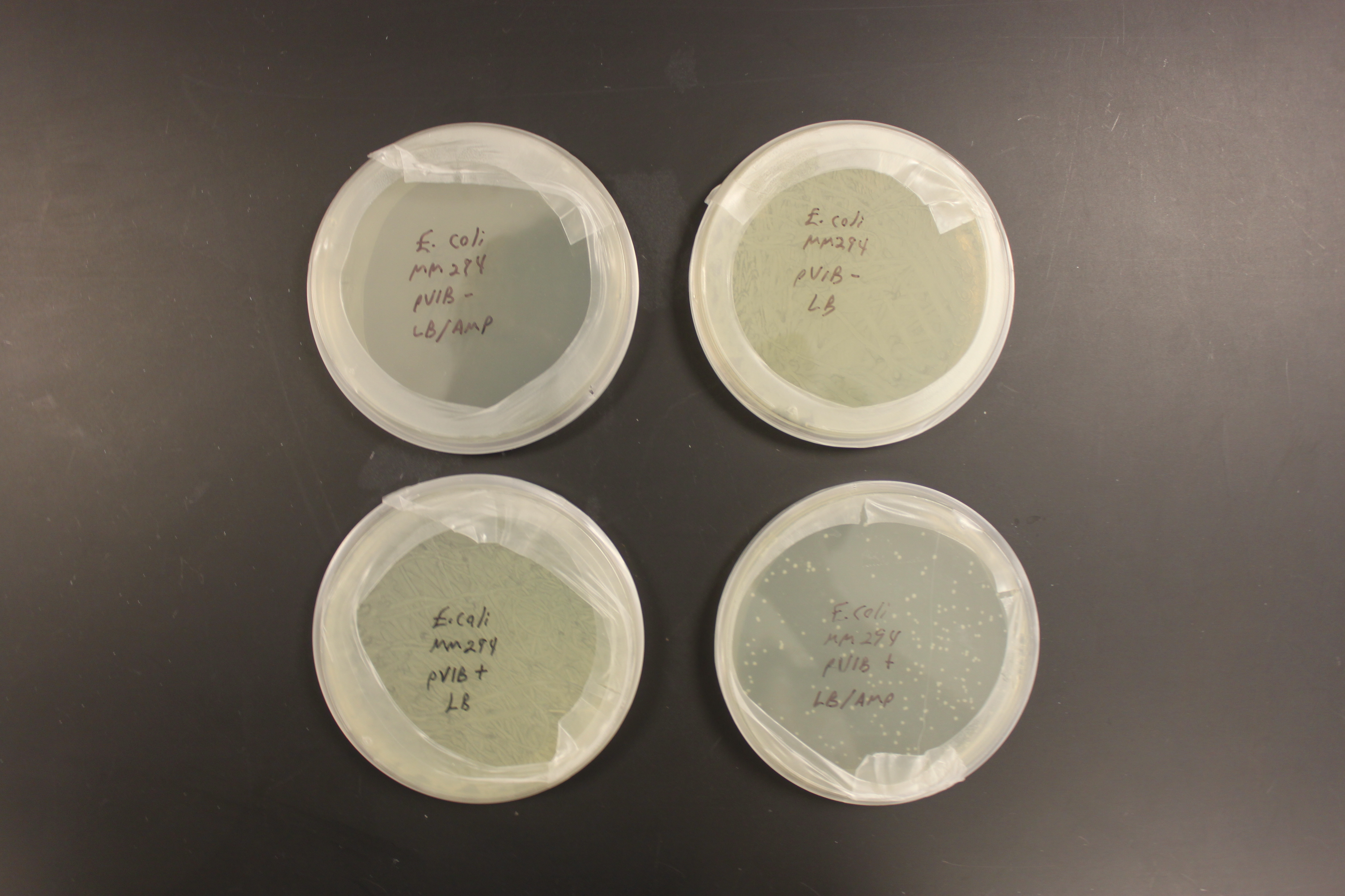
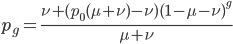
The probability that a transposable element inserts into a specific gene sequence is very small. Once it is inserted (and sticking with simplistic assumptions here) the probability it will excise is likely much higher than the insertion in the first place. Say we had data from huge fields of purple kernel color corn that had been maintained for many generations. In, let's say, 3% of these we find a mutation due to a transposable element that prevents the pigment from being produced. Assuming the population is at or very near to equilibrium what can we say about the insertion versus excision relative mutation rates?
can be rearranged to
 .
.
Setting  gives
gives

So in this example, the excision rate is approximately 32 times higher than the insertion rate. (If you define as the excision rate and as the insertion rate. We can alternatively set  and switch the symbols for the insertion and excision rates but the result is the same.)
Backing up to a more basic level, why is there an equilibrium at all? We might also intuitively think that if one mutation rate is higher than the other that we would eventually end up with all of one type (allele) in the population. (Actually this can happen when we start talking about drift in finite population but we are still ignoring that at the moment and pretending populations are so large that they are essentially infinite and even tiny fractions will be present.) The trick to thinking about this is that as one allele becomes rarer it is a smaller target for mutations in the population. As it becomes more common and in more copies there are more opportunities for mutations to occur to change the allele into a different form. This frequency effect "buffers" the alleles towards intermediate frequencies, so an allele is never quite lost or fixed and we end up with an equilibrium.